In this session we shall use Minitab® to
- Place data in a Minitab worksheet,
- sort the raw data into ascending order,
- produce descriptive statistics,
- create a Minitab project report,
- produce a bar chart,
- produce a histogram and
- produce a tally chart.
From the course text, (Navidi, second edition), table 1.2 p. 20:
The data set below consists of observations on particulate matter emissions x (in g/gal) for 62 vehicles driven at high altitude.
| 7.59 | 6.28 | 6.07 | 5.23 | 5.54 | 3.46 | 2.44 | 3.01 | 13.63 | 13.02 |
| 23.38 | 9.24 | 3.22 | 2.06 | 4.04 | 17.11 | 12.26 | 19.91 | 8.50 | 7.81 |
| 7.18 | 6.95 | 18.64 | 7.10 | 6.04 | 5.66 | 8.86 | 4.40 | 3.57 | 4.35 |
| 3.84 | 2.37 | 3.81 | 5.32 | 5.84 | 2.89 | 4.68 | 1.85 | 9.14 | 8.67 |
| 9.52 | 2.68 | 10.14 | 9.20 | 7.31 | 2.09 | 6.32 | 6.53 | 6.32 | 2.01 |
| 5.91 | 5.60 | 5.61 | 1.50 | 6.46 | 5.29 | 5.64 | 2.07 | 1.11 | 3.32 |
| 1.83 | 7.56 |
[The simplest method to import these data into Minitab is to copy and paste from this link.]
- Produce summary statistics of the data.
- Construct a bar chart of the data, using class intervals of equal width, with the first interval having lower limit 1.0 (inclusive) and upper limit 3.0 (exclusive).
- Modify the histogram of the data, combining the class
intervals for
[11, 15) into one class and the class intervals for[15, 25) into one class - Construct a tally chart for the following qualitative
descriptions of emissions:
low: [0, 5);
moderate: [5, 10);
high: [10, 15);
very high: >= 15.
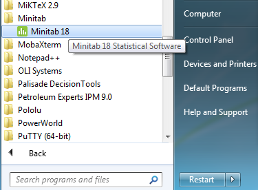
Open Minitab.
On the machines in rooms EN 3000 and 3029, double click the
Minitab icon on the desktop:
![]()
OR click on the
"Start" button in the lower left corner, then
click on the chain of menu options
All Programs > Minitab >
 Minitab 17 Statistical Software
(or there may be a quick link to Minitab 17 on your Start Menu).
The upper window is the
Session window,
while you can scroll through your data in the lower Data window.

[The three asterisks *** beside the file name in the title bar of the Data window indicate that this is the active Data window. Of course, it is also the only Data window in your project at this time!]
Data Entry
Click on the grey cell just below
' |

|
 |
From the link above open the plain text file "NavidiT1-2.txt" containing the data, using a simple program such as 'Notepad'. Right click anywhere in the main window and click on 'Select All' (or click on the menu item 'Edit' and then click on 'Select All' or press 'Ctrl A'). |
|
Right click anywhere in the main window and click on
'Copy' |
 |
 |
Back in Minitab, click on the top white cell,
just below the column label, |
|
Type a label into column C2 |
 |
 |
By itself, this column of raw data
is not very helpful One way to improve visibility is simply to rearrange these data into ascending order. On the main menu bar near the top left corner of the
Minitab window, |
A dialog box appears. In the left pane all of the columns
of numeric data are displayed - in this case, column
'C1' only. Click on 'C1' in the
box on the left, then click the 'Select' button.
'C1' now appears in the top right pane
('Columns to sort by:').
[Alternatives are to double click 'C1' in the left
pane or to type 'C1' manually in the top right pane.]
Keep the "Increasing" item as is.

Click on the right arrow under 'Columns to sort:'.
In the drop down menu, select 'Specified columns'.

Click in the new pane and type C1 (or
double click 'C1 PM Emissions' in the left pane).
Click on the right arrow under 'Storage location for the columns:'.
In the drop down menu, select 'In specified columns of the current worksheet'.

Click in the new pane and type C2 (or
double click 'C2 Sorted' in the left pane).

|
Click the 'OK' button. The data, sorted into ascending order, now appear in column 2 of the data window, alongside the raw non-sorted data. Take a moment to scroll down through the Data window, to gain some appreciation for the data. |
 |
Summary Statistics
On the main menu bar near the top of the Minitab window,
click 'Stat' then,
on the successive pop-up menus, hover on
'Basic Statistics' then click on 'Display Descriptive
Statistics...'.

 |
In the new dialog box, select column This will place Now click on the 'Statistics...' button. |
|
By default, the summary statistics that Minitab displays are those indicated by the checked boxes. |
 |
 |
Uncheck 'SE Mean' and 'N missing' Then click on the 'OK' button to return to the previous dialog box. |
|
Click on the 'Graphs' button to bring this dialog box up. Check the second and fourth boxes, as shown. Then click on the 'OK' button to return to the previous dialog box. Click on the 'OK' button of the main dialog box. |
 |
Text appears in the Session window, which is immediately hidden
under two graphs.
Click on any part of the Session window that you can see, to
bring it back to the top.
The summary statistics that we chose to display for the
particulate matter emissions of the sample of 62 cars are now
displayed.

Now click on the bar chart. If you cannot find that window, then go to the window menu, which lists all of the currently open windows. Click on the window that you wish to move to the top.

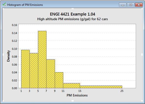
What Minitab calls a “histogram” is not a
histogram!
It is a bar chart.

The probability curve of a normal distribution that has the same mean and variance as the data is superimposed on this diagram. Clearly our data set was not drawn from any normal distribution. A substantial portion of the area under the normal curve extends into negative values of 'PM Emission', which are impossible.
 |
Now find the boxplot graph. The line inside the box is the median The upper and lower sides of the box are at The whiskers extend to the last observation This sample has four outliers, all off the upper
end. |
|
We can tidy this display up. Right click anywhere in a blank part of the boxplot. On the pop-up menu, hover on 'Add', |
 |
 |
Check the top box, then click 'OK'. |
|
Double click anywhere in the box. In the 'Attributes' tab of the new dialog box, click the radio button 'Custom', then You can now replace the default colour of the box in the boxplot by clicking on another colour of your choice. Click the 'OK' button to return to the boxplot. |
 |
By default Minitab does not display the mean on a boxplot.
In order to force the display of the mean,
right click anywhere in a blank part of the boxplot.
On the pop-up menu, hover on 'Add',
then click on 'Data Display...'

 |
In the 'Add Data Display' dialog box, |
Leave the cursor resting on any part of the box A pop-up tool tip provides some numerical information about the boxplot. |
 |
Minitab Report Pad
In the session window, drag the cursor over the lines containing
the summary statistics,
then right click on the selection,
then click on 'Append Selected Lines to Report'

Use the window menu to locate the 'Project Manager' and bring
that window to the top.
In the left pane, click on 'Report Pad'
The Project Report then appears in the right pane.
The lines that you selected from the session window now appear
in your report.
You can add and edit other text to this report as you wish.

You can also append graphs to your report.
Right click on the graph.
On the pop-up menu, click on 'Append Graph to Report'

Bar Charts
|
On the main menu bar, |
 |
 |
In the dialog box, |
|
In the new dialog box, select and click the 'Scale...' button. |
 |
 |
In the new dialog box, Click on the 'Gridline' tab, Check the first box then click the 'OK' button |
|
Click the 'Labels...' button. In the new dialog box, in the first tab Click the 'OK' button. Back in the main dialog box, |
 |
The following bar chart appears.
As noted earlier, this is not a histogram!

These default intervals (bins) are centred on 0.0, 2.5, 5.0, ... ,
20.0 and 22.5.
The question requires intervals with boundaries at 1, 3, 5, ... ,
23 and 25.
Position the cursor near the horizontal axis, over one of the number labels and double click.
 |
In the 'Edit Scale' dialog box, Click on the third tab 'Binning', In the upper group 'Interval Type' In the lower group 'Interval Definition' Click in the pane and Click the 'OK' button. |
The bar chart has been modified to a more reasonable form:

|
On the bar chart, double click In the 'Edit Bars' dialog box, In the 'Attributes' tab, in the left group When done, click the fourth tab |
 |
Now lets us combine some low frequency bins in the long right tail together.
 |
In the lower group In the pane delete the numbers Then click the 'OK' button. |
In this bar chart

the frequencies are displayed by the heights of the bars.
This gives a very misleading impression that there are more
observations in the right tail than there really are.
We need to replace this bar chart by a histogram, in which the frequencies are proportional to the areas of the bars, not their heights. The vertical axis needs to be changed from frequency to density.
Histograms
Position the mouse cursor over any number label on the vertical axis and double click.
|
In the 'Edit Scale' dialog box, Click on the third tab 'Type', Click on the radio button 'Density', and click on the 'OK' button. |
 |
The histogram is now correct.
We can append this graph to our report.

The Report Pad can be exported to a RTF (rich text format) file, for easier editing in a word processing program (such as Microsoft Word). With the report as the active window,
 |
right click on 'ReportPad' Save the file to any convenient location. The main 'File' menu can be used instead. |
Of course, we should save our work.
In the main 'File' menu, click on 'Save Project As...'.
Choose an appropriate directory and file name.

Tally Chart
 |
In column 3 of the worksheet |
|
On the main menu bar near the top left corner of the
Minitab window, |
 |
In the left pane double click on 'C1 PM Emissions' to bring it
into the top right pane.
In the mid-right pane 'Method:', click on the down arrow at the right and
select 'Code ranges of values' from the drop down menu.
This opens a new table. Enter the values and labels as shown.
The tab key can be used to move from cell to cell during this data entry.

Endpoints cannot be left blank. Choose boundaries that encompass all
the data.
|
Click the down arrow at the right of the pane
'Storage location for the coded columns:' |
 |
|
The first few rows of the worksheet |
 |
|
while the Session window should now include |
 |
On the main menu bar near the top left corner of the
Minitab window,
click on 'Stat', then on 'Tables', then on 'Tally Individual
Variables...'

|
In the resulting dialog box, |
 |
 |
An extended tally appears in the session window. Unlike the case in earlier versions of Minitab, |
One can then proceed to generate graphical summaries in various forms.
|
To create a pie chart, click on 'Graph', |
 |
 |
In the resulting dialog box, click the radio button for |
|
In the new dialog box, select the tab 'Slice Labels' Then click OK on each of the two dialog boxes. |
 |
 |
A pie chart appears. By clicking on various parts of the chart, |
|
To create a bar chart, click on 'Graph', |
 |
 |
In the resulting dialog box, from the drop-down menu 'Bars represent', accept the default button 'Simple', |
|
In the pane 'Categorical values' The six buttons allow for some finer control. Just click 'OK'. |
 |
A bar chart (not a histogram) is produced.

Experiment with various settings to improve its appearance.

Don’t forget to save your work (if you want to keep it).
From the main 'File' menu, click on 'Exit' to terminate the Minitab program.
Created 2009 12 31 and most recently modified 2020 04 13 by Dr. G.H. George