ENGI 3423 - Normal Probability Plot
Simulation using MINITAB
In this session we shall use Minitab® to
- create a simulated set of data for use in Minitab,
- use Minitab to display a graphical
summary of the data,
- use Minitab to produce a normal
probability plot for the data,
- use Excel® to produce a
normal probability plot for the data.
Creation of a Data Set
|
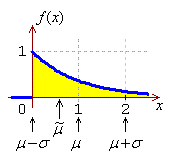
We shall simulate the creation of a normal probability plot for a
case where the data are known to be non-normal, namely data drawn
from an exponential distribution. The standard exponential
distribution (λ = 1) is shown here:
Start Minitab.
Click on the menu item "Calc"
Move to "Random Data"
On the new pop-up menu, click on
"Exponential..." |
|
![[Menus]](i01menu.jpg) |
 |
|
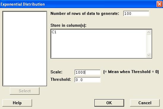
In the new dialog box,
Enter 100 for the number of rows,
Type C1 for the location,
Enter 1000 for the Scale,
Leave the Threshold at 0 and
Click on the "OK" button. |
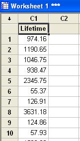
Type a new name for column
C1 .
As lifetimes are often random quantities that
follow an exponential distribution, we shall use
the name Lifetime here.
The column Lifetime now
contains 100 values.
Note that, as this is a set of random data,
the numbers in your data column will not be
identical to those shown here. |
|
 |
Graphical Summary of the Data
![[Menus]](i04menu.jpg) |
|
As we have done before, we can use Minitab
to gain a first impression of the distribution
of our newly-generated data.
Click on the menu item
"Stat",
Move to "Basic Statistics" and
Click on "Display Descriptive
Statistics...". |
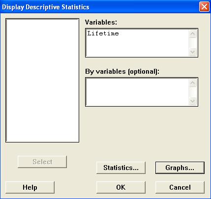
In the dialog box,
Double click on "C1 Lifetime"
to select it into the "Variables"
pane, then
Click on the "Graphs..."
button. |
|
 |
 |
|
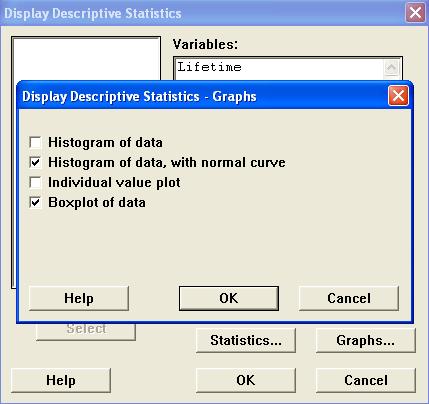
In the new dialog box,
Check the boxes "Histogram of data,
with normal curve" and
"Boxplot of data"
and
Click on the "OK" button.
Back in the "Display Descriptive
Statistics" window, click on the
"OK" button. |
Two graph windows then appear:
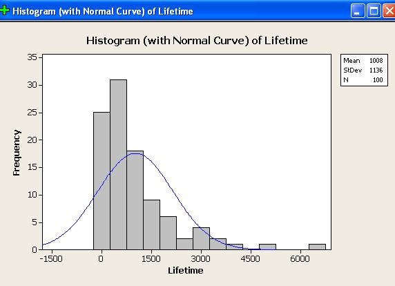
The evidence for positive skew is overwhelming.
The histogram shows a long right tail and no left tail.
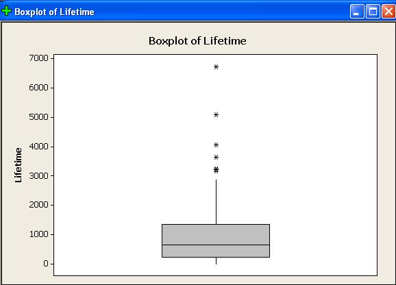
The boxplot shows the upper quartile to be further away from
the median than the lower quartile.
The boxplot’s upper whisker is much longer than its lower
whisker.
There are several outliers, all on the positive side.
From the Session window,
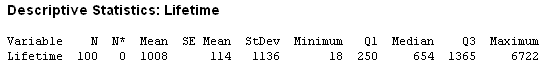
The mean is much greater than the median.
[Note also that the values of sample mean and sample standard
deviation are consistent with equality of the population mean
and population standard deviation, which is true of any
exponential distribution.]
Clearly the normal distribution does not fit these data.
Normal Probability Plot
— Minitab
Click on the menu item
"Graph", then
Click on
"Probability Plot..." |
|
![[menus]](i08menu.jpg) |
 |
|
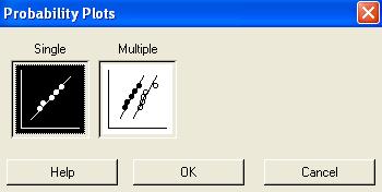
Accept the default "Single"
Just click on the "OK" button. |
In the dialog box,
Double click on "C1 Lifetime"
to select it into the "Variables" pane, then
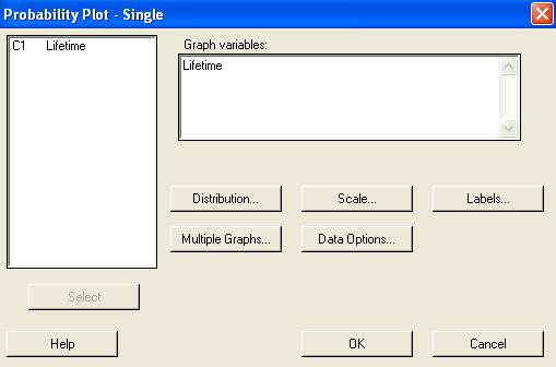
Click on the "Labels..." button.
Provide a more meaningful title for the normal probability plot.
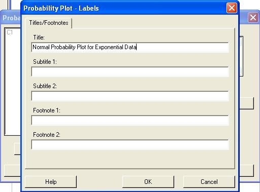
Then click on the "OK" button.
Back in the "Probability Plot"
window, click on the "OK" button.
The following normal probability
plot (or something very like it) then appears:
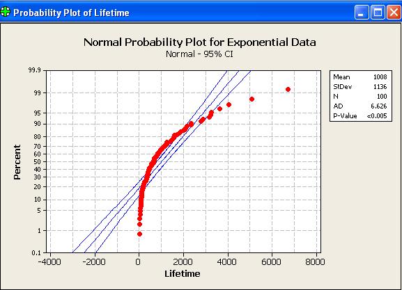
A random sample of size 100, drawn from a normal distribution,
will have all (or nearly all) of its points near the straight
line of a normal probability plot. Only 5% of all points
will fall, by chance, outside the two curves on either side of
the line.
Clearly this data set has not been drawn from a normal distribution.
Here are some other normal probability plots (as produced by
Version 13.2 of Minitab - mostly the same as Version 15.1).
100 data drawn from a Normal
distribution N(1000, 102)
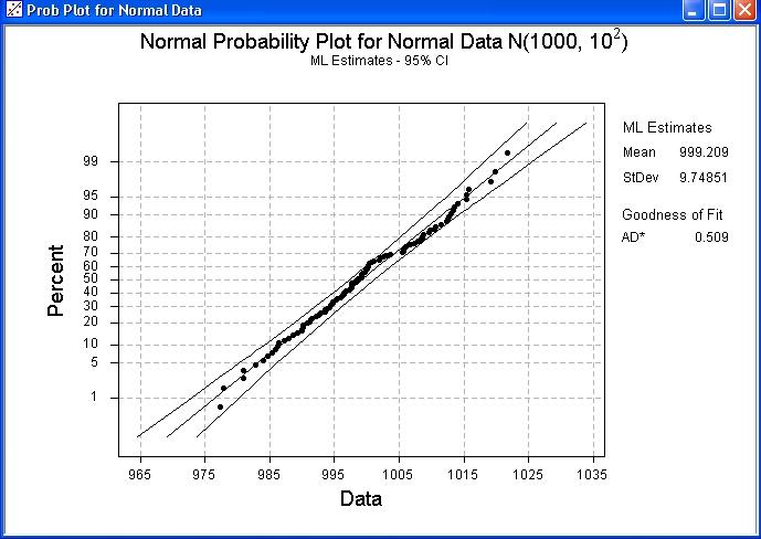
Note how nearly all points lie within the two curves, close to a
straight line.
100 data drawn from a standard
LogNormal distribution.
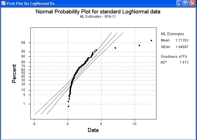
Note how this plot resembles that for the exponential distribution.
100 data drawn from a
Cauchy distribution
of mean 0 and semi-interquartile range 1.
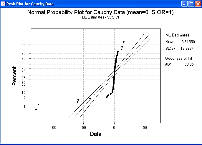
This plot reveals the very heavy tails of the Cauchy distribution.
For the run that produced this plot, the 100 data values had a sample
median very close to the population median value of zero and quartiles
near ±1. However, the sample mean was below –3.
Recall from
Problem Set 5
Question 4 that the Cauchy
distribution has a finite interquartile range but an infinite
population variance.
100 data drawn from a Beta
distribution Beta(18, 2).
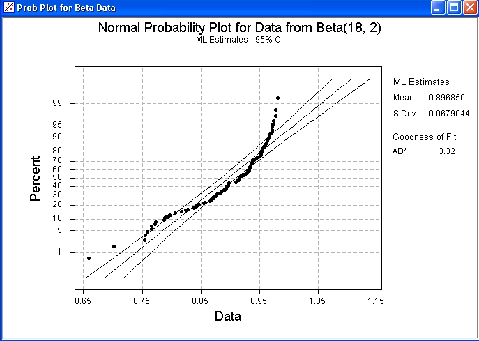
Note how this plot reveals a strong negative skew, together with the
light right tail. The plot clearly shows that these data are
inconsistent with a normal distribution.
You can copy and paste the above results into your Report Pad.
Then save your work and exit from Minitab.
The populations from which these
data sets came are illustrated here, in their standard forms.
standard exponential
|
standard normal
![[graph]](distnorm.gif) |
standard log-normal
![[graph]](distlognorm.gif) |
standard Cauchy
![[graph]](distcauchy.gif) |
beta (18, 2)
![[graph]](distbeta18_2.gif) |
Normal Probability Plot
— Excel
Open Excel and import the data set, for which you wish to create a
normal probability plot, into a column.
Check that the Analysis Tool Pack is present,
as follows.
Click on the menu item
"Tools"
and check if the item
"Data Analysis..."
is present in that drop down list.
If it is present, then bypass the next step.
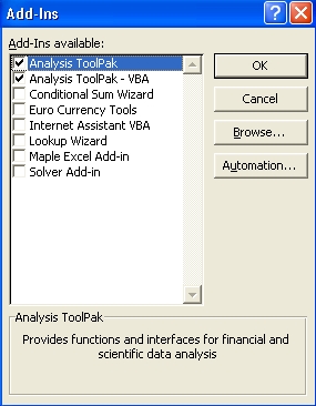
Otherwise, click on
"Add-Ins...".
|
|
![[Menus]](i16toolsmenu.jpg) |
 |
|
Check the options for
"Analysis ToolPak" and
"Analysis ToolPak - VBA"
then click on the "OK" button. |
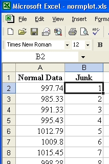
Alongside the genuine data,
place a column containing
the same number of values.
The new values can be any set of distinct
numbers.
They are needed for the next two steps. |
|
 |
![[menus]](i19menus.jpg) |
|
Click on the menu item
"Tools" and then
Click on "Data
Analysis...". |
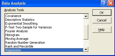
Scroll down the list of Analysis Tools
and click on "Regression"
then click on the "OK" button. |
|
 |
 |
|
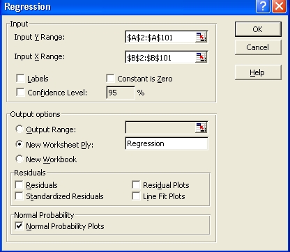
In the Regression dialog box:
Select the range where your data are stored as the
"Input Y Range".
Select the range where the junk data are stored as the
"Input X Range".
Choose a location for the tables of values,
(most of which will be irrelevant!).
In this example, a separate tab has been chosen.
Check the last box "Normal
Probability Plots" and
leave all other boxes unchecked.
then click on the "OK" button. |
At the location where the
output was chosen to be, various tables and a graph appear.
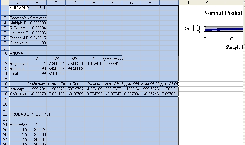
Resize the graph and move it
to another tab.
Right-click on any of the plotted points.
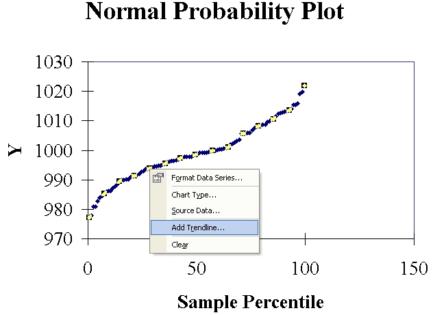
Click on "Add Trendline...".
In the new dialog box, accept the default option (linear trend) and
click on the "OK" button.
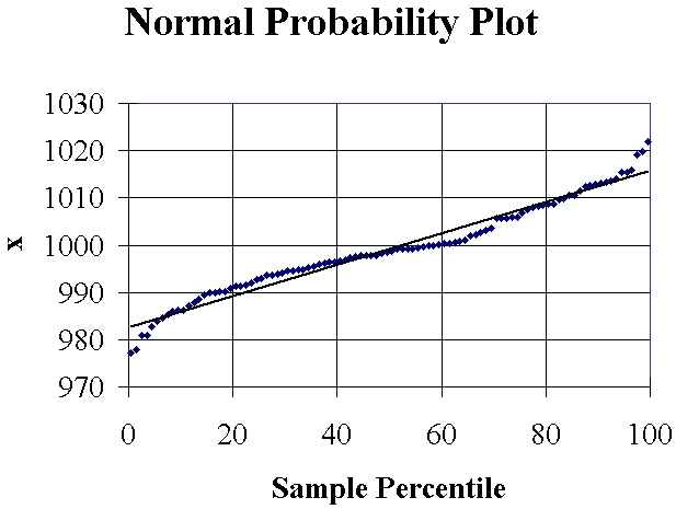
You may also wish to tidy the graph up somewhat, to produce a result
like this:
The Excel file is available here.
 [Return to the index of
demonstration files]
[To the next tutorial]
[Return to the index of
demonstration files]
[To the next tutorial]

[Return to your previous page]
Created 2003 10 19 and most recently modified 2007 07 09 by
Dr. G.H. George