All Programs > Minitab Solutions >
 Minitab 15 Statistical Software English
.
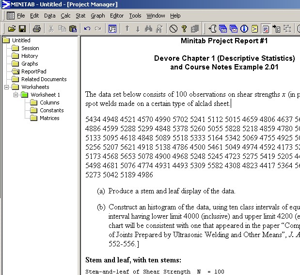
From the course text, (Devore, sixth edition), exercise question 1.24:
The data set below consists of observations on shear strengths x (in pounds) of ultrasonic spot welds made on a certain type of alclad sheet.
| 5434 | 4948 | 4521 | 4570 | 4990 | 5702 | 5241 | 5112 | 5015 | 4659 | 4806 | 4637 |
| 5670 | 4381 | 4820 | 5043 | 4886 | 4599 | 5288 | 5299 | 4848 | 5378 | 5260 | 5055 |
| 5828 | 5218 | 4859 | 4780 | 5027 | 5008 | 4609 | 4772 | 5133 | 5095 | 4618 | 4848 |
| 5089 | 5518 | 5333 | 5164 | 5342 | 5069 | 4755 | 4925 | 5001 | 4803 | 4951 | 5679 |
| 5256 | 5207 | 5621 | 4918 | 5138 | 4786 | 4500 | 5461 | 5049 | 4974 | 4592 | 4173 |
| 5296 | 4965 | 5170 | 4740 | 5173 | 4568 | 5653 | 5078 | 4900 | 4968 | 5248 | 5245 |
| 4723 | 5275 | 5419 | 5205 | 4452 | 5227 | 5555 | 5388 | 5498 | 4681 | 5076 | 4774 |
| 4931 | 4493 | 5309 | 5582 | 4308 | 4823 | 4417 | 5364 | 5640 | 5069 | 5188 | 5764 |
| 5273 | 5042 | 5189 | 4986 |
[The simplest method to import these data into Minitab is to copy and paste from this link.]
Open Minitab.
On the machines in rooms EN 3000 and 3029, click on the
"Start" button in the lower left corner, then
click on the chain of menu options
All Programs > Minitab Solutions >
Minitab 15 Statistical Software English.
In the remainder of this site, most screenshots are taken from Minitab 14, but Minitab 15 is very similar.
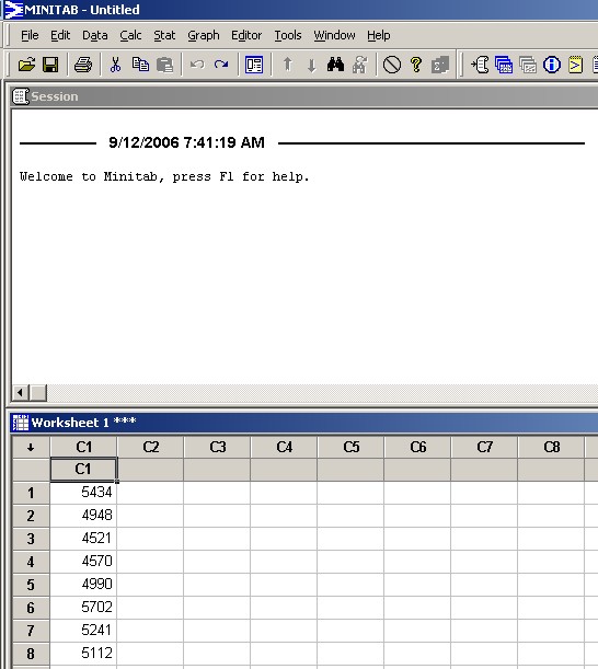
The upper window is the
Session window,
while you can scroll through your data in the lower Data window.
[The three asterisks *** beside the file name in the title bar of the Data window indicate that this is the active Data window. Of course, it is also the only Data window in your project at this time!]
Click on the grey cell just below 'C1'
in the Data window.
Paste the data in at that location, using one of the methods
click on the "paste" button on the icon bar, or
Right-click on the grey cell and select "Paste"
from the pop-up menu, or
Press Shift+Ins, or
Press Ctrl+V).
Your Minitab window should now look like this.
You can rename the column of data to something more meaningful. Click on the grey cell again and type the new name.
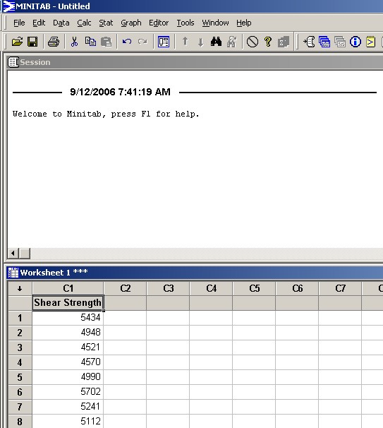
'Shear Strength' is now an alias for
'C1'.
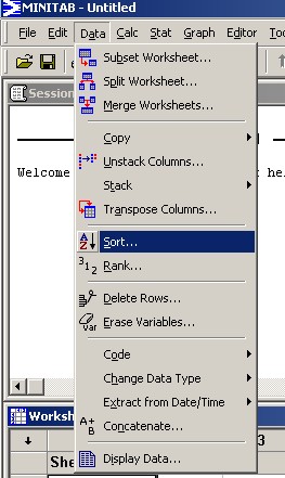
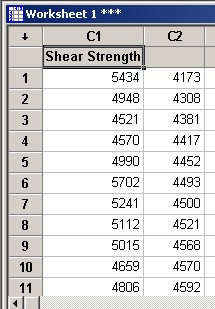
By itself, this column of raw data On the main menu bar, click on "Data". |
|
Now click on C1 in the box on the left.
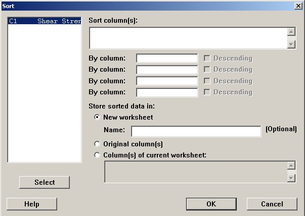
Click the "Select" button.
'C1' now appears in the top right box.
[Alternatives are to double click C1 in the left pane or to
type 'C1' manually in the top right pane.]
In the topmost of the boxes labelled "By column:",
click, then click on the C1 in the left box,
then click the "Select" button
(or just type C1 in that "By column:" box).
Leave the "Descending" box unchecked.
Click the lowest radio button (next to 'Column(s) of current
worksheet').
Click in the lowest pane and type C2.
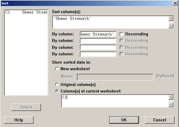
Click the "OK" button.
|
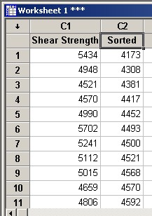
The data, sorted into ascending order, now appear in column 2, alongside the raw non-sorted data. Take a moment to scroll down through the Data window, to gain some appreciation for the data. |
If you wish, you can give more meaningful names to your new column of data. Rename a column by clicking in the grey cell just above
row 1 of that column, |
|
|
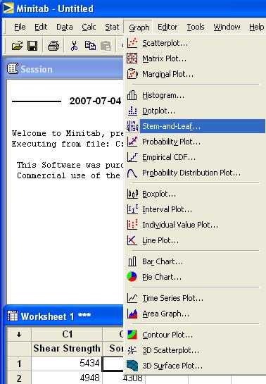
On the main menu bar, click on "Graph". |
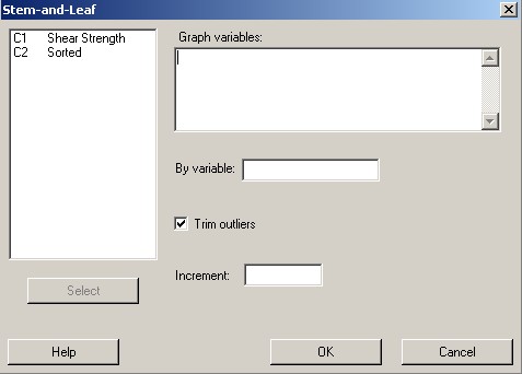
In this dialog box, |
|
|
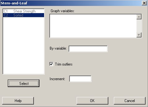
click on either variable, and click the "Select" button.
[An alternative to using the "Select" button is to double click on the variable name.] |
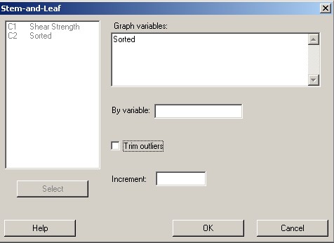
The chosen variable now appears in the top right "Graph variables" pane.
Uncheck the "Trim outliers" box. Leave the "By variable" and "Increment"
panes blank. then click "OK". |
|
|
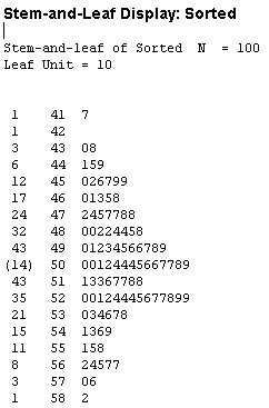
You may wish to maximize the Session window The first column is the cumulative frequency, There are 100 data. The median (halfway value) lies between Instead of a cumulative frequency in the first column,
the median class has its frequency displayed, in
parentheses, in the first column: " |
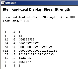
The second column is the stem.
The "Leaf Unit = 10" means that
the stem starts from the next decimal place, (the hundreds).
Thus the first stem, "41", is 4100.
The final column is the leaf.
Each digit denotes a value in that interval.
The first row (1 41 7) tells us that
a single value lies in the 4170’s (it is 4173)
and no other values lie in the 4100’s to 4190’s.
The second (1 42 ) row tells us that
no values at all lie in the 4200’s to 4290’s.
The third (3 43 08) row tells us that
one value lies in the 4300’s and
one value lies in the 4380’s, but
no other values lie in the 4300’s to 4390’s.
And so on.
Note that whenever the median value falls entirely inside one of the classes, then, instead of a cumulative frequency, the frequency is displayed in brackets next to that stem.
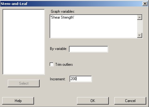
We can also force the stem and leaf diagram to show a different
number of stems. With 100 data, a more reasonable choice for
the number of stems is ![]()
Repeat the same steps as before:
In the "Increment" box, type The "Trim outliers" box should remain unchecked. then click "OK". |
|
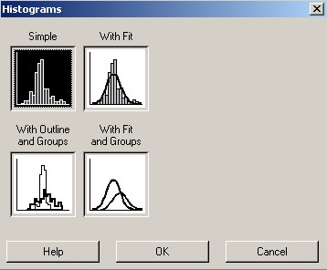
On the main menu bar, click on "Graph". Then click on "Histogram...". |
|
|
This dialog box appears. Accept the default ("Simple") and click the "OK" button. |
This dialog box appears.
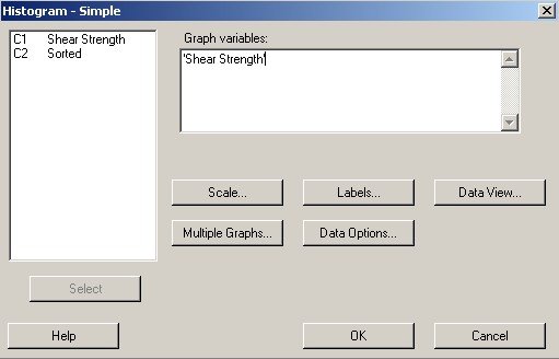
Click on either variable, (it doesn’t matter which one;
I chose "Shear Strength"),
and click the "Select" button.
Then click on the "Labels..." button.
On the "Titles/Footnotes" tab of the new dialog box, enter a suitable title for your histogram.
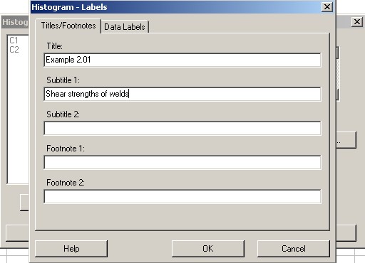
then click "OK".
Back on the "Histogram - Simple" dialog box, click on
the "Scale..." button.
A new dialog box appears.
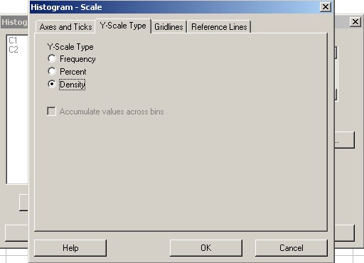
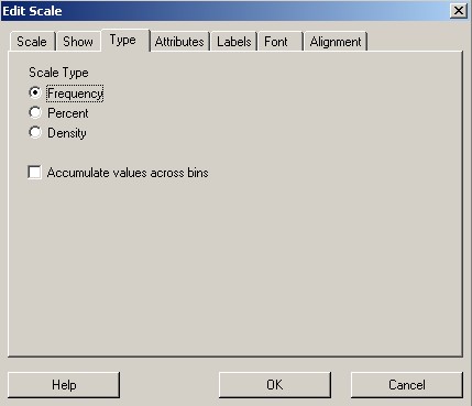
Select the "Y-Scale Type" tab and click on the third
radio button "Density".
This changes the vertical scale from frequency (appropriate for
bar charts of discrete data) to density (appropriate for
true histograms of continuous data).
The area of each histogram bar equals the relative frequency of
the interval covered by that bar.
The total area of any such histogram is 1.
Click on the "OK" buttons for both this dialog box and the previous "Histogram - Simple" dialog box.
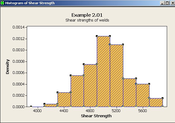
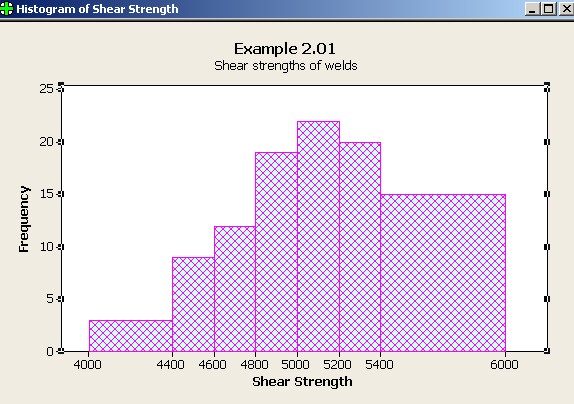
This histogram appears.
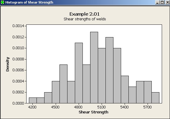
However, there are
too many classes (17) for only 100 observations.
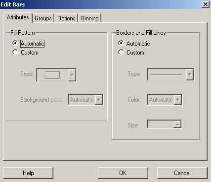
Double-click on any of the bars in the graph in order to edit it.
A new dialog box pops up.
Click on the "Attributes" tab. In this tab we can alter the visual appearance of the
display. |
|
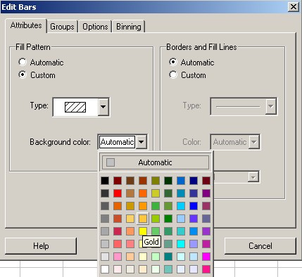
You can also change the colour of the bars. If you wish, you can also change the colour of the borders and hatch-lines of the bars. |
|
|
In the "Binning" tab of the "Edit Bars" dialog box, in the second group, click on the middle button "Number of intervals" click in the text box alongside This changes the number of classes. |
Click "OK" and the graph changes accordingly.
Minitab also allows you to create a report that can be
exported as an rtf (rich text format)
file.
Click this button ![]() near the right end of the top button bar to switch to a view of
the report pad.
near the right end of the top button bar to switch to a view of
the report pad.
You can type whatever you wish on this pad.
You can also copy and paste various graphs and text directly into the
report pad.
If you haven’t done so yet, you should save your work!
The save button will prompt you to give this Minitab project a name under which it is to be saved.
If you lose track of a window,
then you can find it again from the Window menu.
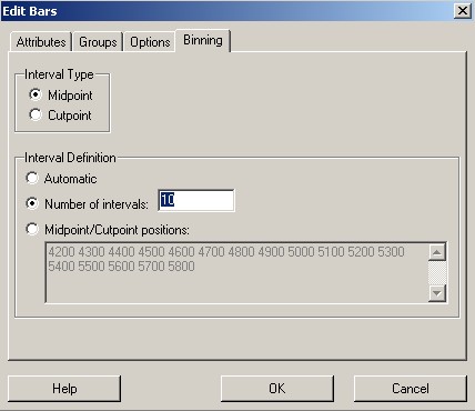
One can manually force bins (the class intervals) of a histogram.
Retrieve your previous histogram and double click away from the axes.
On the "Edit Bars" dialog box, select the "Binning"
tab.
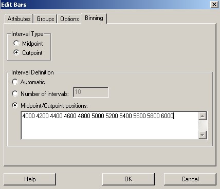
First change the Interval Definition from "Number of
Intervals" to "Midpoint/Cutpoint positions";
select all the values in the "Midpoint /
Cutpoint" pane and copy them onto the clipboard,
(using any of CTRL INS, CTRL C
or right click on the selection and choose Copy from
the pop-up menu);
change the Interval Type from "Midpoint" to
"Cutpoint" and
paste the desired class boundaries into the now-empty pane,
(using any of SHIFT INS, CTRL V or
right click on the pane and choose Paste from
the pop-up menu), which is a time-saving alternative to a manual
typing of the desired class boundaries into the pane, in increasing
order, separated by single spaces.
Click "OK" to see the change in the histogram.
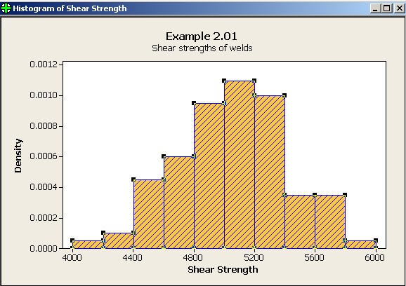
The class boundaries are now where the problem specification
required them to be.
The ordinate is frequency density
(number of observations per pound-force).
The area of each bar = the relative frequency in that class.
For example, the second bar, for the interval [4200, 4400), has
a width of 200 lb,
a height of 0.0001 /lb and therefore
an area of 200 × 0.0001 = 0.02 (a dimensionless number).
2% of all observations do, indeed, fall in the interval [4200, 4400).
The sum of the areas of all bars is 1 (100% of all data).
Discrete data (such as counts of numbers of time an event occurs, or the number of children in a family) can be represented by bar charts. Data which are, fundamentally, continuous, (such as measurements of height, weight, temperature and time), cannot be represented perfectly by a bar chart. No two values of a continuous variable will ever be identical down to the last true decimal place (although their rounded reported values may be). Measurements therefore have to be grouped into intervals, as has been done in this example.
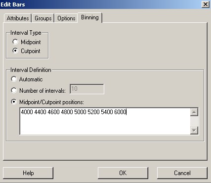
One can also impose unequal class widths (which is often done when few observations would otherwise fall in a class).
Return to the
"Edit Bars" dialog box,
select the "Binning" tab and
enter an unequally spaced set of cutpoints.
When two bars merge, their total area equals the area of the new wider bar, so that the height of the new wider bar is the average of the heights of its two constituent bars.
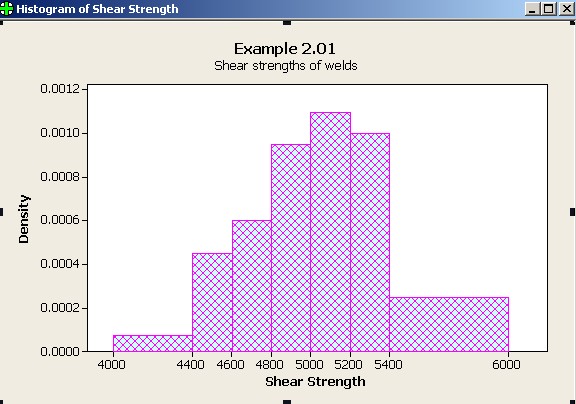
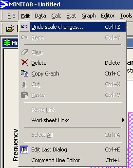
If the frequency were represented by the height of a bar instead of the area, then the result can be very misleading in the case of unequal class widths. In order to illustrate this point, let us return the vertical scale from density back to frequency.
On the histogram, double click on any of the
numbers on the vertical axis. |
|
The resulting bar chart suggests greater numbers in the tails than are actually there. This bar chart is clearly misleading.
If you wish to undo this last change, From the top menu click on "Edit" then
"Undo scale changes"; or |
|
Amend your Report Pad if you wish, then
Save your work and exit.