As a reminder, these data are observations on shear
strengths x (in pounds) of ultrasonic spot welds
made on a certain type of alclad sheet.
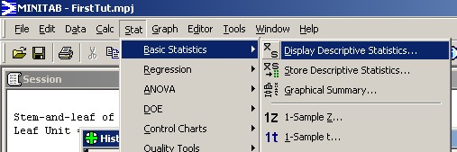
On the main menu bar, click on "Stat".
Then move the mouse cursor over "Basic Statistics".
Then click on "Display Descriptive Statistics...".
|
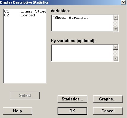
A new window appears. Double click on "C1" in the left box. Leave the other text box blank. Then click on the button "Graphs...". |
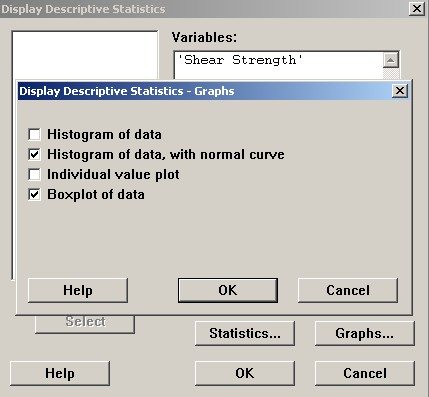
The human eye is generally quite good at picking patterns out from data when the data are displayed in a graphical format. Here we will demonstrate two of the four graphs available from the dialog box "Display Descriptive Statistics - Graphs". Check the two boxes shown, then click the "OK..." button. |
|
Back in the "Display Descriptive Statistics" dialog box, click on the "Statistics..." button.
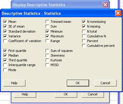
Here we can customize the summary statistics that will appear.
For example, check the box for "Variance" in order to
add it to the list of displayed summary statistics.
Click "OK..." on this dialog box and on the main
"Display Descriptive Statistics" dialog box.
Two new windows appear.
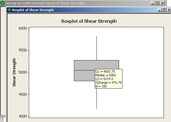
We can see at a glance that this data set is not quite symmetric, with a noticeable negative skew.
However, there are no outliers. That is, none of the data are further away from the median than one and a half interquartile ranges beyond either quartile.
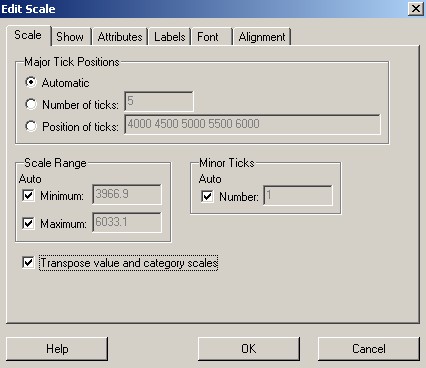
To re-orient the boxplot horizontally, double click on any number on the vertical axis.
|
On the new "Edit Scale" dialog box If the "Scale" tab is not on top, Check the lowest box, "Transpose value and category scales". Click the "OK..." button. |
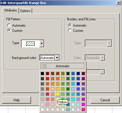
One may also change the visual features of the boxplot.
Double click anywhere on the box to activate the "Edit
Interquartile Range Box" dialog box
Ensure that the "Attributes" tab is on top. As for the histogram, adjust the colours and hatching as you see fit Then click on "OK". |
|
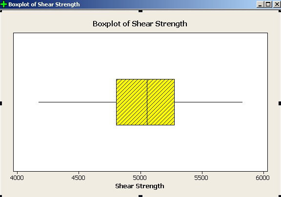
The boxplot is modified according to your choices.
Click on the other new window.
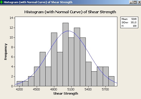
This displays an “histogram” of the data, using Minitab’s default settings. Superimposed is the graph of the normal distribution that has the same mean and standard deviation as the data.
The human eye can see that it is not unreasonable to suggest that our data may have been drawn from a normal population.
Now click anywhere on the "Session" window.
A summary of the data has appeared at the end of this window.
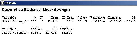
By default, Minitab displays the descriptive statistics seen here:
N : |
number of data |
|---|---|
N* : |
number of missing values |
Mean : |
arithmetic mean |
SE Mean : |
standard error of the mean (later in this course) |
StDev : |
sample standard deviation |
Minimum : |
smallest data value |
Q1 : | lower quartile (below which 25% of all values lie) |
Median : |
median |
Q3 : | upper quartile (above which 25% of all values lie) |
Maximum : |
largest data value |
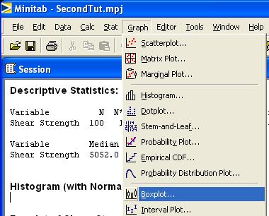
Now let us create another boxplot On the main menu bar, click on "Graph". |
|
|
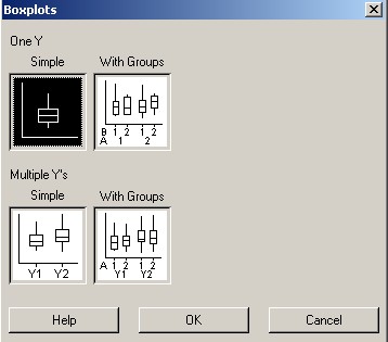
Accept the default Just click the "OK..." button. |
Either
double click on one of the variable names
or
single click on it then click on the
"Select" button.
Either way, the chosen variable will appear
as the Graph variable in the upper right box.
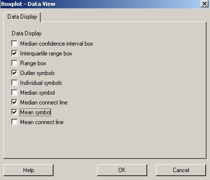
By default, Minitab
does not display the location of the mean on its boxplots.
We can force the mean to appear as follows.
Click on the "Data View..." button.
In the "Data Display" group of
boxes, "Interquartile range box", All other boxes should be unchecked. Click the "OK..." button. |
|
It is somewhat more common to see boxplots plotted horizontally. However, Minitab’s default is to plot them vertically. The following step is necessary to restore our boxplot to the more conventional horizontal alignment.
Click on the "Scale..." button. |
|
|
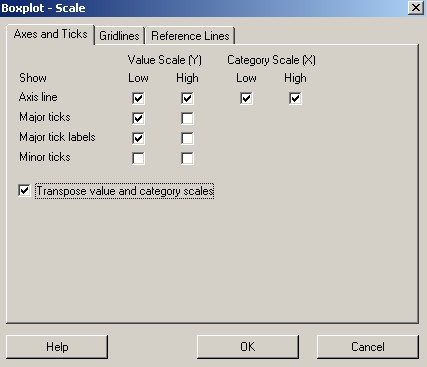
On the "Axes and Ticks" tab, Check the lowest check box, Then click the "OK..." button. |
Upon clicking the "OK..." button again, your boxplot may look like this:
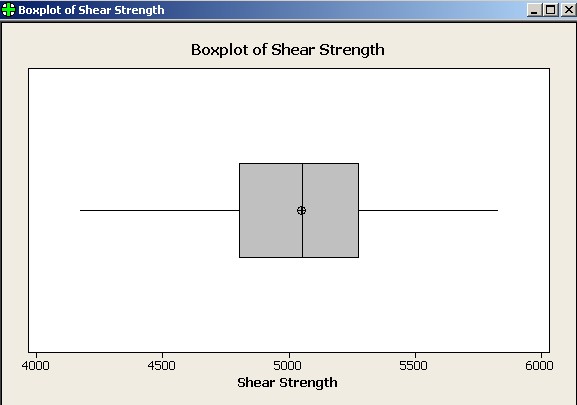
The arithmetic mean is the black circle near the median line of the boxplot. The difference between median and mean is so small at this resolution that the eye can barely detect any difference.
Amend your Report Pad if you wish, then save your work.