In this session we shall use Minitab® to
- Place data in a Minitab worksheet,
- sort the raw data into ascending order,
- produce descriptive statistics,
- export Minitab output,
- produce a bar chart,
- produce a histogram,
- produce a frequency table,
- produce a pie chart of categories and
- produce a bar chart of categories.
From the course text, (Navidi, second edition), table 1.2 p. 20:
The data set below consists of observations on particulate matter emissions x (in g/gal) for 62 vehicles driven at high altitude.
| 7.59 | 6.28 | 6.07 | 5.23 | 5.54 | 3.46 | 2.44 | 3.01 | 13.63 | 13.02 |
| 23.38 | 9.24 | 3.22 | 2.06 | 4.04 | 17.11 | 12.26 | 19.91 | 8.50 | 7.81 |
| 7.18 | 6.95 | 18.64 | 7.10 | 6.04 | 5.66 | 8.86 | 4.40 | 3.57 | 4.35 |
| 3.84 | 2.37 | 3.81 | 5.32 | 5.84 | 2.89 | 4.68 | 1.85 | 9.14 | 8.67 |
| 9.52 | 2.68 | 10.14 | 9.20 | 7.31 | 2.09 | 6.32 | 6.53 | 6.32 | 2.01 |
| 5.91 | 5.60 | 5.61 | 1.50 | 6.46 | 5.29 | 5.64 | 2.07 | 1.11 | 3.32 |
| 1.83 | 7.56 |
[The simplest method to import these data into Minitab is to copy and paste from this link.]
- Produce summary statistics of the data.
- Construct a bar chart of the data, using class intervals of equal width, with the first interval having lower limit 1.0 (inclusive) and upper limit 3.0 (exclusive).
- Modify the histogram of the data, combining the class
intervals for
[11, 15) into one class and the class intervals for[15, 25) into one class - Construct a tally chart for the following qualitative
descriptions of emissions:
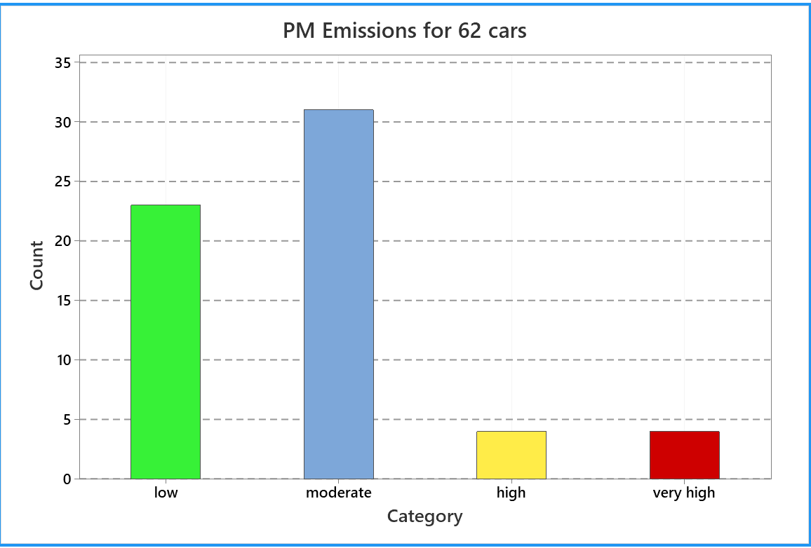
low: [0, 5);
moderate: [5, 10);
high: [10, 15);
very high: >= 15.
Open Minitab.
Double click the Minitab icon on the desktop:
![]()
OR click on the search box next to the
"Start" button in the lower left corner, then
type in Minitab.
You should find Minitab 21 Statistical Software.
After first use, there may be a quick link to Minitab 21 on your Start Menu.
The upper large window is the output pane,
while you can scroll through your data in the data pane below it.
You can resize these panes by dragging on the edge of a pane.
To the left of these panes is the navigator pane.
Across the top are the menus and toolbars.
There is an excellent introductory tutorial to Minitab, at quickstart.minitab.com/.
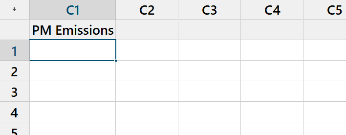
Data Entry
Click on the grey cell just below
' |
|
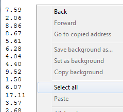 |
From the link above open the plain text file "NavidiT1-2.txt" containing the data, using a simple program such as 'Notepad'. Right click anywhere in the main window and click on 'Select All' (or click on the menu item 'Edit' and then click on 'Select All' or press 'Ctrl A'). |
|
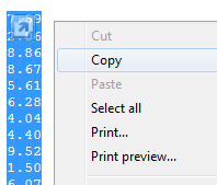
Right click anywhere in the main window and click on
'Copy' |
 |
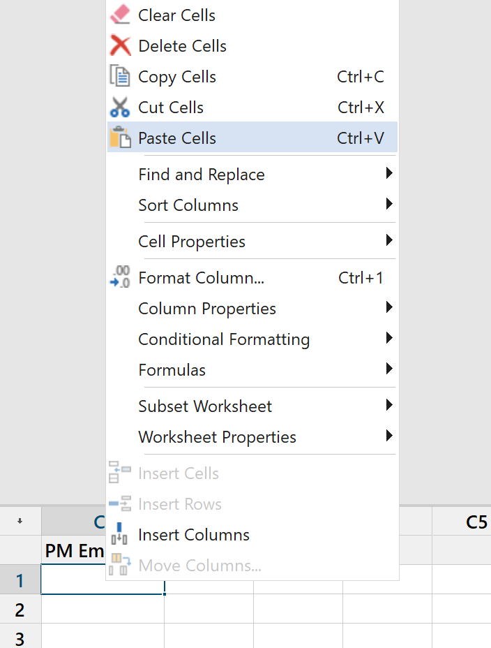 |
Back in Minitab, click on the top white cell,
just below the column label, |
|
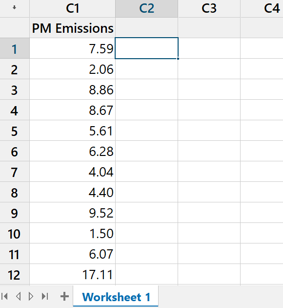
The data are now in column C1 |
 |
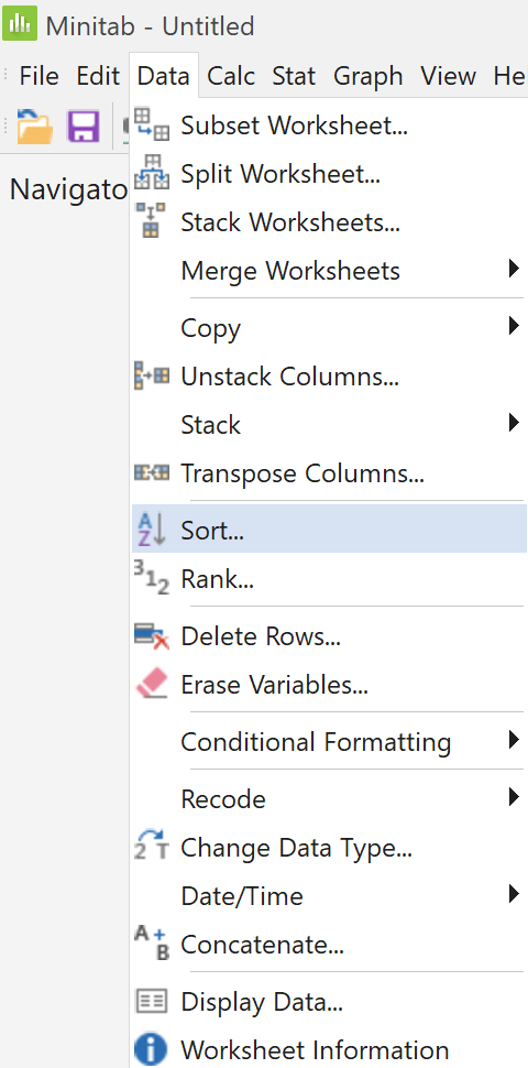
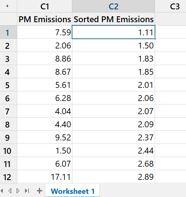
Sorting Data
 |
By itself, this column of raw data
is not very helpful One way to improve visibility is simply to rearrange these data into ascending order. On the main menu bar near the top left corner of the
Minitab window, |
|
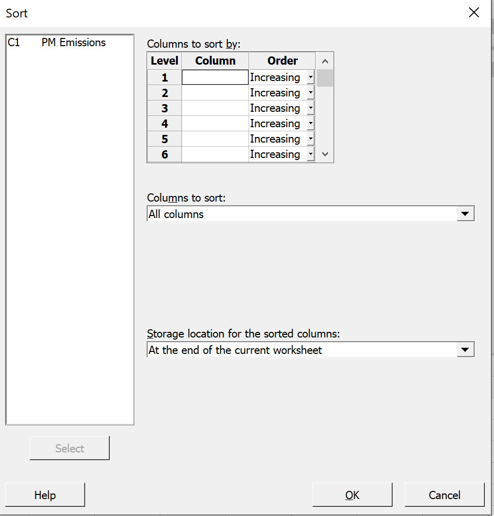
A dialog box appears. Click on ' [Alternatives are to double click ' Keep the "Increasing" item as is and Columns to Sort: All columns Click the 'OK' button at the foot of this window. |
|
|
The data, sorted into ascending order, now You can edit the alias for column 2 if you wish. Take a moment to scroll down through the |
 |
Summary Statistics
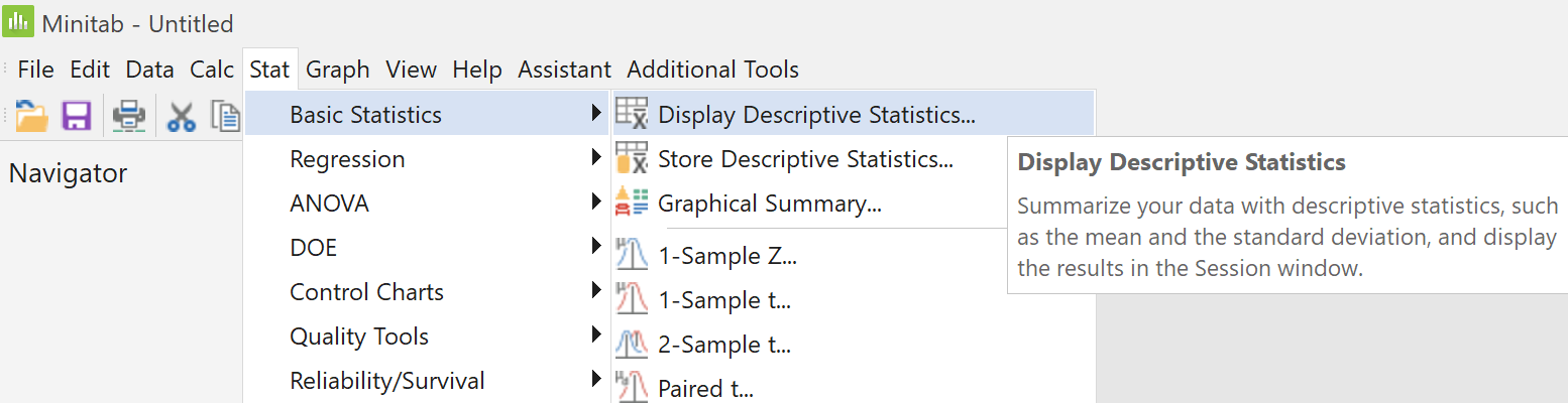
On the main menu bar near the top of the Minitab window,
click 'Stat' then,
on the successive pop-up menus, hover on
'Basic Statistics' then click on 'Display Descriptive
Statistics...'.
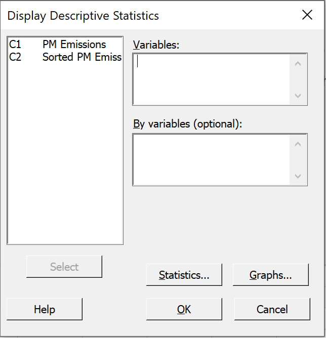 |
In the new dialog box, select column This will place Now click on the 'Statistics...' button. |
|
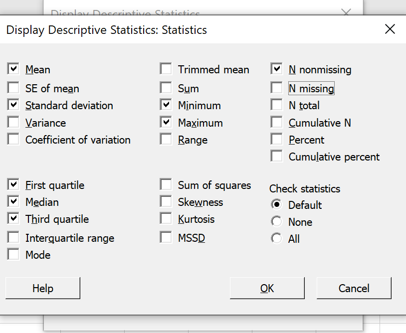
By default, the summary statistics that Minitab displays are those indicated by the checked boxes. Uncheck 'SE Mean' and 'N missing' Then click on the 'OK' button to return to the previous dialog box. |
 |
|
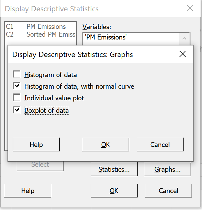
Click on the 'Graphs' button to bring this dialog box up. Check the second and fourth boxes, as shown. Then click on the 'OK' button to return to the previous dialog box. Click on the 'OK' button of the main dialog box. |
 |
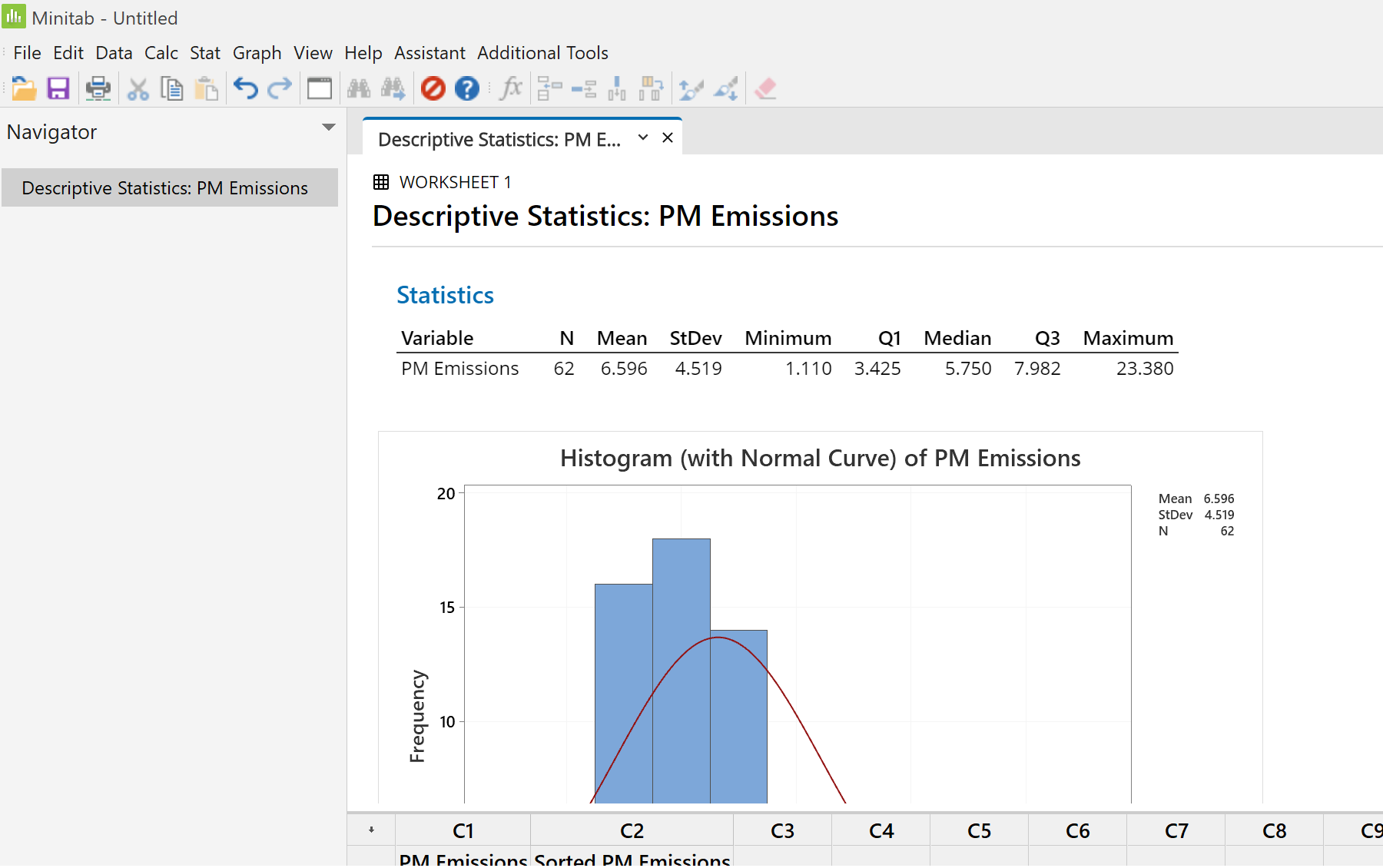
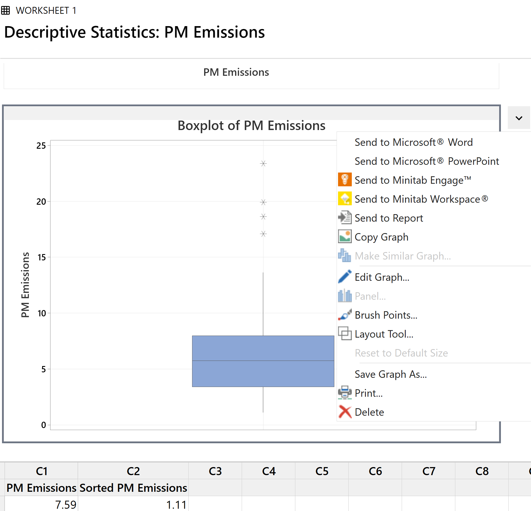
A table and two graphs appear in the output pane.
You will need to scroll down in the output pane to see the boxplot.
The summary statistics that we chose to display for the particulate matter emissions of the sample of 62 cars are now displayed.
Now click on the bar chart. Scroll down in the output pane if necessary to bring the full bar chart into view.
What Minitab calls a “histogram” is not a histogram! It is a bar chart.
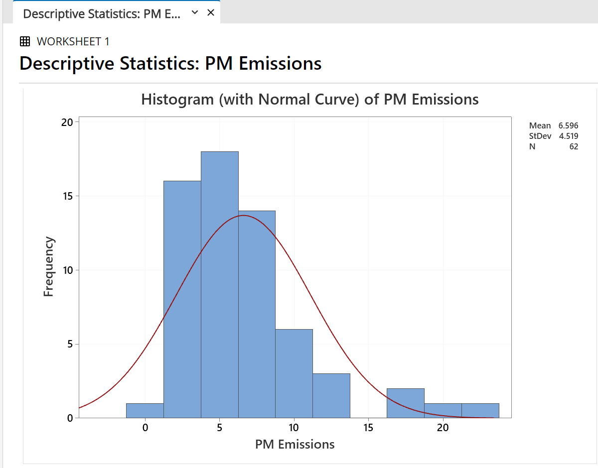
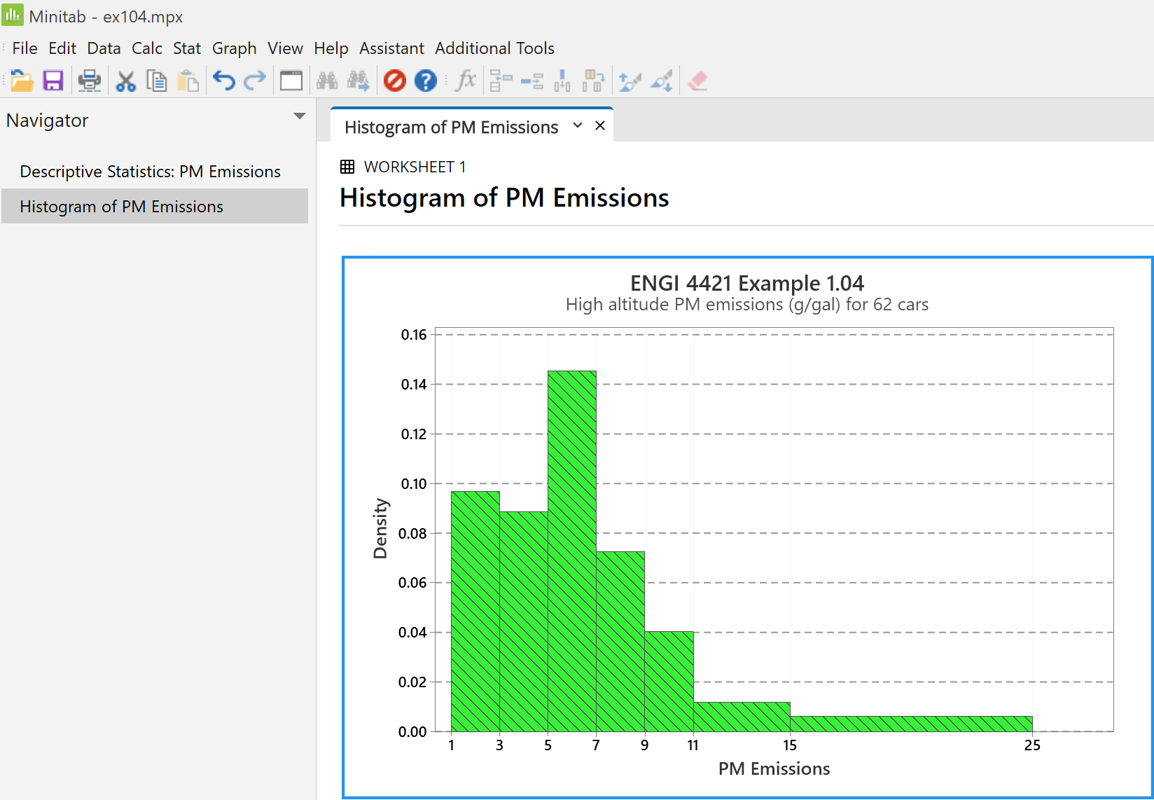
The probability curve of a normal distribution that has the same mean and variance as the data is superimposed on this diagram. Clearly our data set was not drawn from any normal distribution. A substantial portion of the area under the normal curve extends into negative values of 'PM Emissions', which are impossible.
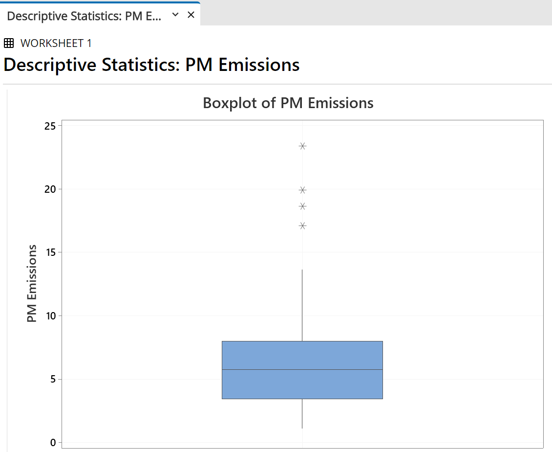 |
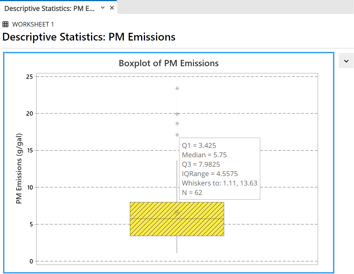
Now scroll down to the boxplot graph. The line inside the box is the median The upper and lower sides of the box are at The whiskers extend to the last observation This sample has four outliers, all off the upper
end. |
|
We can tidy this display up. The gridlines are present We would also like a different Right click anywhere in the boxplot On the pop-up menu, |
 |
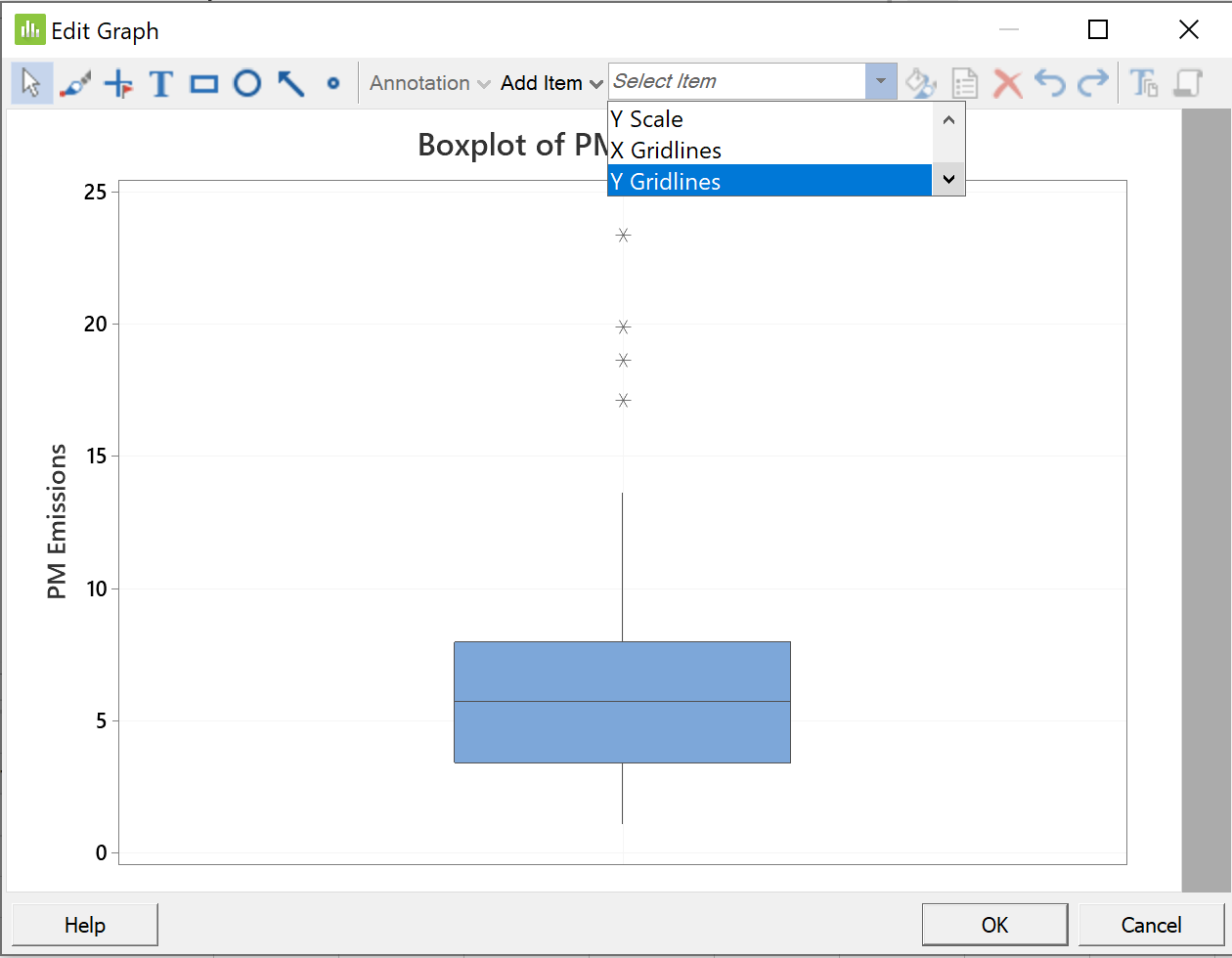 |
In the new 'Edit Graph' box, Click on the down arrow to the right of From the pull-down menu, |
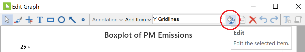 |
Now click on the 'Edit" button |
|
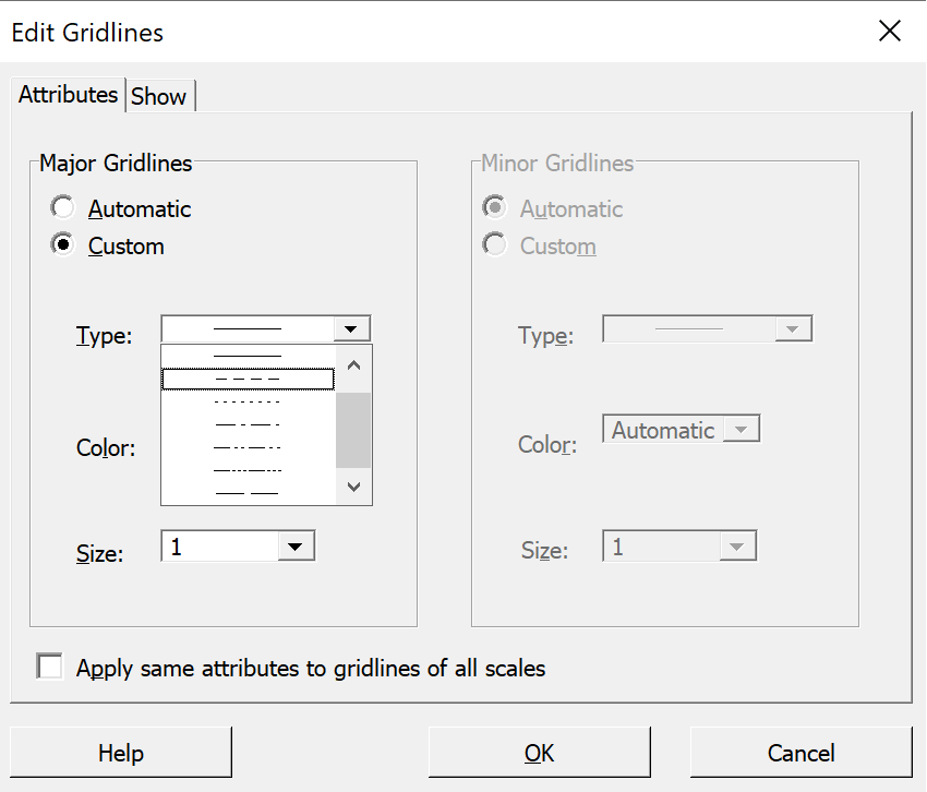
In the new 'Edit Gridlines' dialog box, Next click the right arrow beside 'Type' Click on the second option (dashed line). |
 |
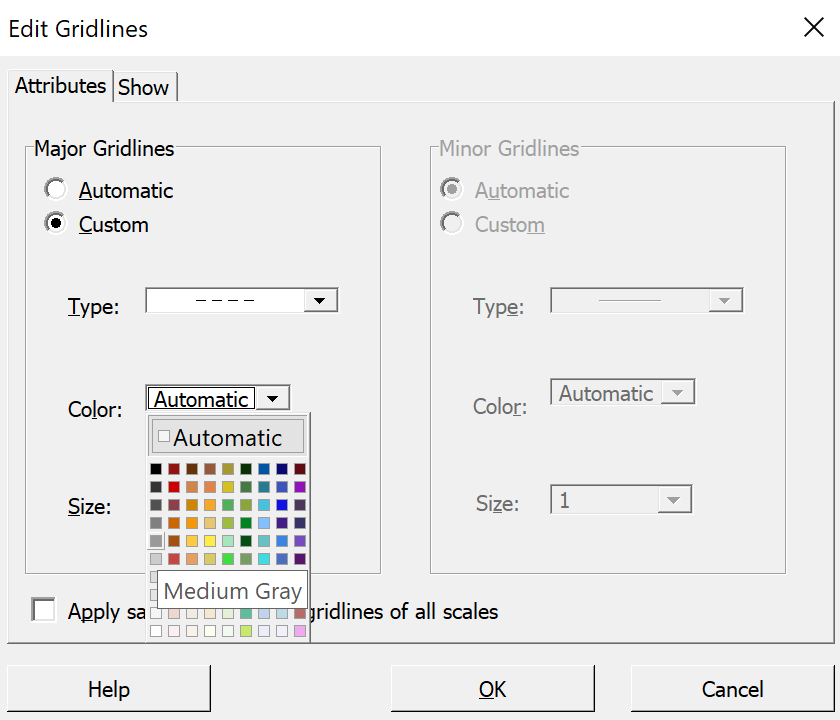 |
Next, change the colour |
|
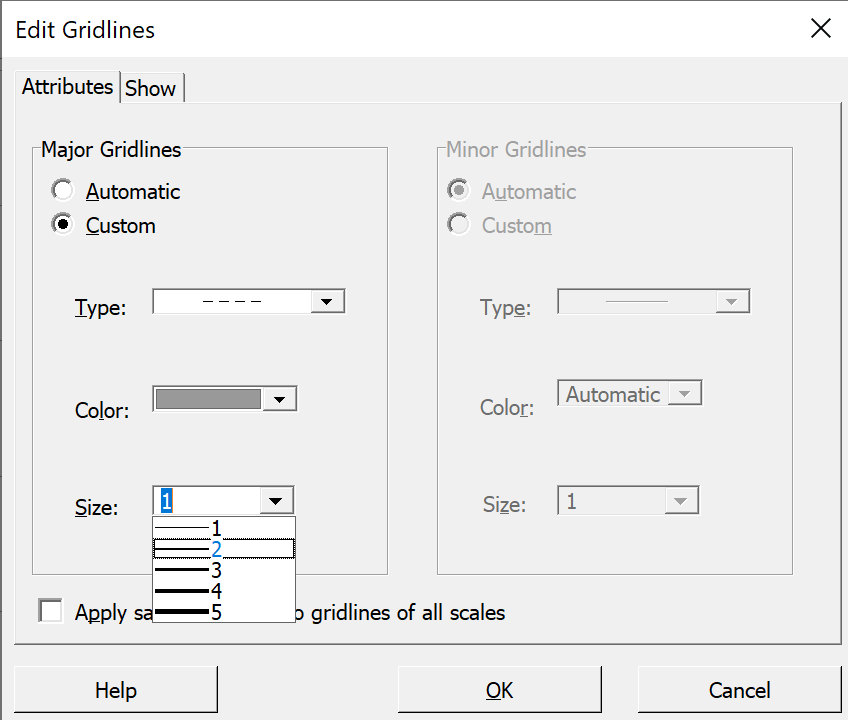
This should be sufficient, but In the 'Size' pull-down menu, then click 'OK'. |
 |
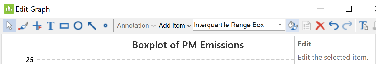 |
Back on the 'Edit Graph' window, At the top, the default edit option changes Again click on the edit button |
|
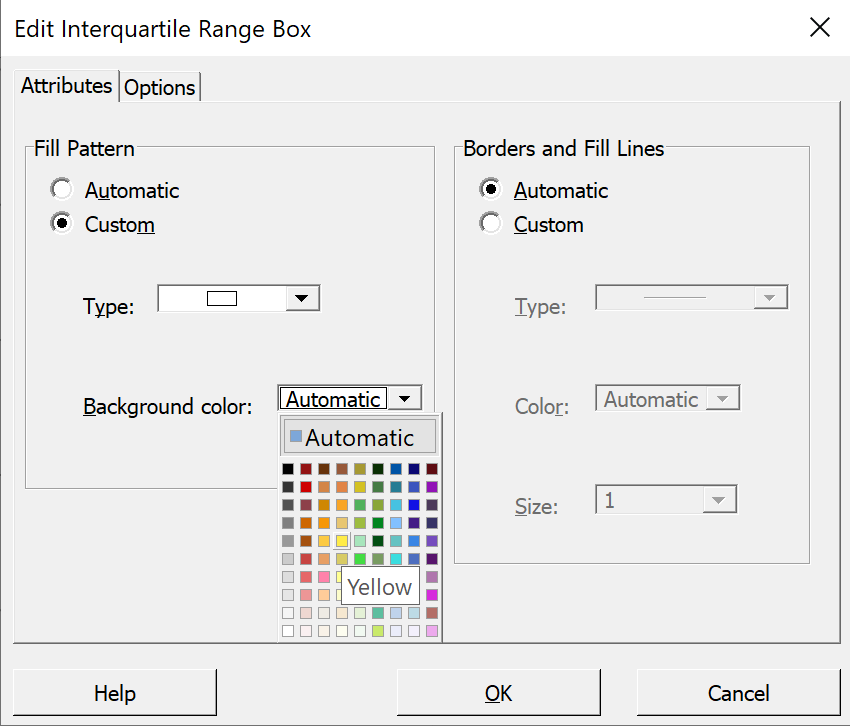
In the 'Edit Interquartile Range Box' Pull down the menu beside 'Background color:' If you wish, you can also add hatching Then click 'OK'. |
 |
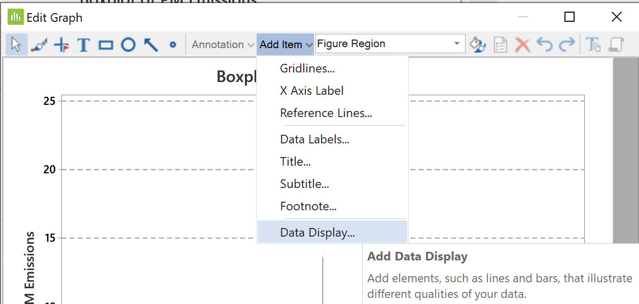 |
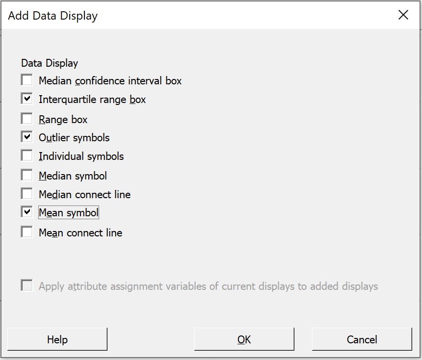
By default Minitab does not display the mean on a boxplot. In order to force the display of the mean, pull down the menu for 'Add Item' and select 'Data Display'. |
|
In the 'Add Data Display' dialog box, Click 'OK' to return to the |
 |
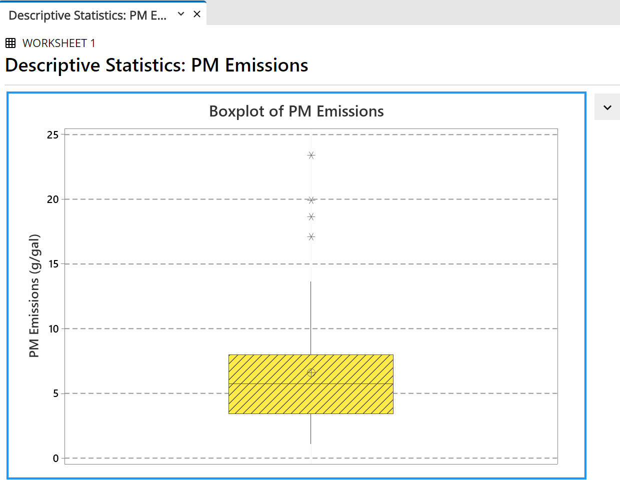 |
Back in the 'Edit Graph' dialog box, Click 'OK' to exit from the The output pane displays the |
Leave the cursor resting on any part of the box. A pop-up tool tip provides some numerical information about the boxplot. |
 |
Exporting Minitab Output
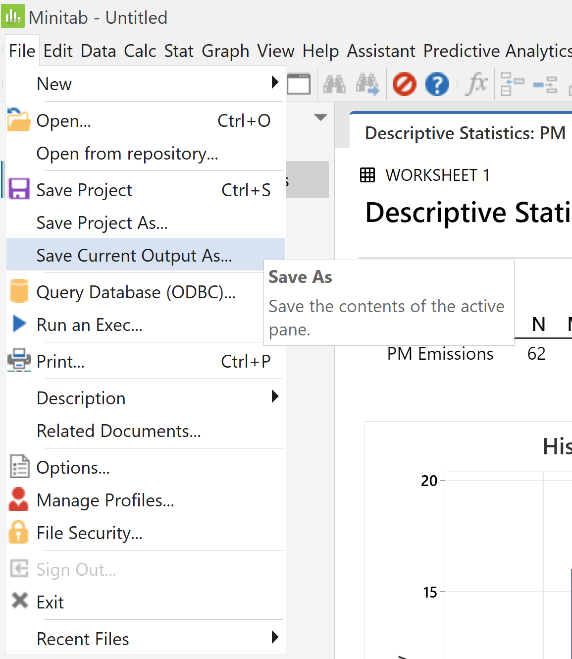 |
Previous versions of Minitab had a “report pad”
to which output could be exported to an associated
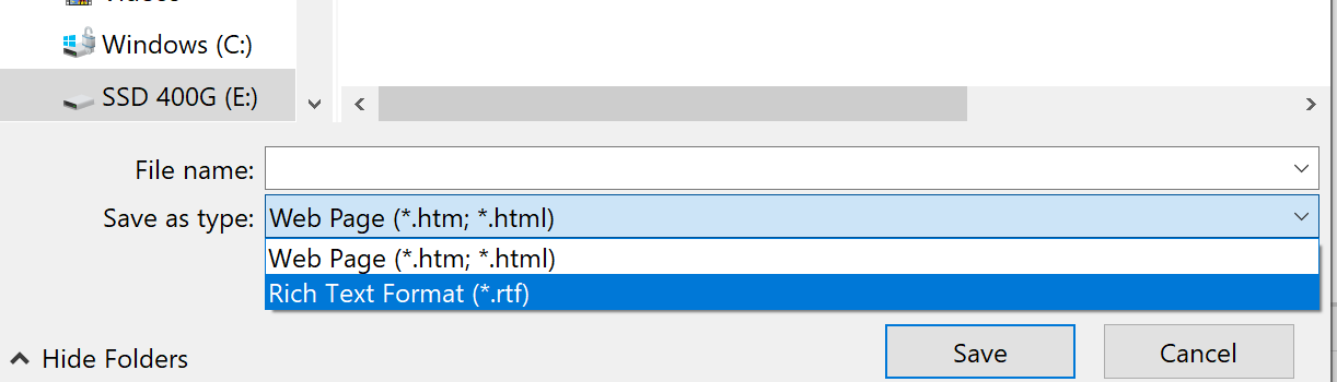
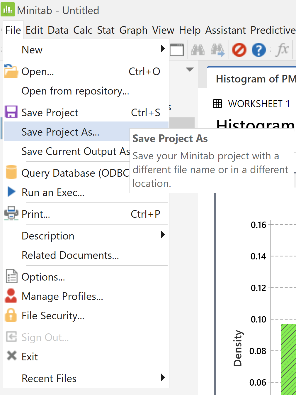
In version 21, click on the output pane to ensure that it is the active pane. From the file menu, select "Save Current Output As..." |
Near the foot of the "Save As" dialog box, You can edit your saved file in Word. In Word, save your edited file |
 |
Bar Charts
|
On the main menu bar, |
 |
 |
In the dialog box, |
|
In the new dialog box, select and click the 'Scale...' button. |
 |
 |
In the new dialog box, Click on the 'Gridline' tab, Ensure that the first box then click the 'OK' button |
|
Click the 'Labels...' button. In the new dialog box, in the first tab Click the 'OK' button. Back in the main dialog box, |
 |
The following bar chart appears in a new tab in the output pane.
As noted earlier, this is not a histogram!
These default intervals (bins) are centred on 0.0, 2.5, 5.0, ... ,
20.0 and 22.5.
The question requires intervals with boundaries at 1, 3, 5, ... ,
23 and 25.
|
Right click anywhere on the plot. In the pop-up menu, |
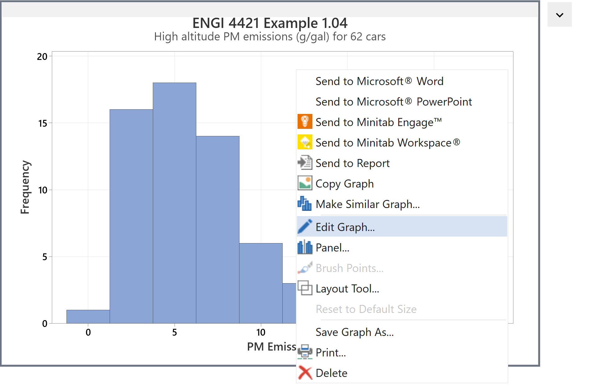 |
In the new 'Edit Graph' window, click on one of the number labels.
The text in the menu pane at the top of the window changes
to 'X Scale'.
Click on the edit button to the right of that pane (highlighted here).
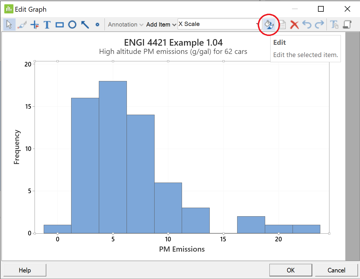
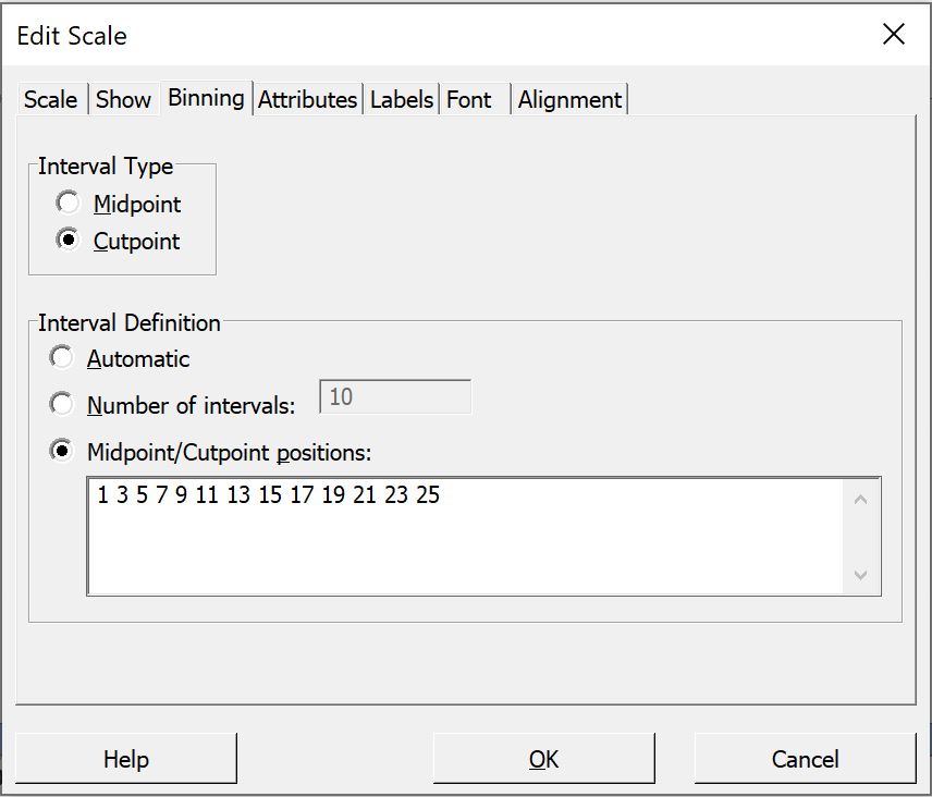 |
In the 'Edit Scale' dialog box, Click on the third tab 'Binning', In the upper group 'Interval Type' In the lower group 'Interval Definition' Click in the pane and Click the 'OK' button. |
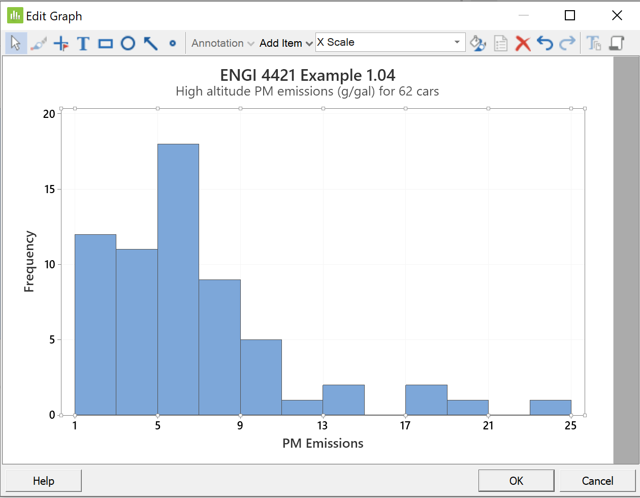
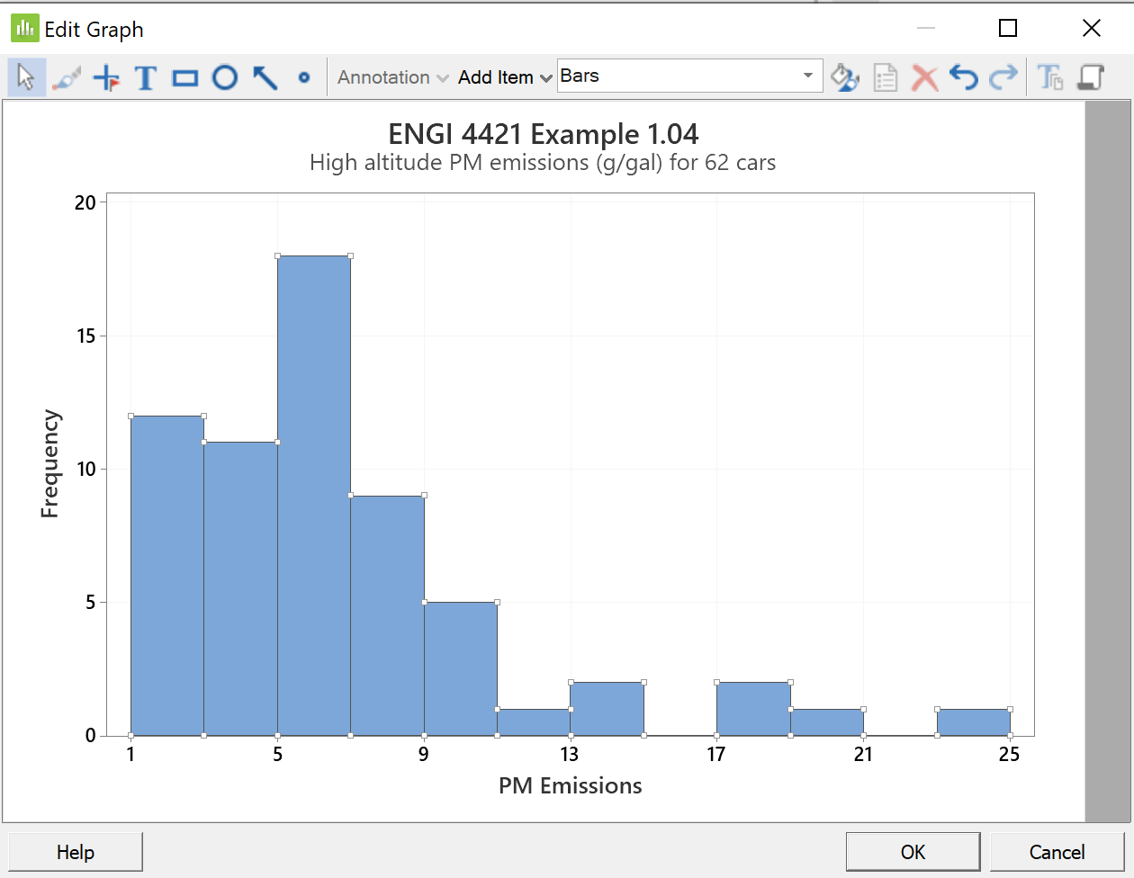
The bar chart has been modified to a more reasonable form:
 |
Now click on any bar. The menu box now shows 'Bars'. Click on the 'Edit' button. |
|
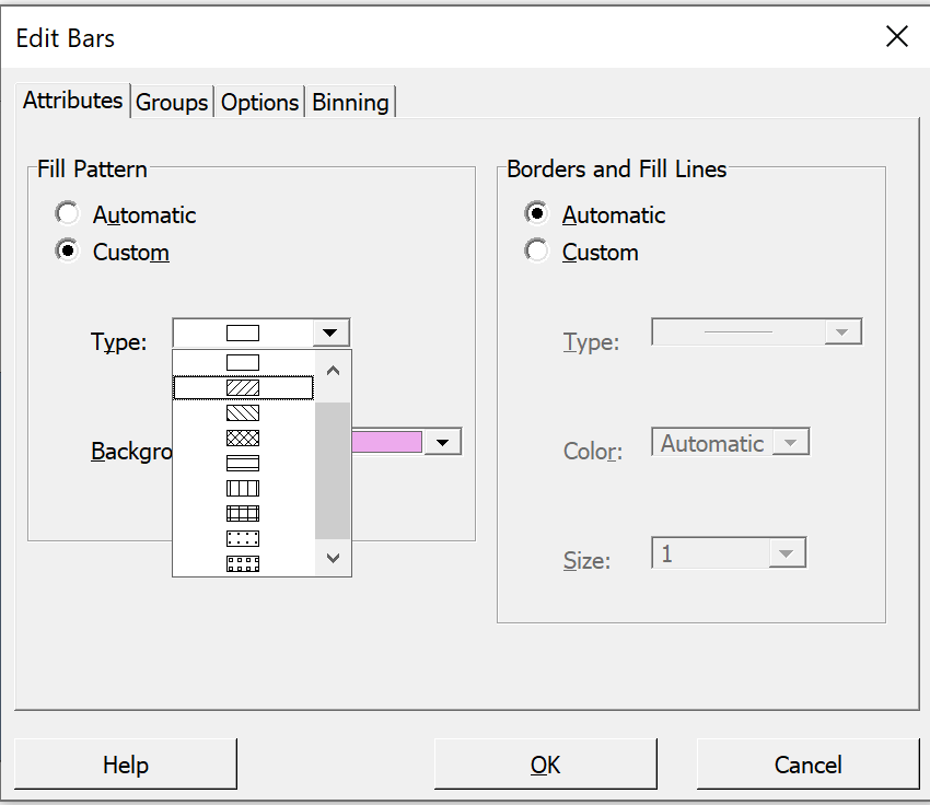
In the 'Edit Bars' dialog box, In the 'Attributes' tab, in the left group When done, click the fourth tab |
 |
Now lets us combine some low frequency bins in the long right tail together.
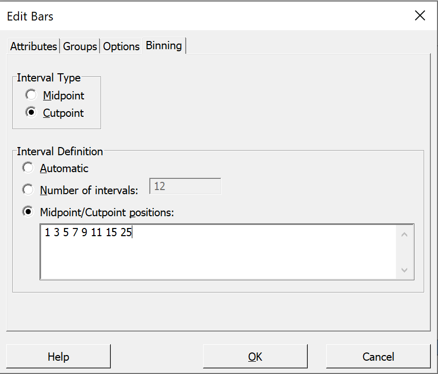 |
In the lower group In the pane delete the numbers Then click the 'OK' button. |
In this bar chart
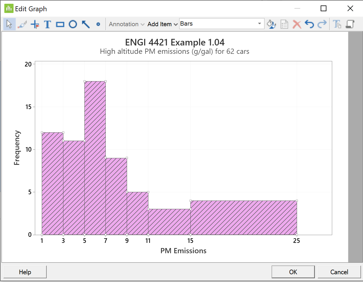
the frequencies are displayed by the heights of the bars.
This gives a very misleading impression that there are more
observations in the right tail than there really are.
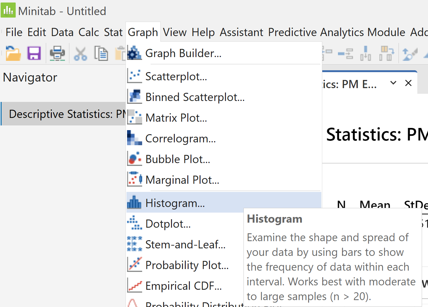
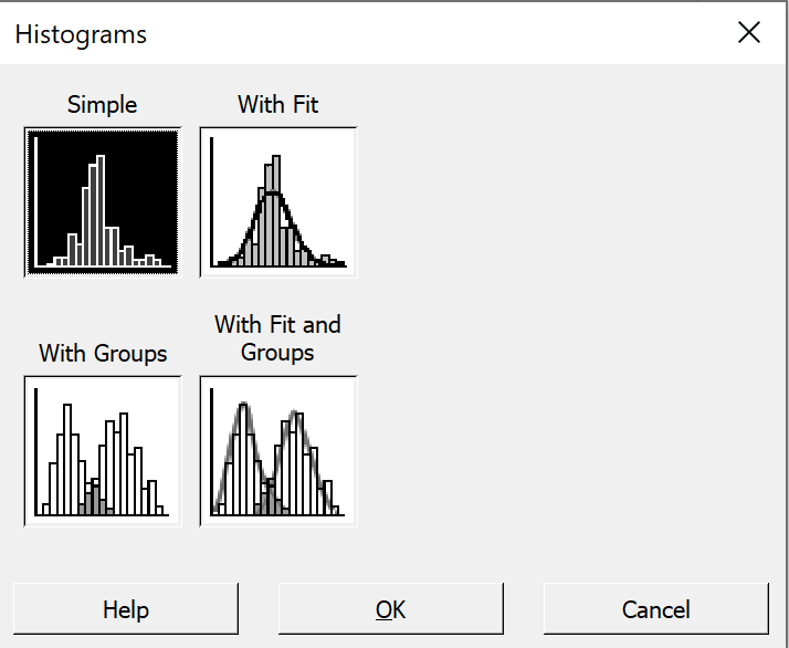
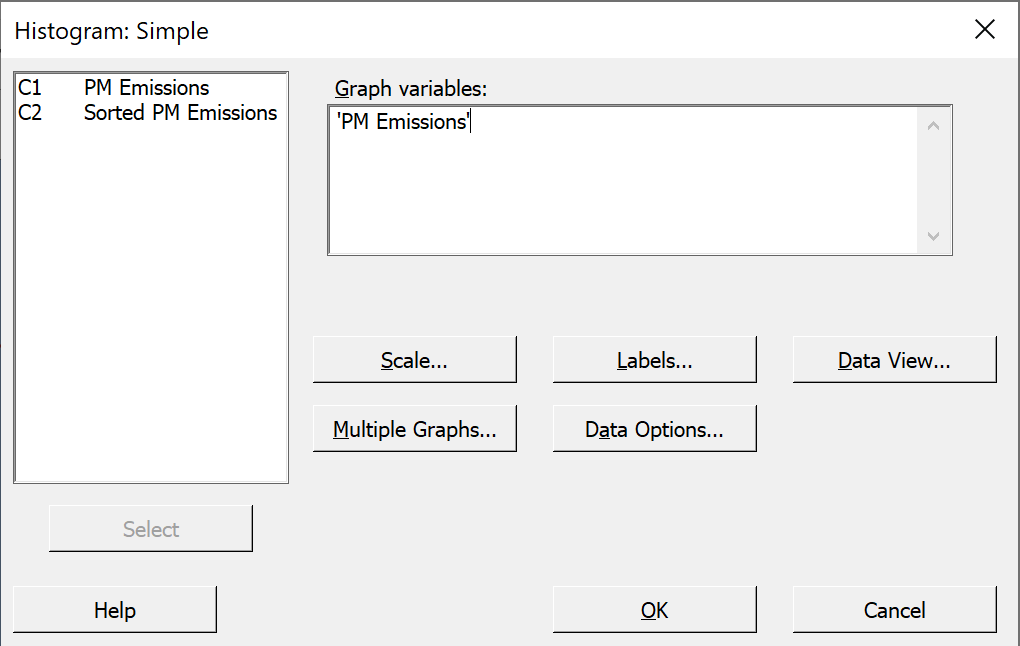
Histograms
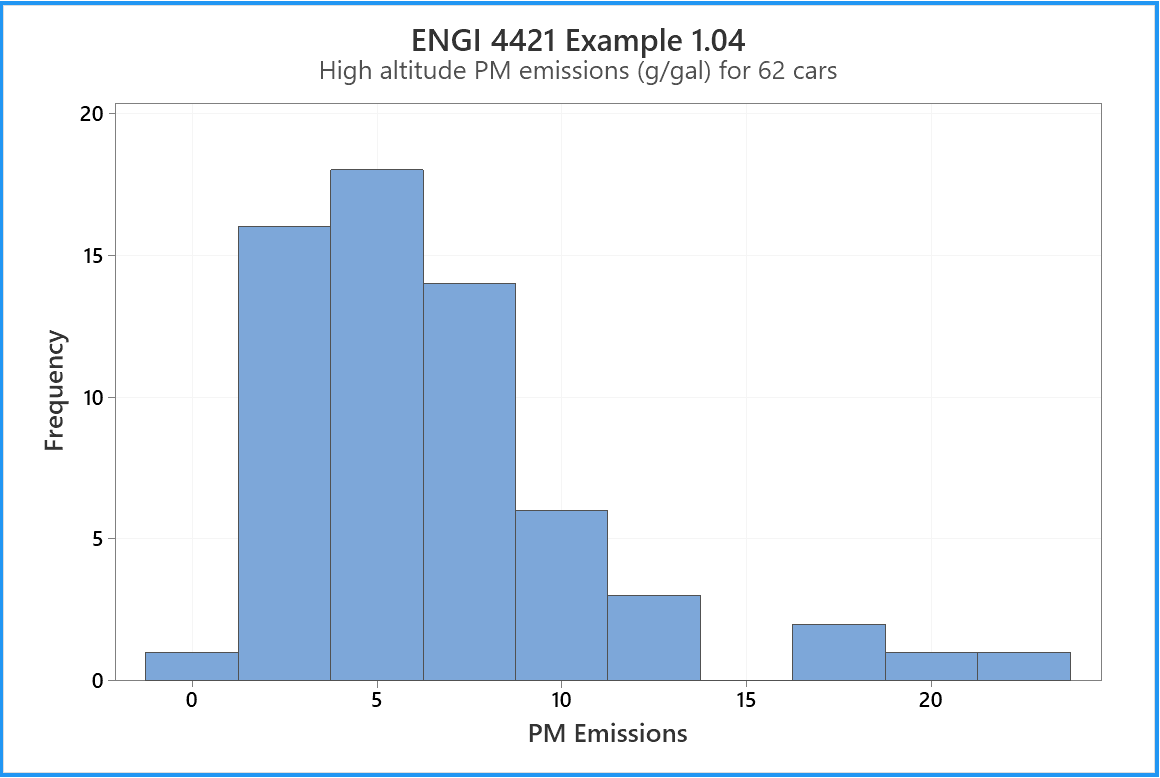
We need to replace this bar chart by a histogram, in which the frequencies are proportional to the areas of the bars, not their heights. The vertical axis needs to be changed from frequency to density.
Again we can use the 'Edit Graph' > 'Edit' feature.
There is also a nice shortcut:
In the 'Edit Graph' window, position the mouse cursor over any number
label on the vertical axis and double click.
|
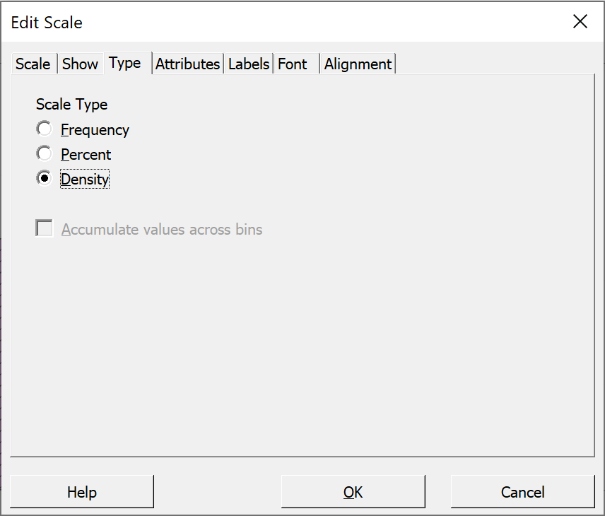
In the 'Edit Scale' dialog box, Click on the third tab 'Type', Click on the radio button 'Density', click on the 'OK' button and click on the next 'OK' button |
 |
The histogram is now correct. [I also changed the bar colour, hatching and gridlines]
As we did with the descriptive statistics, we can save this tab of the
output pane to a .rtf file for later editing in Word.
Of course, we should save our work.
 |
In the main 'File' menu, Choose an appropriate directory and file name. |
Tally (Frequency) Table
|
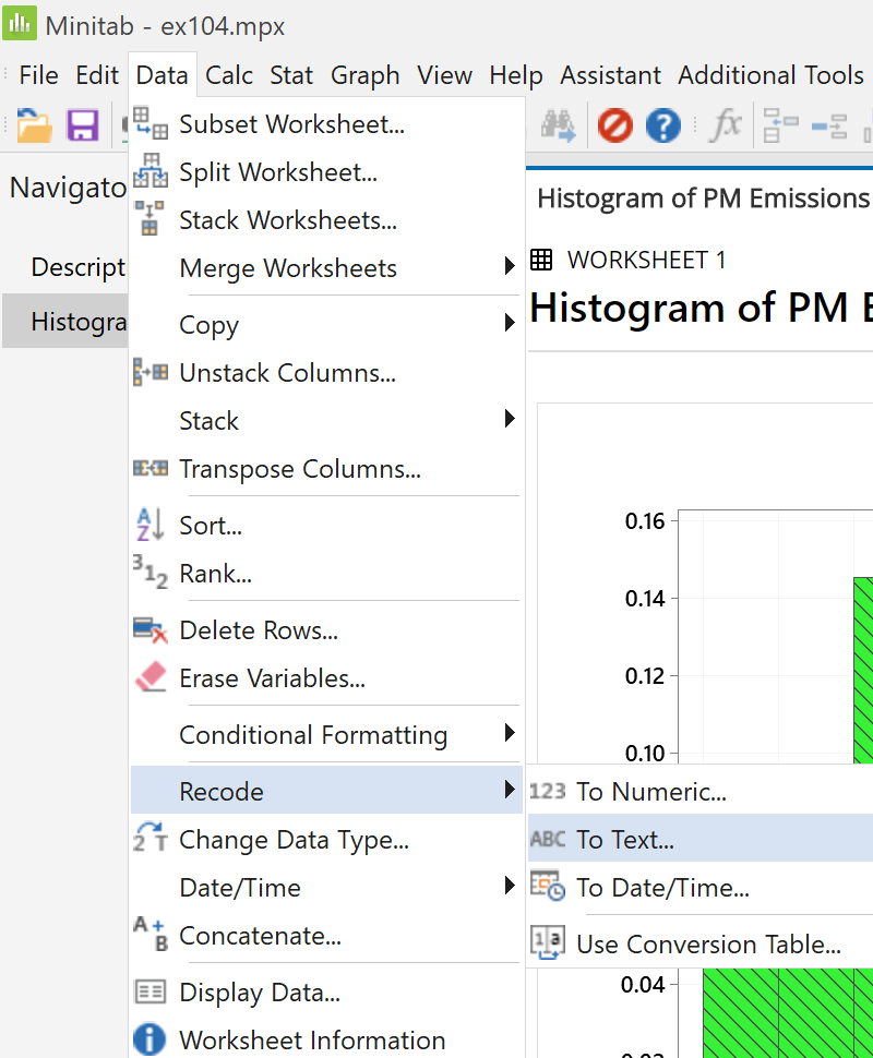
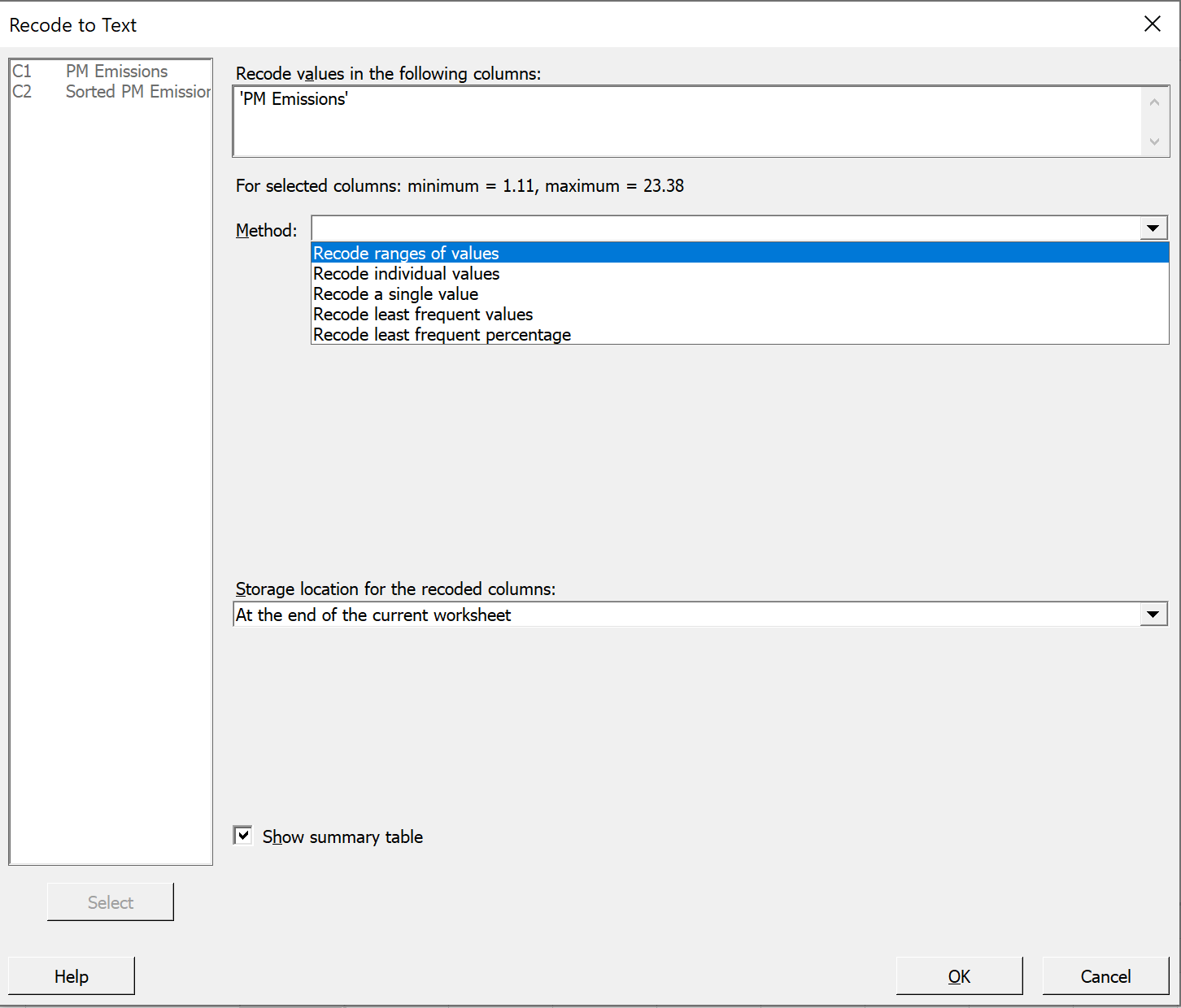
On the main menu bar near the click on 'Data', then on 'Recode', then on 'To Text...' |
 |
In the left pane, double click on 'C1 PM Emissions'
to bring it into the top right pane.
In the mid-right pane 'Method:', click on the down arrow at the right and
select 'Recode ranges of values' from the drop down menu.
This opens a new table. Enter the values and labels as shown.
The tab key can be used to move from cell to cell during this data entry.
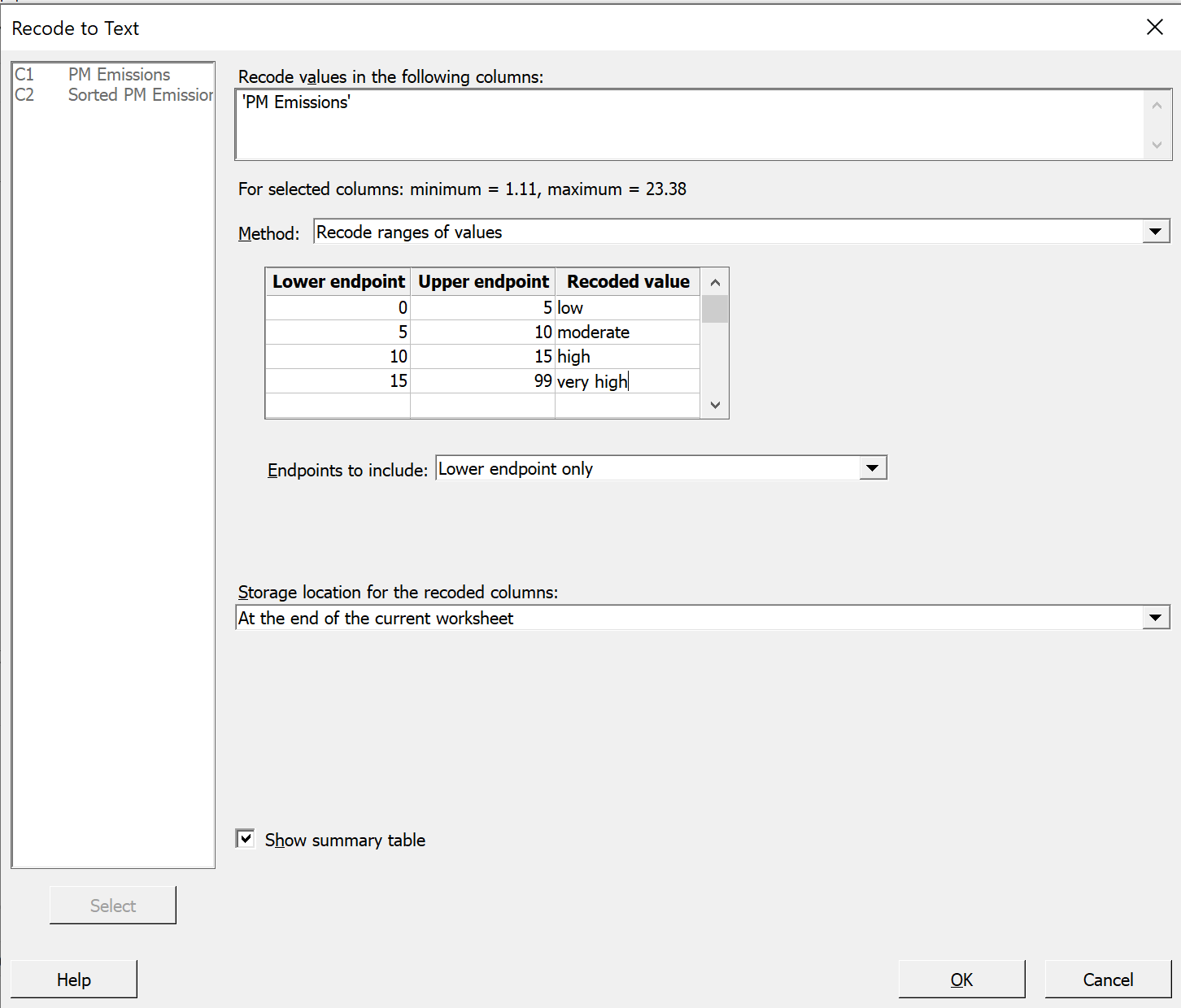
Endpoints cannot be left blank. Choose boundaries that encompass all
the data.
Accept the other defaults for 'Endpoints to include',
'Storage location ...' and 'Show summary table'.
Click 'OK'
|
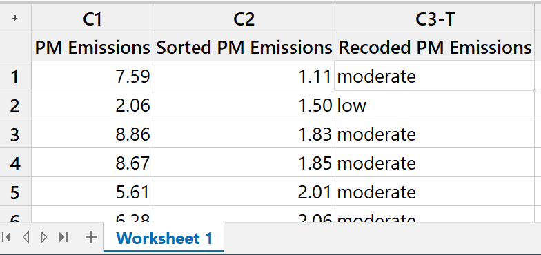
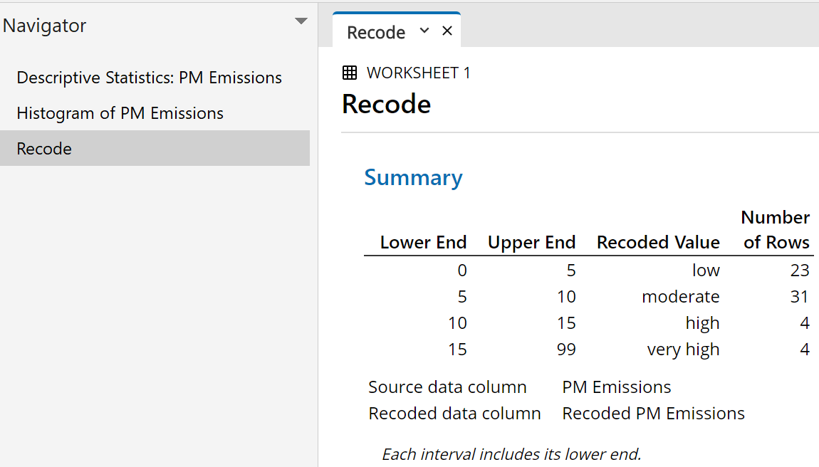
The first few rows of the data pane |
 |
|
while the output pane should now This provides a simple |
 |
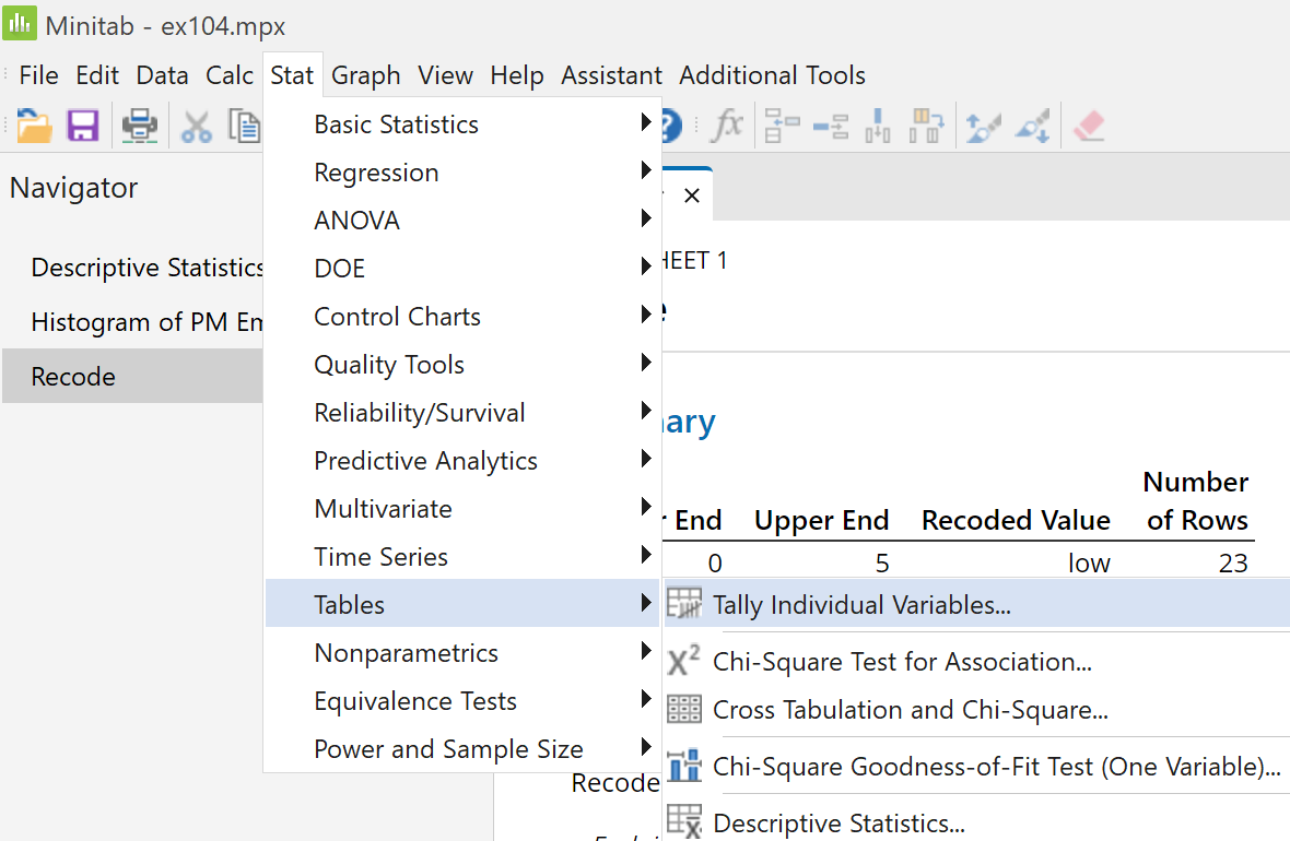
On the main menu bar near the top left corner of the
Minitab window,
click on 'Stat', then on 'Tables', then on 'Tally Individual
Variables...'
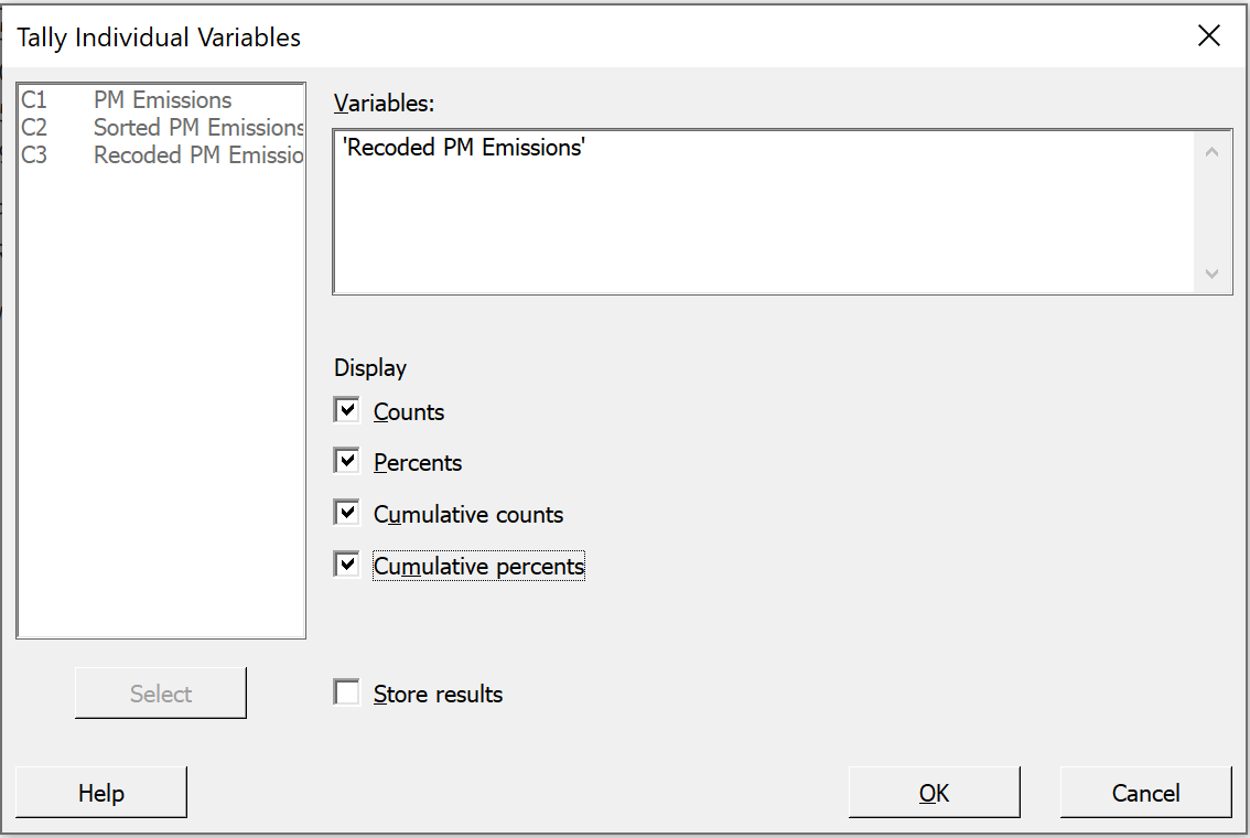
|
In the resulting dialog box, double click on check all four boxes and click 'OK'. |
 |
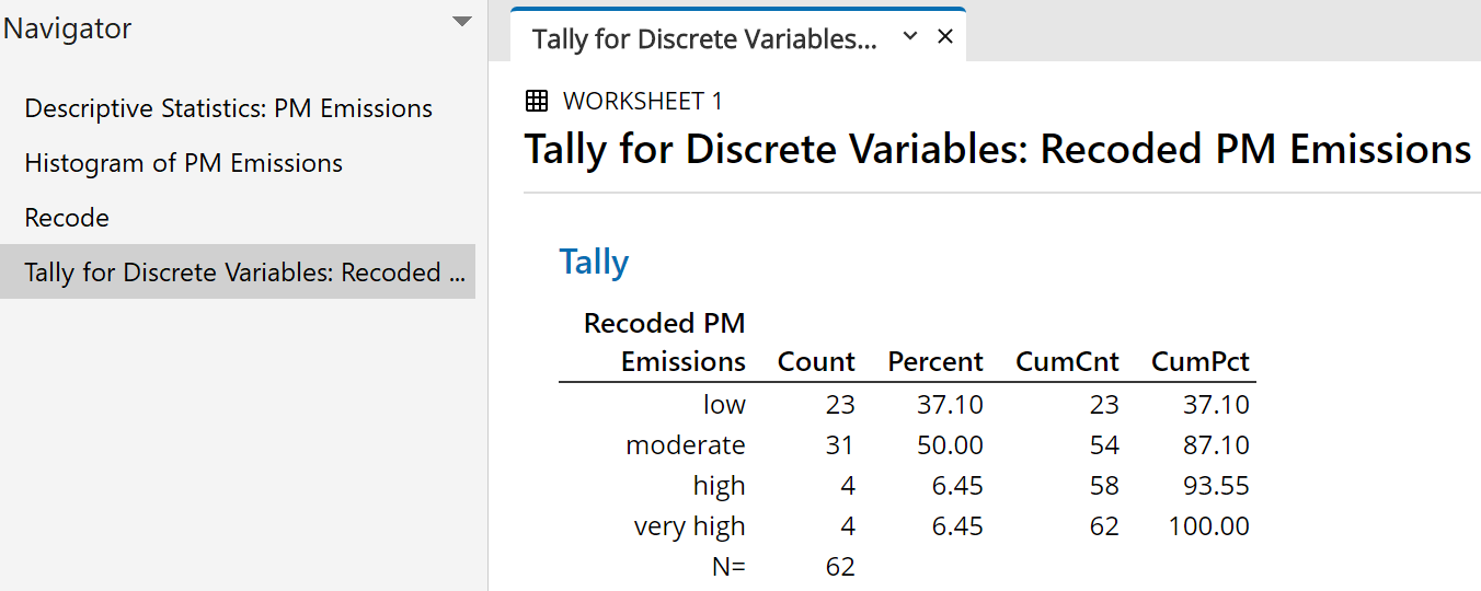
An extended tally table appears as a new tab in the output pane.
Unlike the case in many earlier versions of Minitab, the levels are listed in the correct numeric order.
 |
' ' ' ' |
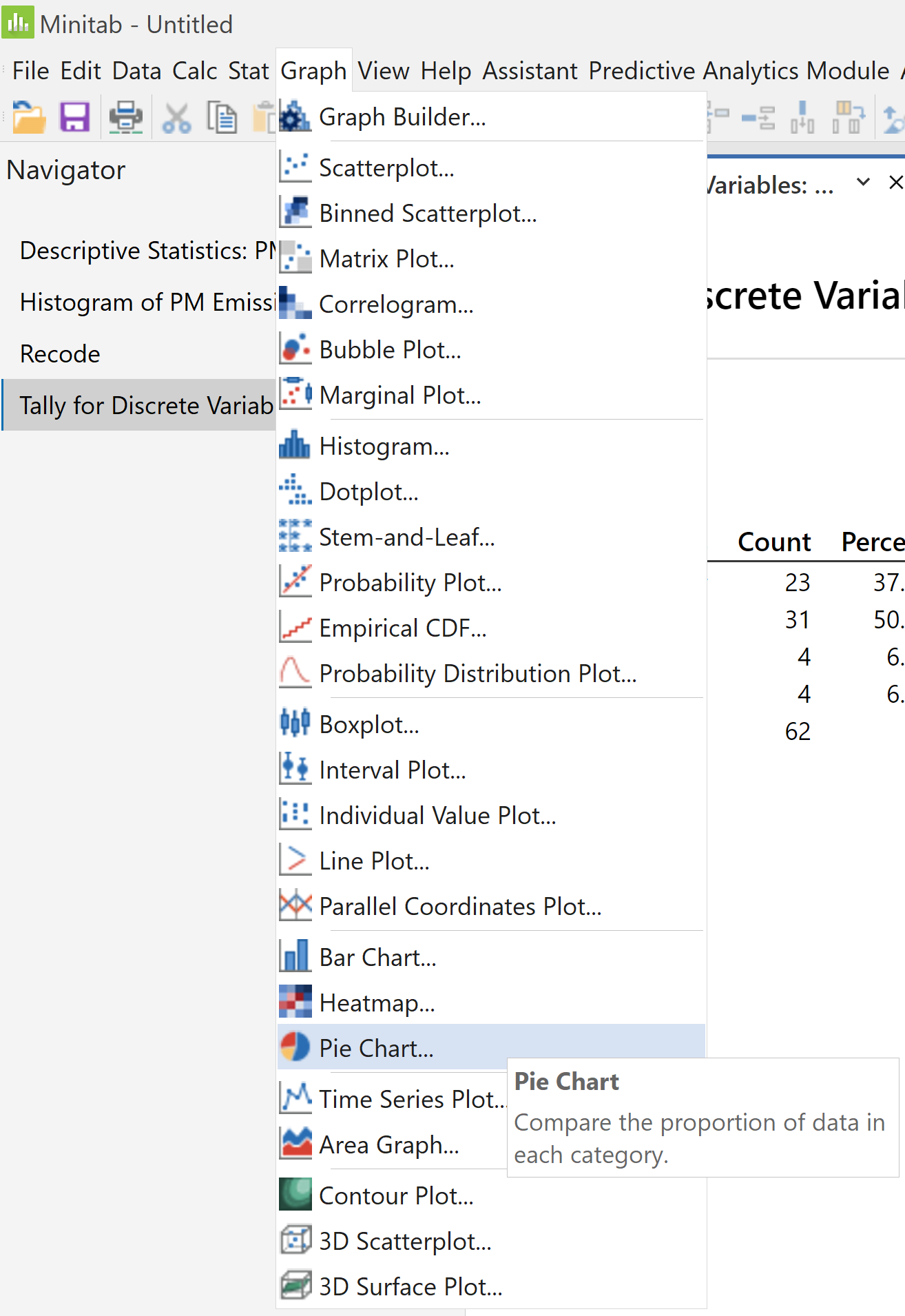
One can then proceed to generate graphical summaries in various forms.
Pie Charts
|
To create a pie chart click on 'Graph', |
 |
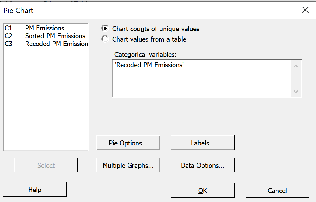 |
In the resulting dialog box, click the radio button for into the pane 'Categorical variables' click the button 'Labels...' |
|
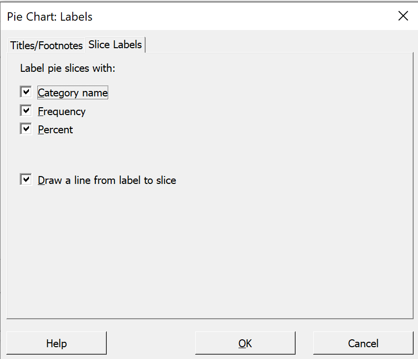
In the new dialog box: In the first tab 'Titles/Footnotes", Select the tab 'Slice Labels' Then click OK on each of the two dialog boxes. |
 |
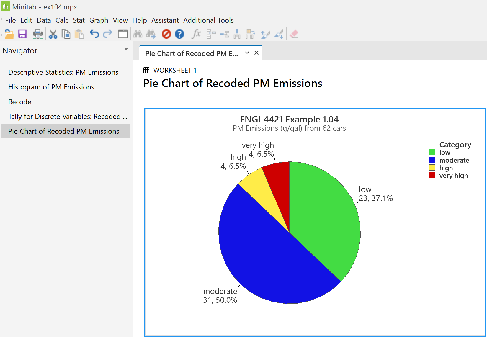
A pie chart appears in a new tab of the output pane.
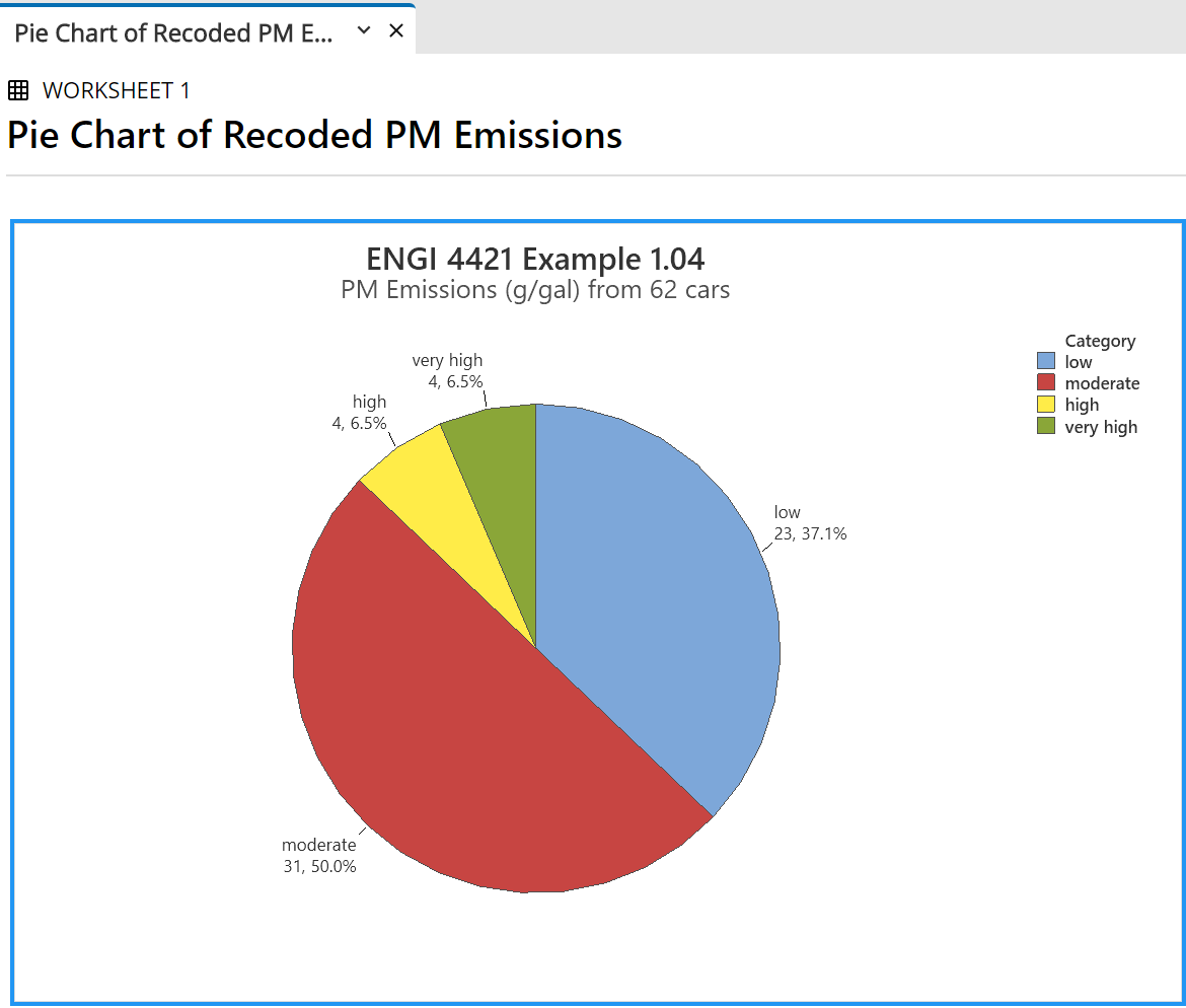
By clicking on various parts of the chart, one can edit its appearance as needed.
The font in the labels may need enlarging. Here is the pie chart after some further editing.
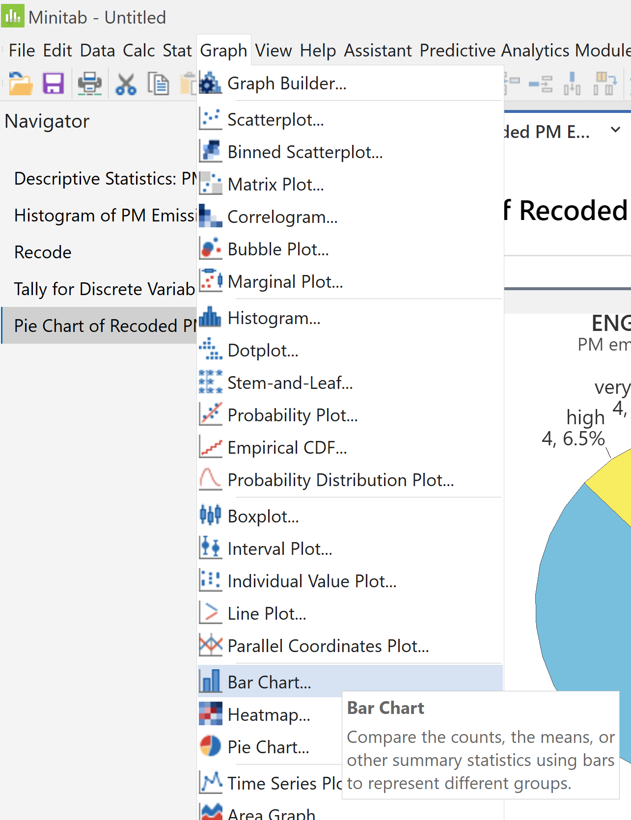
Bar Charts
|
To create a bar chart click on 'Graph', |
 |
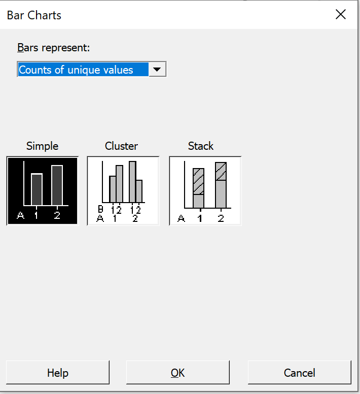 |
In the resulting 'Bar Charts' dialog box, from the drop-down menu 'Bars represent', accept the default button 'Simple', |
|
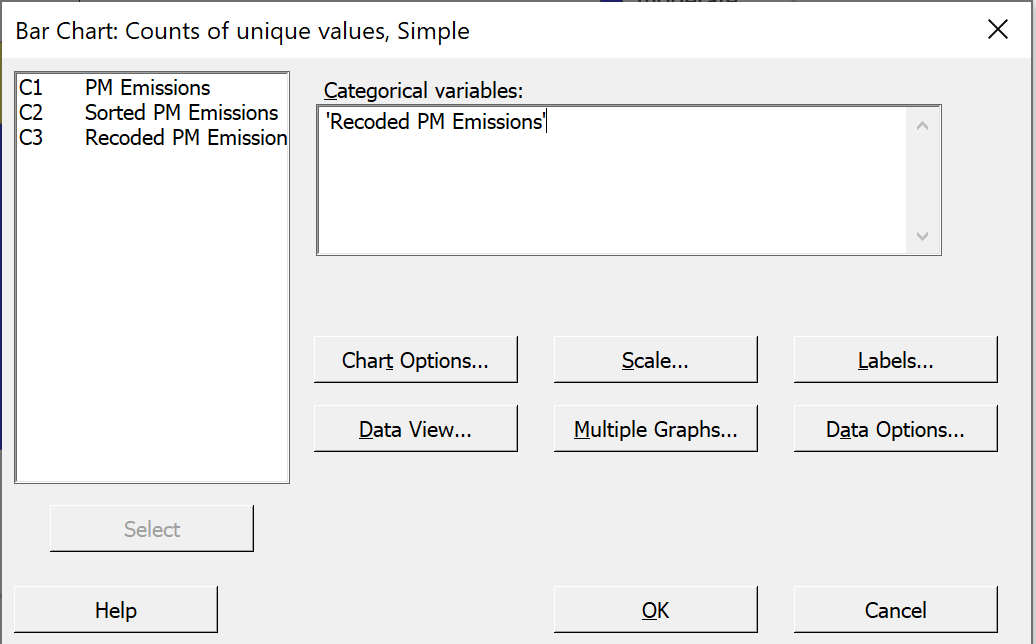
In the left pane of pane 'Categorical variables'. The six buttons allow for some finer control. Just click 'OK'. |
 |
A bar chart (not a histogram) is produced.
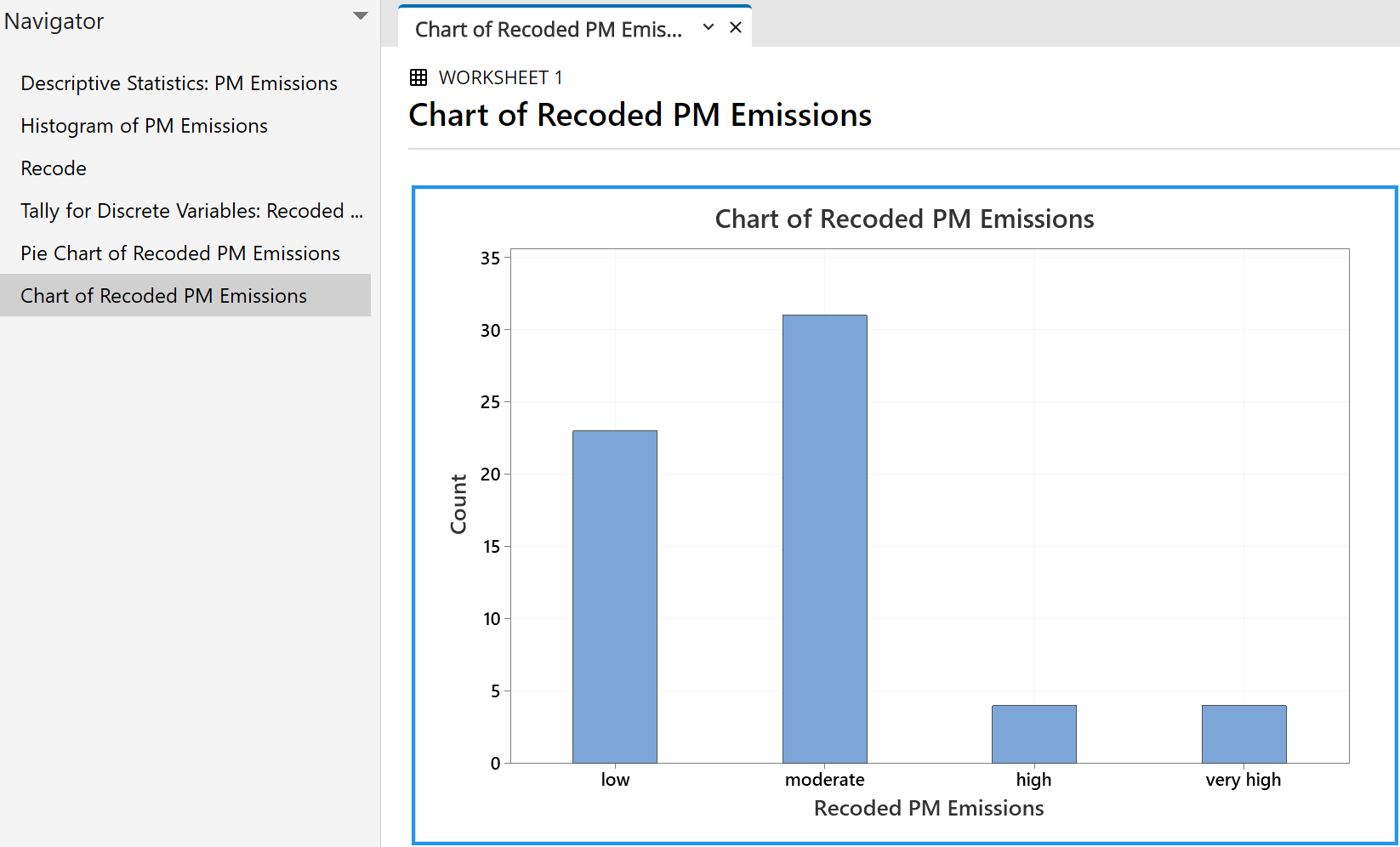
Experiment with various settings to improve its appearance.
Don’t forget to save your work (if you want to keep it).
From the main 'File' menu, click on 'Exit' to terminate the Minitab program.
Created 2009 12 31 and most recently modified 2022 04 07 by Dr. G.H. George