ENGI 4421 - Second Excel Tutorial
In this session we shall use Excel® to
Simulation Example #1 - Lamp Lifetimes
A particular type of lamp filament is known to have a life time
that is a random quantity with an exponential distribution.
The true mean lifetime of the filaments is known to be 1,000 hours.
Simulate a random sample of 100 such lamp filaments by placing
100 values, drawn randomly from an exponential distribution of
mean µ = 1000, in a column in a Excel
worksheet. Generate the following descriptive statistics in
Excel for your sample:
- a list of descriptive statistics (mean, median, etc.)
- a boxplot
- an histogram with seven or eight classes, not all of equal width.
Generating Random Values
Unlike Minitab, Excel lacks the direct ability to populate a column
with values drawn randomly from an exponential distribution.
However, we can build on the Excel function that generates random
numbers from the standard continuous uniform distribution U(0,1).
In a new workbook, enter names for the first two columns.
On the main menu bar, click on 'Data', then 'Data Analysis'
(if it is there).
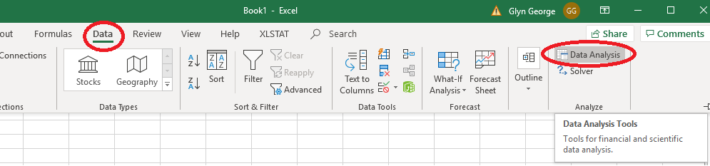
If 'Data Analysis' is not visible, then you will need to load it.
On the main menu bar at the top, click 'File ' then 'Options'.
Near the bottom of the left pane of the new window, click 'Add-Ins',
If 'Analysis ToolPak' is not in the list of Active Application Add-ins, then
at the foot of the main pane, click the button 'Go...'.
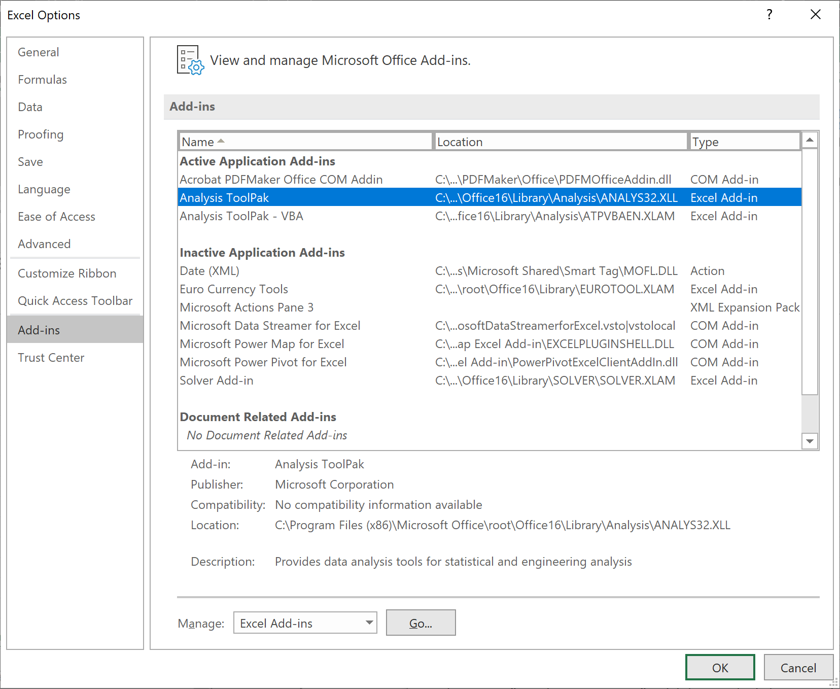
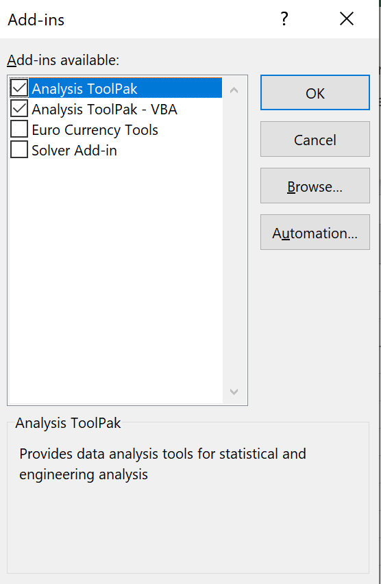
In the new pop-up box,
check the boxes for
'Analysis ToolPak' and
'Analysis ToolPak - VBA'
and click 'OK'. |
|
|
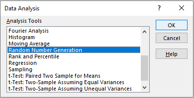
Having clicked on 'Data', then 'Data Analysis',
in the new dialog box,
find and click on 'Random Number Generation'
and click 'OK'. |
|
|
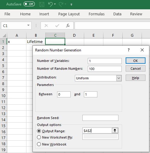
In the new dialog box,
enter values as shown.
Number of variables: set to 1
Number of Random Numbers: set to 100
Use the pull down menu to set the
distribution to Uniform.
Accept the default parameters 0 and 1.
In the output options group,
click on the Output Range radio button,
then set the range to cell 'A2'.
Click 'OK'. |
|
|
|
|
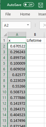
A set of random numbers appears in cells 'A2' to 'A101'.
These numbers are drawn randomly from the interval (0, 1),
with any number as likely as any other to be drawn.
Note that your values will be different from the ones you see here. |
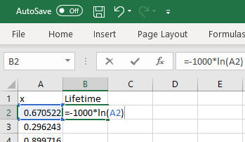
To generate random values from the exponential distribution with mean (and
standard deviation) = 1000, we need to take the natural logarithm of these
uniform random values and scale by ‐1000.
In cell 'B2', enter the formula
= -1000 * LN(A2).
|
|
|
|
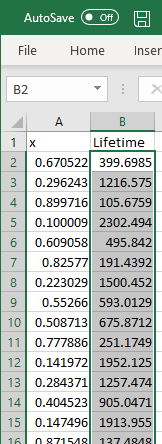
Click and hold on the bottom right corner of cell 'B2',
so that the cursor becomes a crosshair (the 'fill handle').
Copy-drag the formula down to cell 'B101' and release.
Column 'B' now contains a random sample of 100 values
drawn from an exponential distribution of mean 1000. |
Sorting Data
Although this step is not required by the problem
specification, let us sort the data into ascending order.
|
|
Click on the grey corner

to select all values in the workbook.
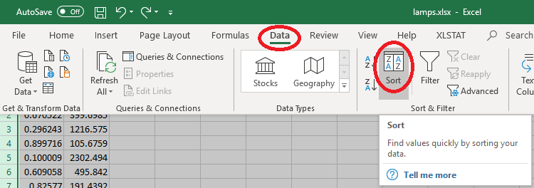
On the main menu bar, click on 'Data'.
Then click on 'Sort'. |
|
|
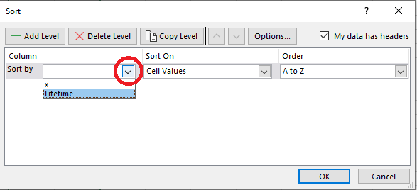
In the 'Sort' dialog box,
ensure that the 'My data has headers' box is checked.
In the 'Column' – 'Sort by' box,
use the pull-down menu to select 'Lifetime'.
Then click on 'OK'. |
|
|
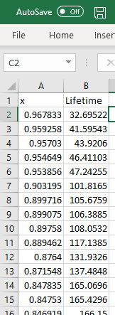
The sorted version of your data should
now be in the second column of the workbook.
[Again, your values won’t match the values
that you see here!]
|
Descriptive Statistics
As we did in the first tutorial, we will extend this workbook to
calculate some of the summary statistics, create a boxplot and find
the values necessary to create a true histogram.
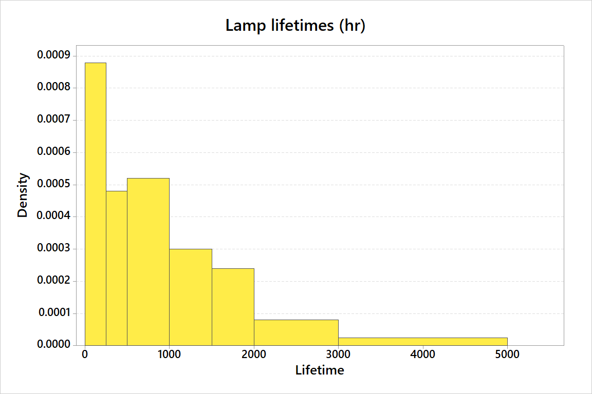
Unfortunately Excel cannot generate a histogram for unequal bar
widths.
Begin by entering text as shown.
I have chosen to change the format to centre for row 1 and right-adjusted for
columns 'I' and 'L'.
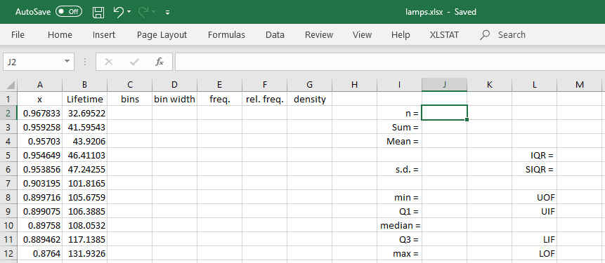
The formulas for the summary statistics are:
| 'J2' (n) | = COUNT(B:B) | |
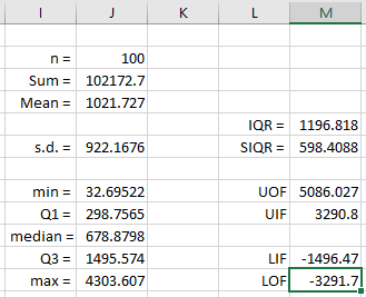 |
| 'J3' (Sum) | = SUM(B:B) |
| 'J4' (Mean) | = J3 / J2 |
| 'J6' (s.d.) | = STDEV.S(B:B) |
| 'J8' (min) | = MIN(B:B) |
| 'J9' (Q1) | = QUARTILE.EXC(B:B, 1) |
| 'J10' (median) |
= QUARTILE.EXC(B:B, 2) |
| 'J11' (Q3) | = QUARTILE.EXC(B:B, 3) |
| 'J12' (max) | = MAX(B:B) |
| 'M5' (IQR) | = J11 - J9 |
| 'M6' (SIQR) | = M5 / 2 |
| 'M8' (UOF) | = J11 + 3*M5 |
| 'M9' (UIF) | = J11 + 3*M6 |
| 'M11' (LIF) | = J9 - 3*M6 |
| 'M12' (LOF) | = J9 - 3*M5 |
Boxplot
|
|
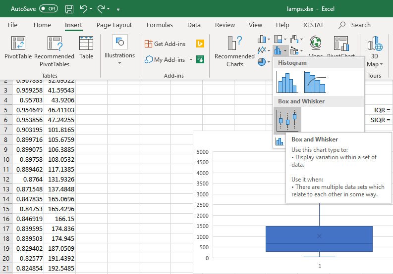
With column 'B' selected,
click on 'Insert',
then the histogram icon 
then the box and whisker plot.
|
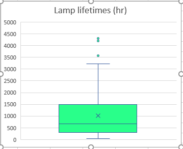
Again one may customize this chart.
| |
|
The random sample illustrated here came from an exponentially
distributed population with a true mean and standard deviation
of 1,000 hours.
The sample mean is somewhat greater, at 1,022 hours, while the
sample standard deviation is somewhat less, at 922 hours.
A good batch, perhaps, but not that unlikely to have occurred
by chance, (as we shall be able to prove, after we have studied
continuous probability distributions).
The positive skew is so strong that, although the sample
mean lamp filament lifetime is about 1,022 hours, half of all
of the lamp filaments in this sample burned out in less
than 679 hours!
Histogram
|
|
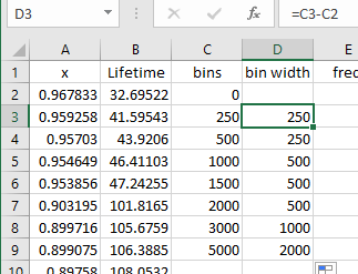
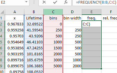
Enter the bins as shown
in column 'C'.
You may need to change the '5000'
to whichever integer multiple of 1000
encompasses the largest value in your data.
Then set the bin width formula in 'D2'
to = C3 - C2
and copy it down to cell 'D9'.
|
Select the eight values of frequency
(cells 'E2' to 'E9')
and keep them selected.
Type = FREQUENCY(B:B, C:C)
but do not press 'Enter'!
Instead press 'Shift+Ctrl+Enter'.
|
|
|
|
|
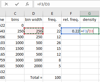
Enter the total frequency
( =SUM(E3:E9) in cell 'E11')
(relative frequency) = freq. / (total freq.)
In cell 'F3' enter
=E3/E$11
(The $ provides an absolute reference)
density = (rel. freq.) / (bin width)
In cell 'G3' enter
=F3/D3
|
Drag-copy the formulae
for relative frequency and density.
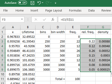
The values in column 'C' (bins)
are the locations of the right edge of each bar.
The values in column 'G' (density)
are the heights of each bar.
You can import these values into
some other drawing program to
generate the histogram
(or to draw it manually!)
| |
|
As noted before, Minitab can generate a true histogram:
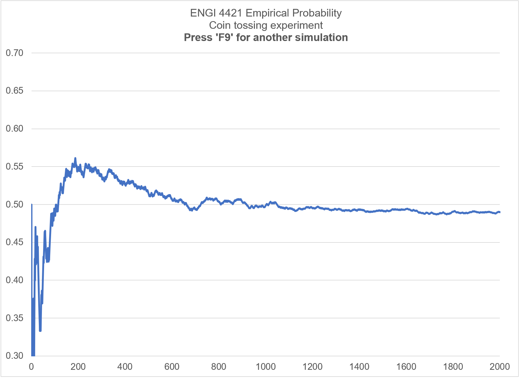
Simulation Example #2 - Coin Flips
We shall use Excel to simulate flipping a fair coin repeatedly and keeping
track of the proportion of heads observed. In this way we can see how the
empirical probability usually converges on the classical probability.
Obviously, for a fair coin, the probability of a head should be 0.5 .
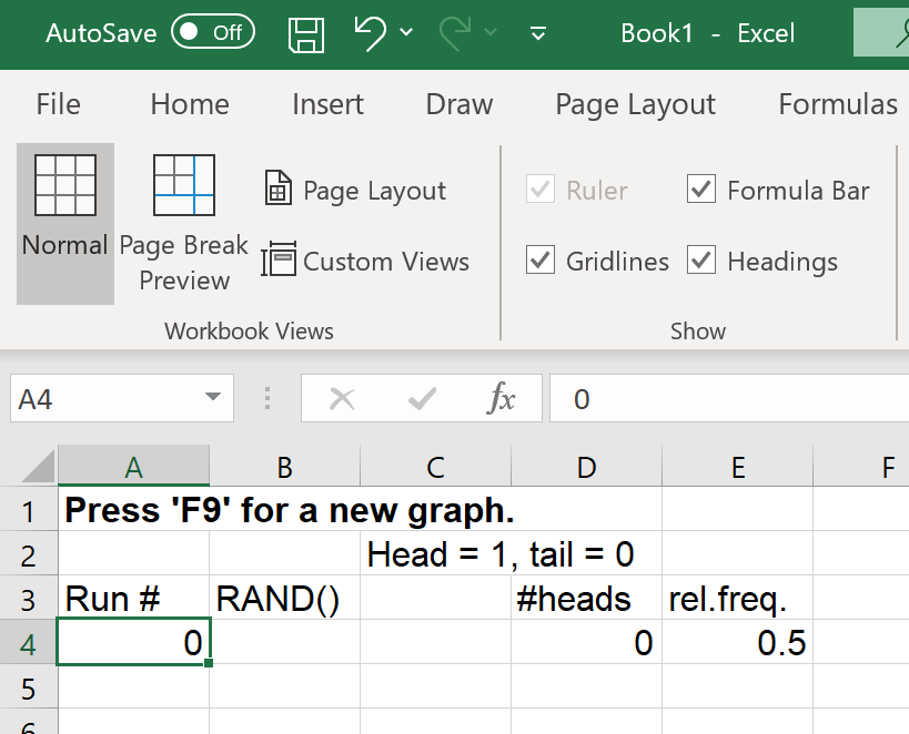
Enter text in the
top four rows as shown.
You can adjust the fonts as desired.
I have chosen bold face in row 1
and Arial 12 for the entire workbook.
|
|
|
|
|
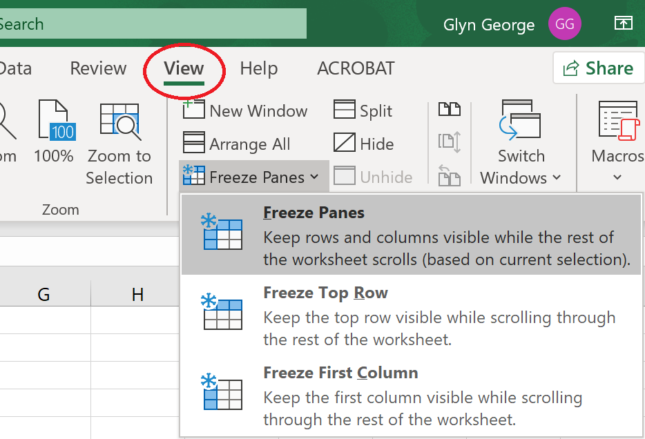
Freeze the top three rows,
so that they remain visible when
scrolling down through the data.
Click the cursor on cell 'A4'.
Click on the 'View' menu,
then on 'Freeze panes'.
Click on the first option
'Freeze panes'.
All rows above and columns to the left
of the active cell will now remain displayed. |
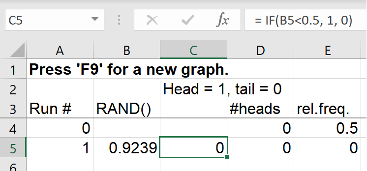
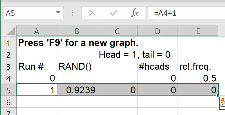
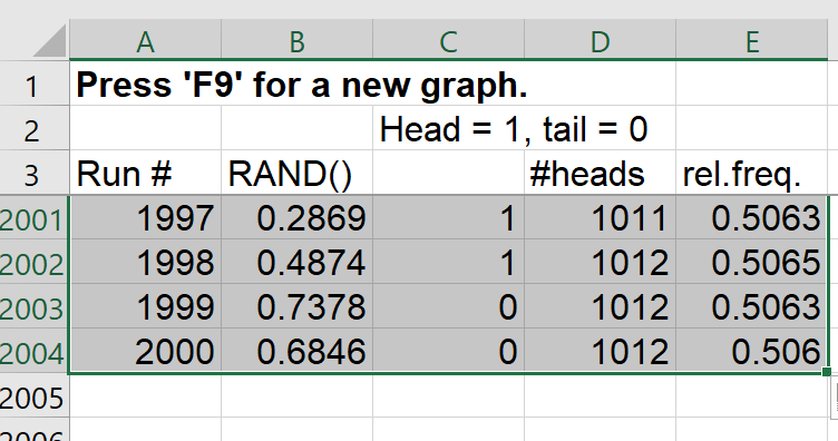
Column 'A' will keep track of the number of coin tosses so far.
Column 'B' is a random number in (0,1), drawn from the continuous uniform
distribution.
Column 'C' simulates whether that coin flip is a head or a tail.
With equal probability for each, a value in column 'B' less than 0.5 will
be interpreted as a 'head', represented by '1', otherwise it’s a tail,
represented by '0'.
Column 'D' keeps track of the number of heads so far (the cumulative frequency).
Each entry in column 'D' is the entry above it plus the new entry to the left,
(0 if a tail, 1 if a head).
Column 'E' keeps track of the relative frequency of heads.
The relative frequency is just the frequency so far, divided by the number of
coin flips so far.
Enter formulas in row 5:
Cell 'A5': = A4 + 1
Cell 'B5': = RAND()
Cell 'C5': = IF(B5<0.5, 1, 0)
Cell 'D5': = D4+C5
Cell 'E5': = D5/A5
|
|
|
|
|
Select cells 'A5' to 'E5'
Position the cursor at the bottom right corner of 'E5'
so that the cursor becomes a crosshair
(the 'fill handle')
Drag the cursor all the way down
to row 2004, then release.
|
|
|
The formulae in row 5 should now
be duplicated to 2000 rows,
simulating 2,000 tosses of a fair coin. |
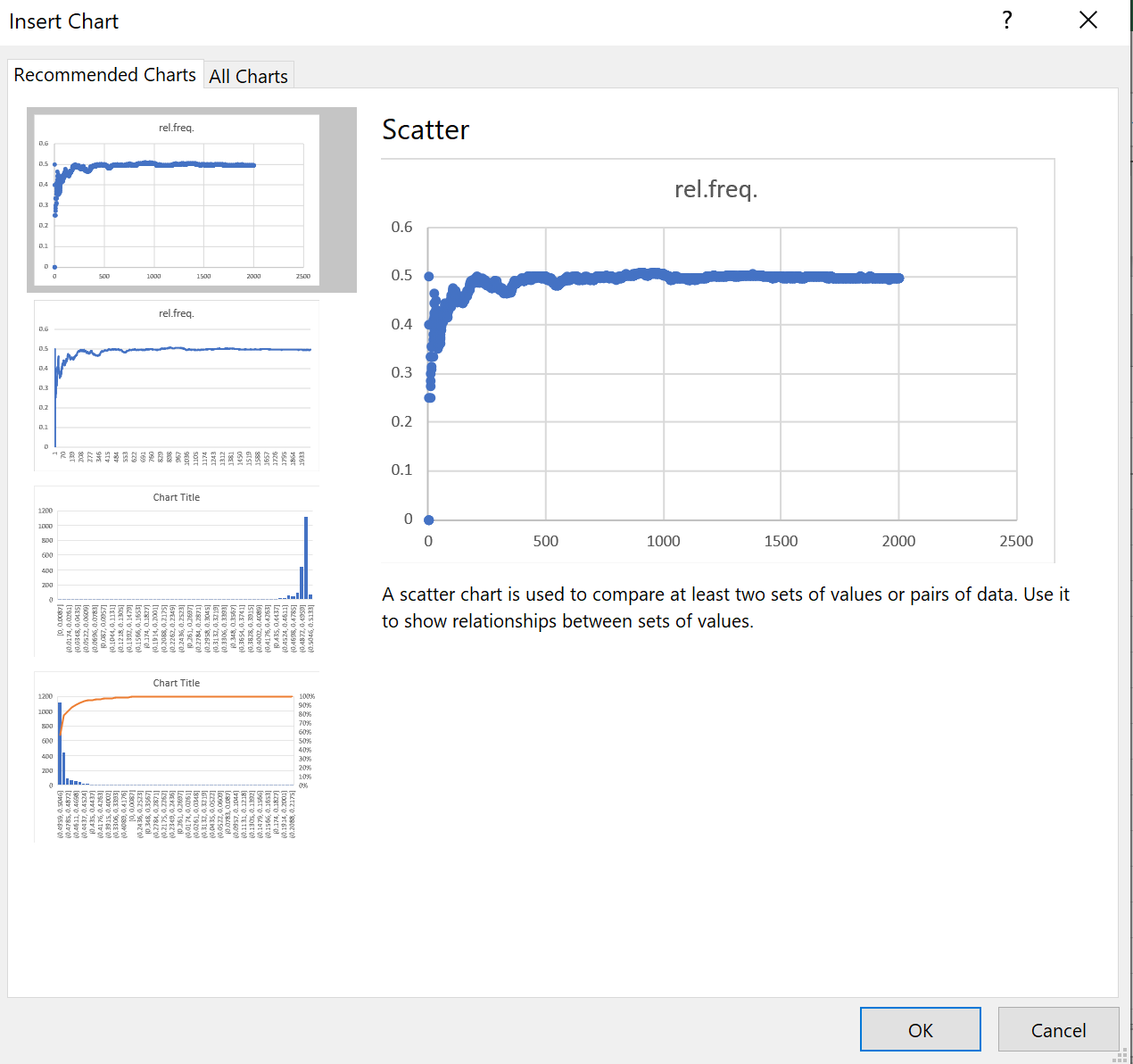
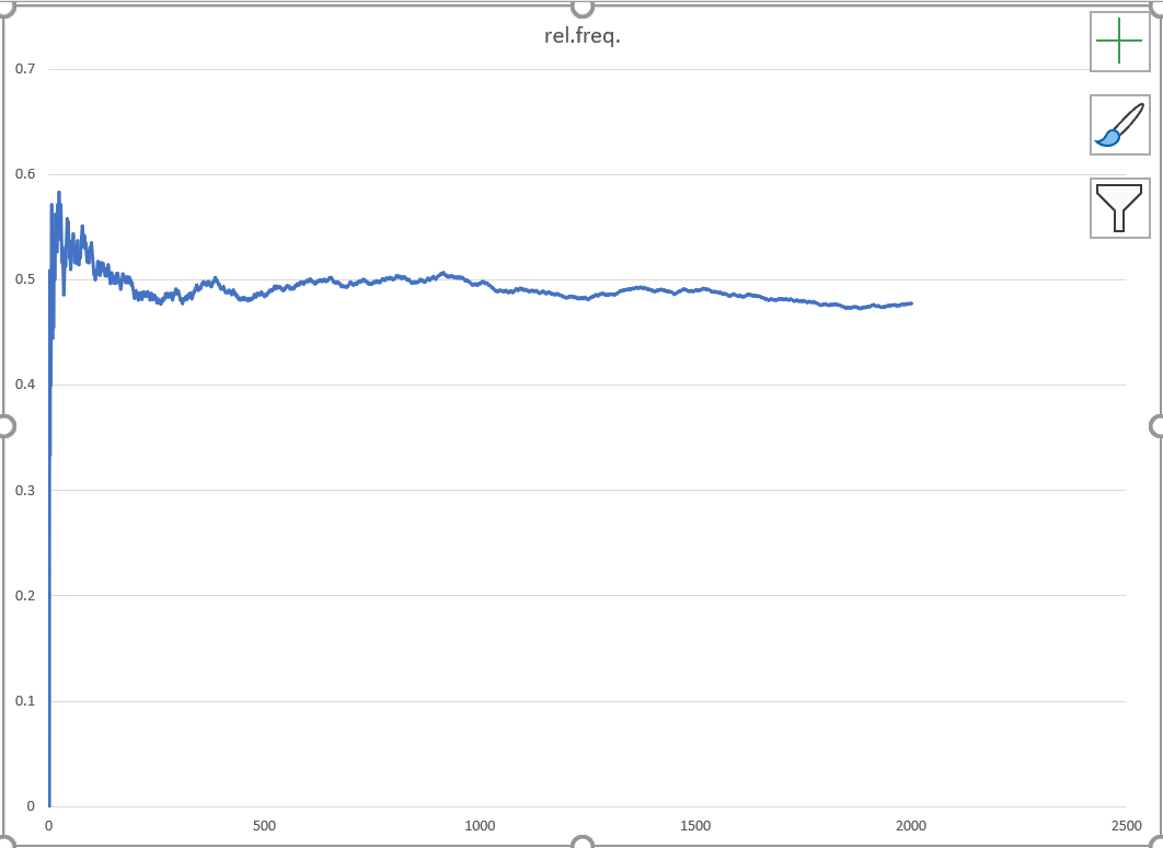
Column 'E' now holds the history of the evolution of the relative frequency,
which is also the empirical probability (our estimate of the true probability).
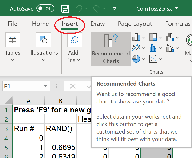
Select all of column 'E'
In the main menu bar,
click on 'Insert', then
"Recommended Charts'. |
|
|
|
|
The first chart will do.
Just click 'OK'.
Note that the chart will
change with each run:
the values in column 'B' are random ! |
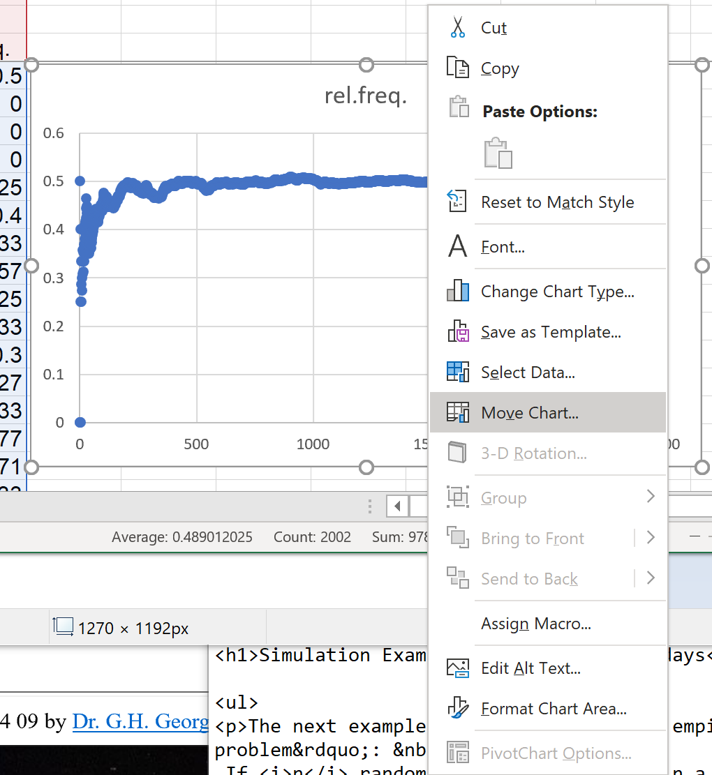
Move the chart to a separate tab.
Right-click on the chart
On the pop-up menu,
click on 'Move Chart...' |
|
|
|
|
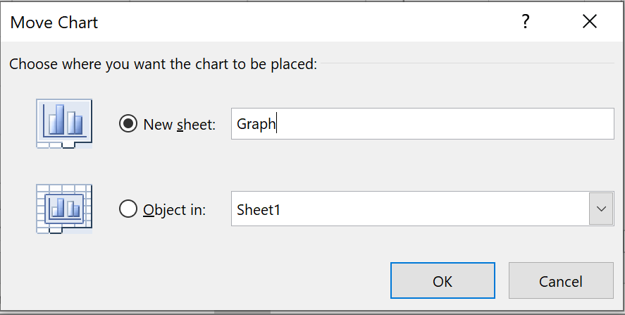
In the 'Move Chart' dialog box,
Click the radio button for 'New sheet"
and rename the new sheet to which
the chart will be moved. |
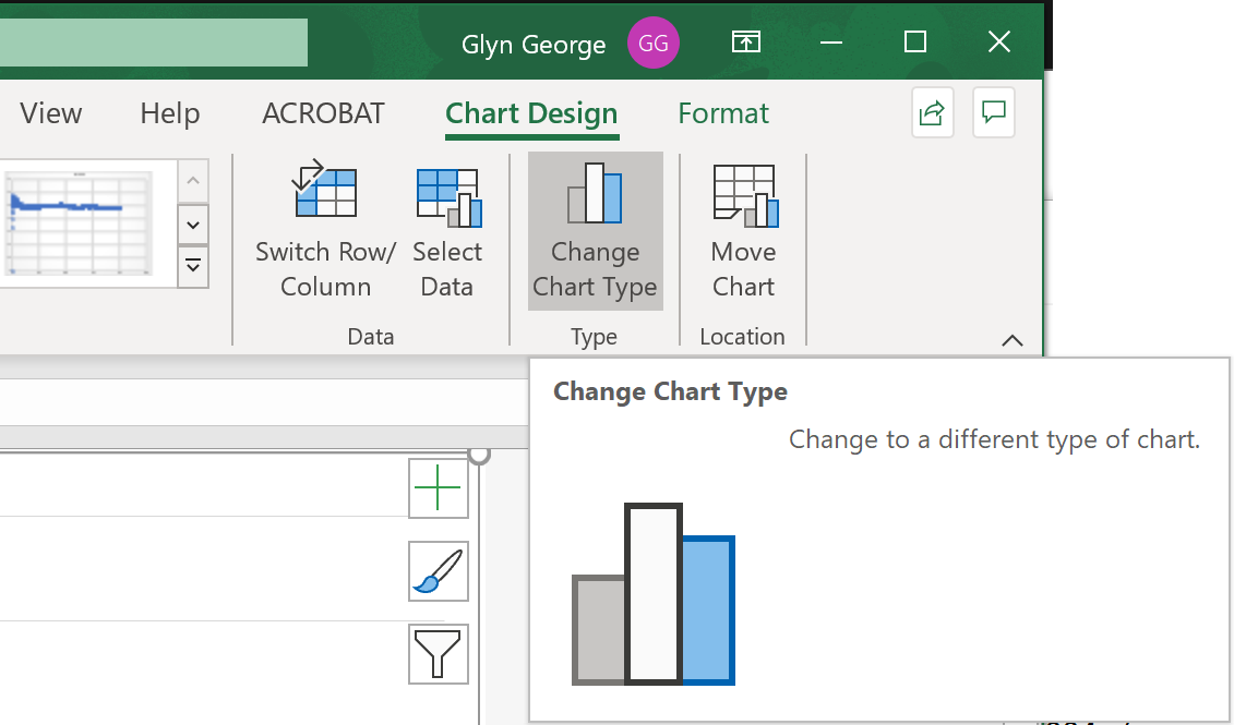
We can tidy this graph up.
In the 'Graph" sheet,
click on the menu item 'Chart Design'
then on 'Chart Type'
|
|
|
|
|
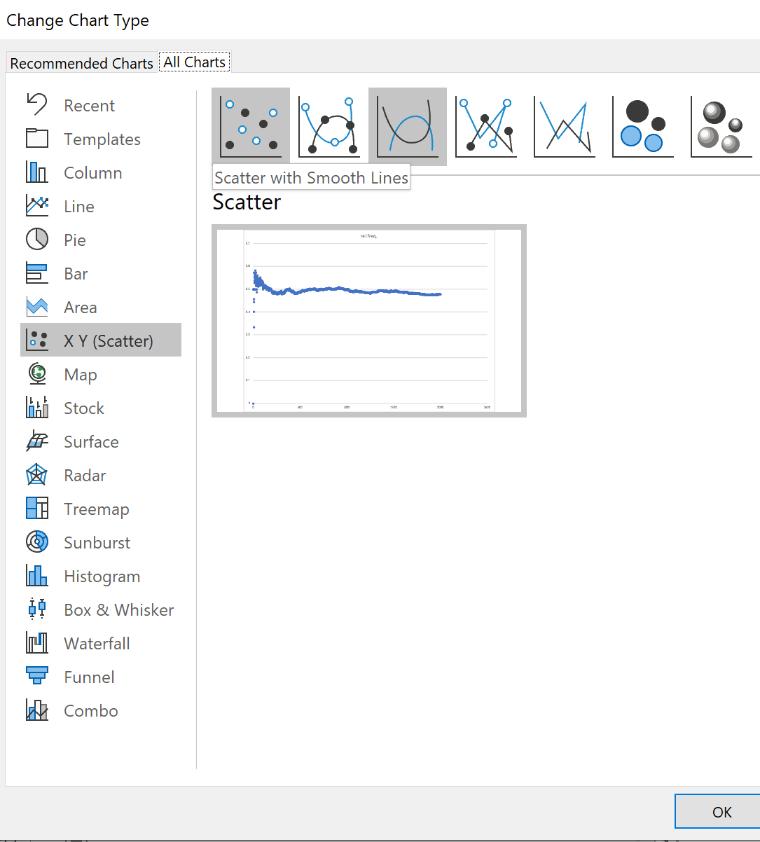
In the 'Change Chart Type' dialog box,
select the third diagram
(Scatter with Smooth Lines)
and click 'OK' |
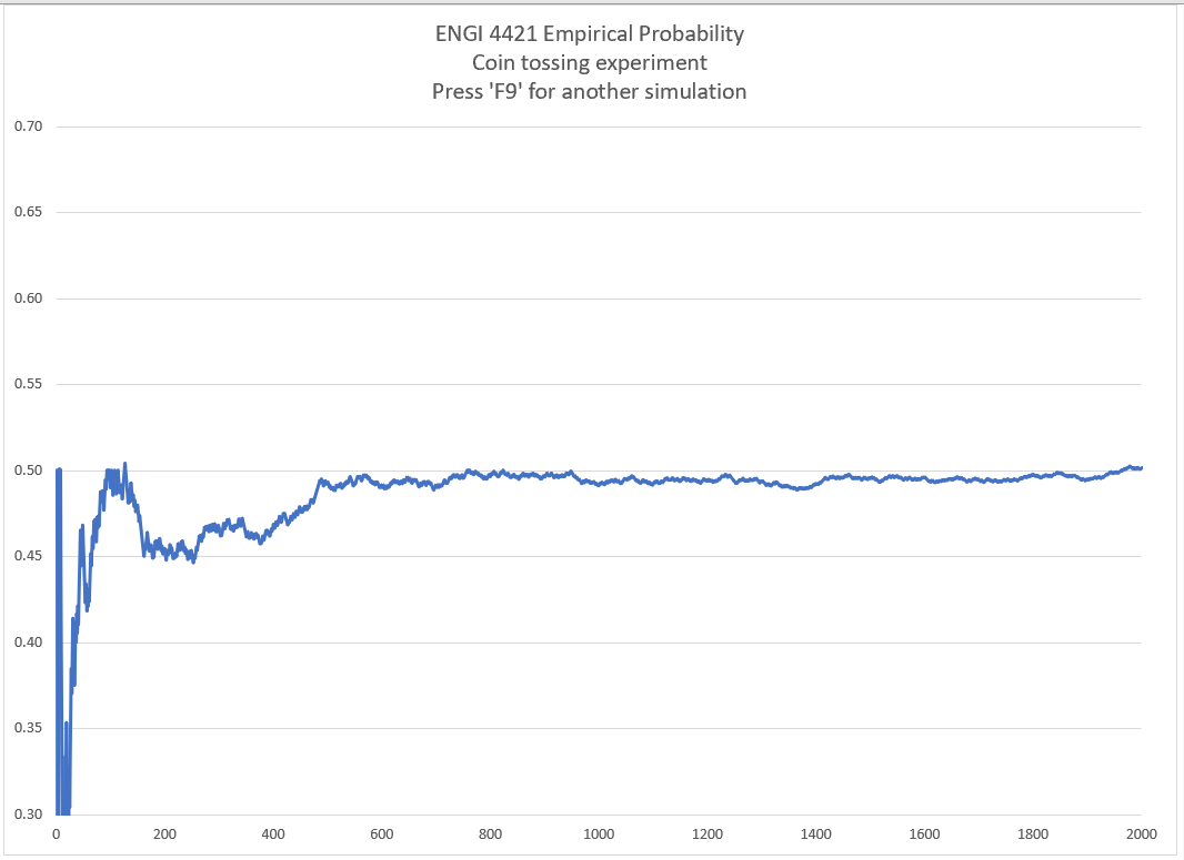
We are interested in values near 0.5.
The early variability is not important.
We should rescale our graph to
display values in 0.3 < p < 0.7 only.
We should also rescale the horizontal axis
to terminate at 2000, not 2500.
A better title is needed. |
|
|
|
|
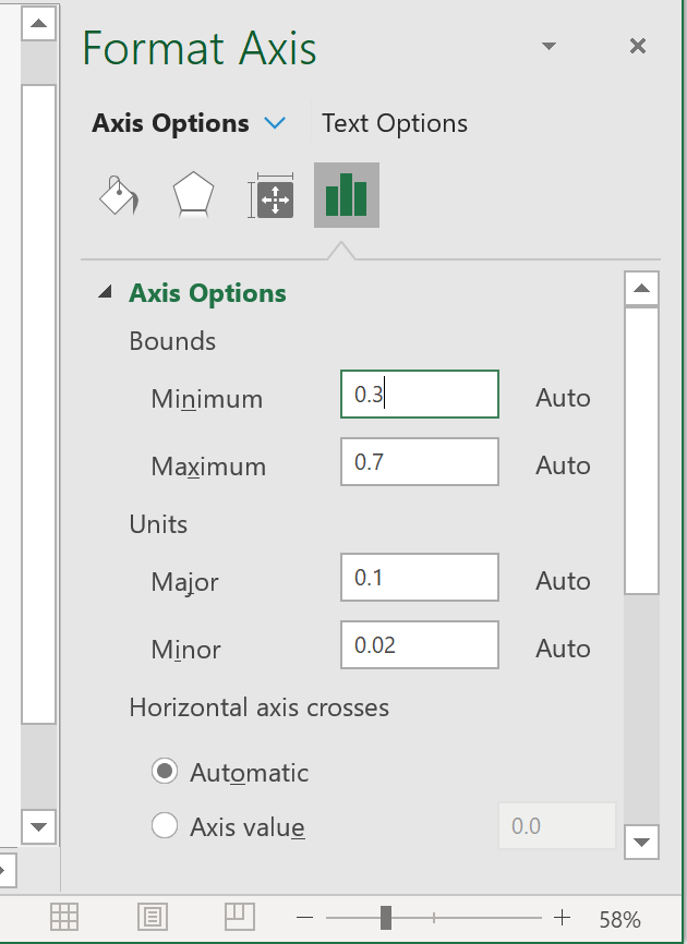
Double-click on the vertical axis.
A new pane opens to the right of the worksheet.
Change the numbers in the 'Bounds' boxes:
'Minimum' to 0.3
'Maximum' to 0.7
so that these values remain fixed
and are not changed automatically by Excel.
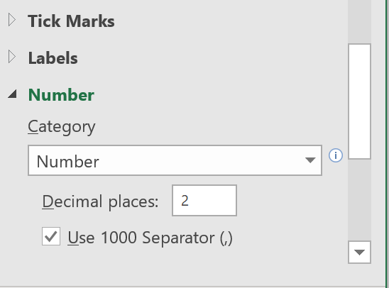
Further down, expand 'Number',
change the 'Category' from 'General' to 'Number'
and set the number of decimal places to 2.
By double clicking on the other axis
and on the title, one can customize
the graph somewhat.
|
|
 |
Here is the result of another run.
Pressing 'F9' generates a new simulation.
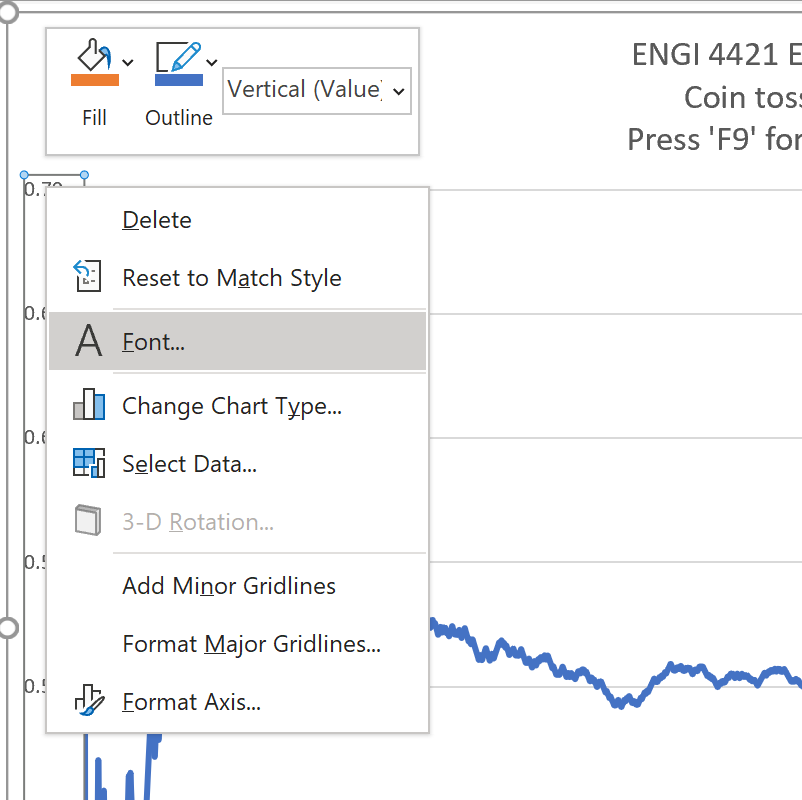
The font size is much too small.
Excel hides the method of
changing the font very well.
Place the cursor on an axis value
and right-click on it
On the pop-up menu, select 'Font...' |
|
|
|
|
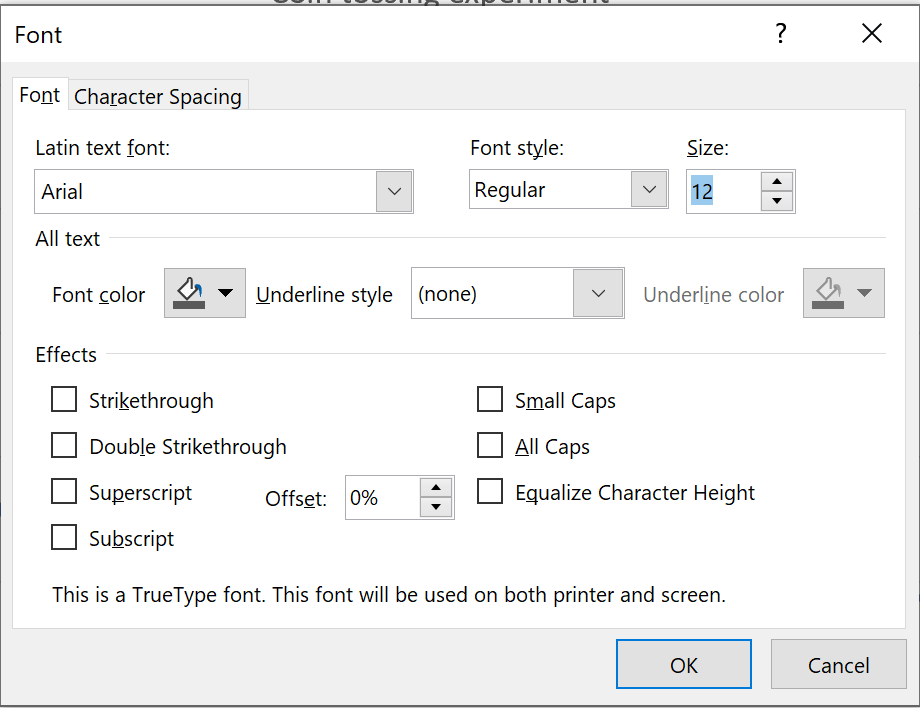
In the pop-up dialog box,
adjust the font as you see fit.
Repeat for the other axis and the title. |
 [Return to the index of
demonstration files]
[To the next tutorial]
[Return to the index of
demonstration files]
[To the next tutorial]

[Return to your previous page]
Created 2003 03 26 and most recently modified 2021 02 10 by
Dr. G.H. George