ENGI 4421 - Third Excel Tutorial
Normal Probability Plot & Confidence Interval
Simulations using Excel
In this session we shall use Excel® to
Creation of a Data Set
 |
|
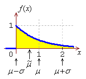
We shall simulate the creation of a normal probability plot for a
case where the data are known to be non-normal, namely data drawn
from an exponential distribution. The standard exponential
distribution (λ = 1) is shown here.
We shall reproduce the steps in
Tutorial #2
for Excel to generate a random sample from an exponential
distribution.
|
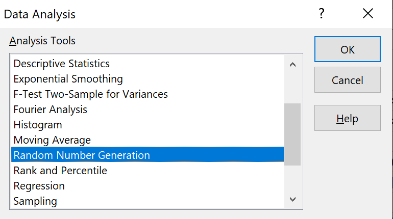
On the main menu bar, click on 'Data', then 'Data Analysis'.
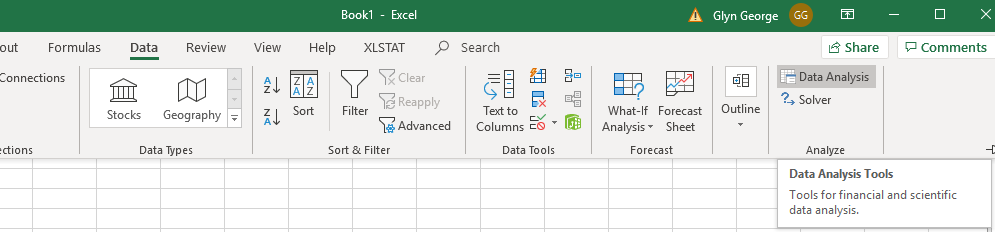
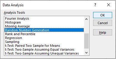
In the new dialog box,
find and click on 'Random Number Generation'
and click 'OK'. |
|
|
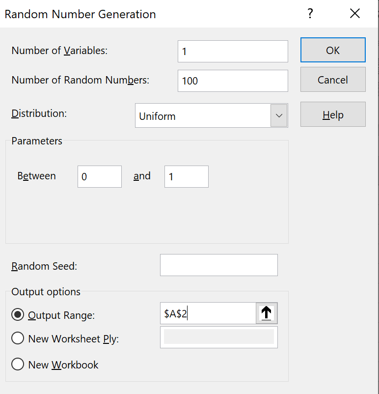
In the new dialog box,
enter values as shown.
Number of variables: set to 1
Number of Random Numbers: set to 100
Use the pull down menu to set the
distribution to Uniform.
Accept the default parameters 0 and 1.
In the output options group,
click on the Output Range radio button,
then set the range to cell 'A2'.
Click 'OK'. |
|
|
|
|
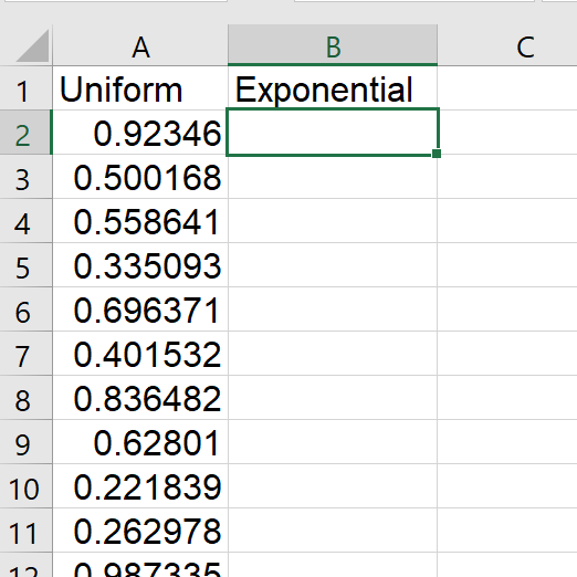
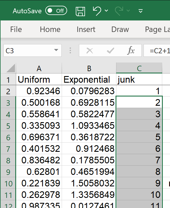
A set of random numbers appears in cells 'A2' to 'A101'.
These numbers are drawn randomly from the interval (0, 1),
with any number as likely as any other to be drawn.
Note that your values will be different from the ones you see here. |
|
|
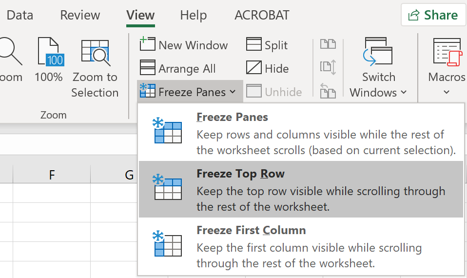
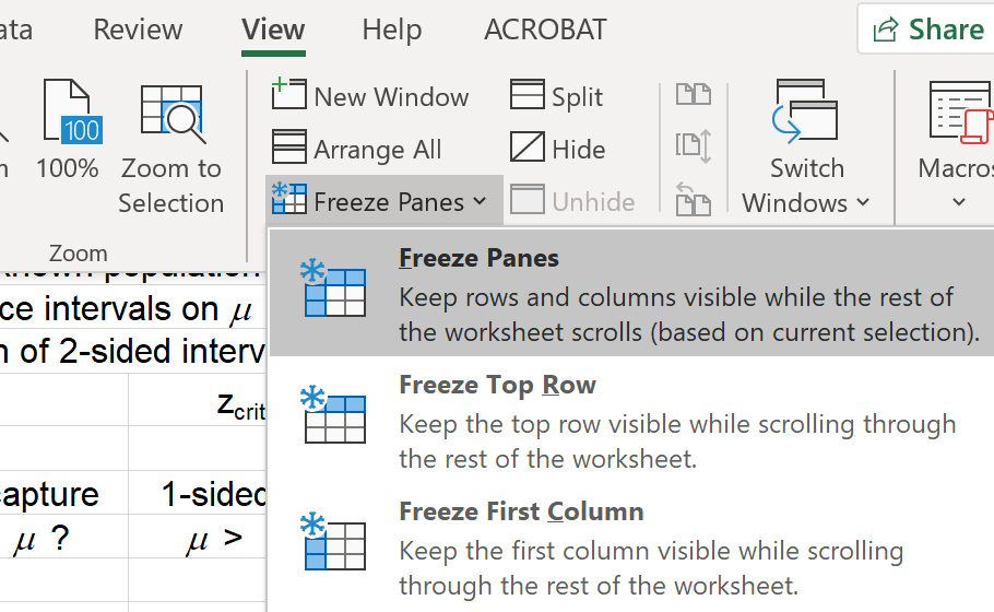
Let us fix the top row, so that we.
don’t lose sight of the column headers
whenever we scroll down through the data.
On the main menu bar at the top,
click on 'View'
then on 'Freeze Panes'.
Click on the middle option
'Freeze Top Row'. |
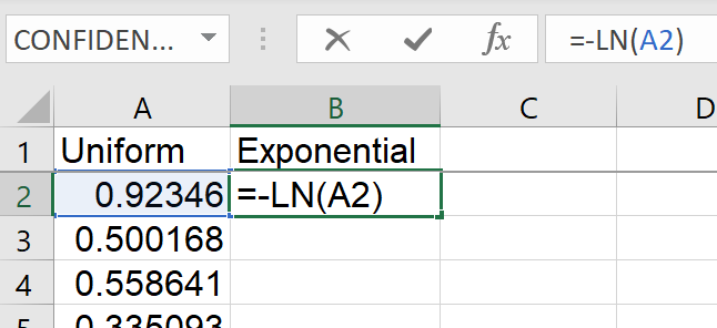
To generate random values from the exponential distribution with mean
μ = 1 / λ
(and standard deviation = σ = μ = 1 / λ),
we need to take the negative of the natural logarithm of these
uniform random values and scale by the mean:
y = –μ × ln(x).
For the standard exponential distribution, μ = 1.
In cell 'B2', enter the formula
= -LN(A2).
|
|
|
|
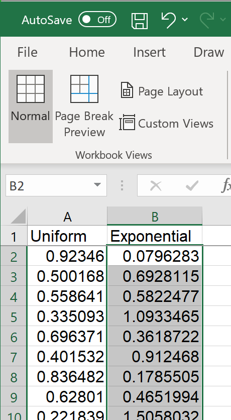
Click and hold on the bottom right corner of cell 'B2',
so that the cursor becomes a crosshair (the 'fill handle').
Copy-drag the formula down to cell 'B101' and release.
Column 'B' now contains a random sample of 100 values
drawn from the standard exponential distribution (mean 1). |
Graphical Summary of the Data
We shall reproduce some of the steps from
Tutorial #1.
Enter the text as shown in columns 'D' and 'G'.
| Enter formulas for the summary statistics: |
|
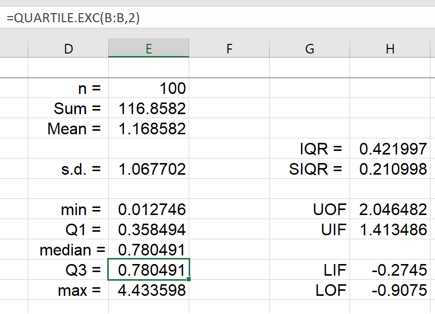
| Cell 'E2' (n): | = COUNT(B:B) |
| Cell 'E3' (Sum): | = SUM(B:B) |
| Cell 'E4' (Mean): | = E3/E2 |
| Cell 'E6' (s.d.): | = STDEV.S(B:B) |
| Cell 'E8' (min): | = MIN(B:B) |
| Cell 'E9' (Q1): | = QUARTILE.EXC(B:B, 1) |
| Cell 'E10' (median): |
= MEDIAN(B:B) |
| Cell 'E11' (Q3): | = QUARTILE.EXC(B:B, 3) |
| Cell 'E12' (max): | = MAX(B:B) |
| Cell 'H5' (IQR): | = E11-E9 |
| Cell 'H6' (SIQR): | = H5 / 2 |
| Cell 'H8' (UOF): | = E11 + 3*H5 |
| Cell 'H9' (UIF): | = E11 + 3*H6 |
| Cell 'H11' (LIF): | = E9 - 3*H6 |
| Cell 'H12' (LOF): | = E9 - 3*H5 |
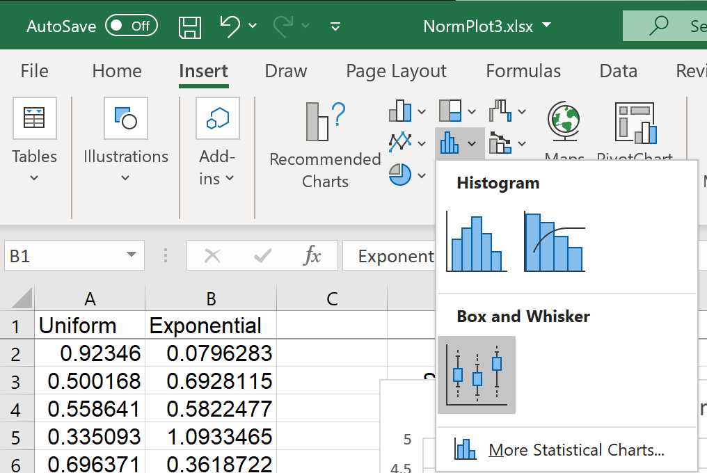
Boxplot
 |
|
First select all of column 'B'.
From the 'Insert' menu,
click the down arrow next to the
second small bar chart / histogram icon
 , ,
then click on 'Box and Whisker'. |
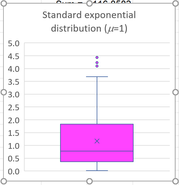
By clicking on various elements within this chart you can
customize it.
Note that the details of your graph are likely to differ somewhat from this
graph. Your random sample will be different from this one.
Normal Probability Plot
— Excel
Open Excel and import the data set, for which you wish to create a
normal probability plot, into a column.
In this demonstration, we shall use the same file that was created above.
Alongside the genuine data,
place a column containing
the same number of values.
The new values can be any set of distinct
numbers.
They are needed for the next two steps.
The first 100 natural numbers are as good a choice as any. |
|
 |
![[menus]](e21menus.png) |
|
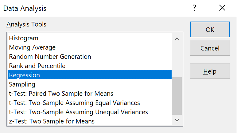
Click on the menu item
"Data" and then
Click on "Data
Analysis...". |
Scroll down the list of Analysis Tools
and click on "Regression"
then click on the "OK" button. |
|
 |
 |
|
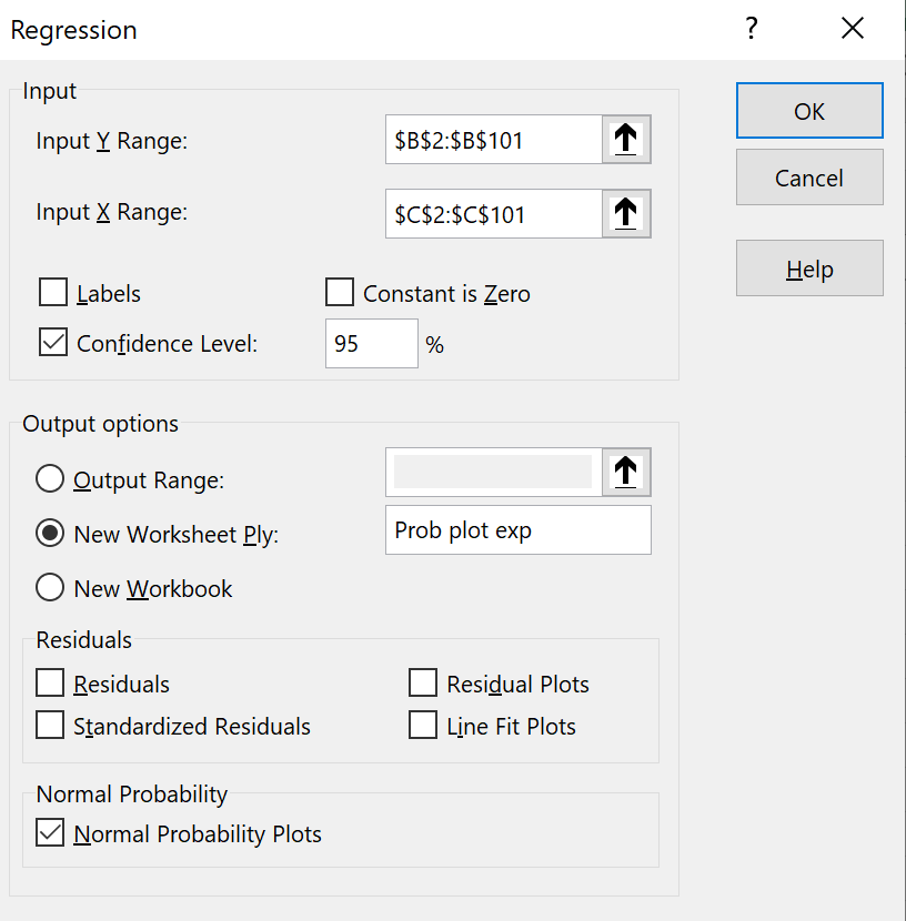
In the Regression dialog box:
Select the range where your data are stored
(column 'B') as the
"Input Y Range",
but note that only cells containing your data
may be in the range: B2:B101.
This is unlike the descriptive statistics functions.
Select the range where the junk data are stored
(C2:C101) as the
"Input X Range".
Check the box for confidence level.
Choose a location for the tables of values,
(most of which will be irrelevant!).
In this example, a separate sheet has been chosen.
Check the last box "Normal
Probability Plots" and
leave all other boxes unchecked.
then click on the "OK" button. |
At the location where the
output was chosen to be, various tables and a graph appear.
Ignore the tables.
Resize the graph.
Right-click on any of the plotted points.
Click on "Add Trendline...".
A new pane appears to the right.
The default option (linear trend) is OK.
You may also wish to tidy the graph up somewhat, to produce a result
like this:
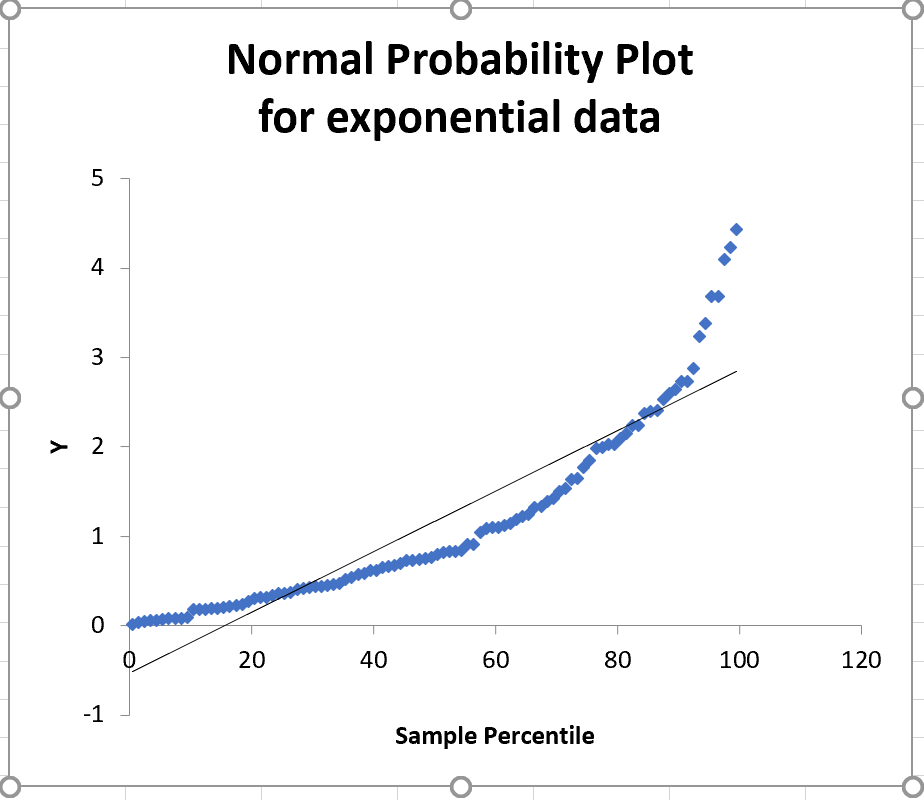
A random sample drawn from a normal distribution
will have all (or nearly all) of its points near the straight
line of a normal probability plot. It is visually obvious
that this sample is inconsistent with having been drawn from a
normal population.
There are problems with this plot:
The two axes are in the wrong order
The scale for the 'sample percentile' axis should be double logarithmic,
not linear.
Confidence interval curves are missing.
Minitab overcomes all of these problems easily.
We can also see what a normal probability plot looks like for data
that really are drawn from a normal population.
In the main menu bar, click on 'Data' then 'Data Analysis'
Find and select 'Random Number Generation'
Click on 'OK'
|
|
 |
Enter the values shown in the 'Random Number Generation' dialog box
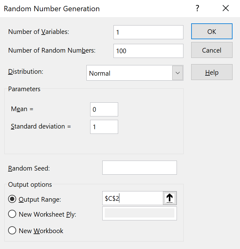
and click 'OK'.
Now we can repeat the steps to create a normal probability plot.
Scroll down the list of Analysis Tools
and click on "Regression"
then click on the "OK" button. |
|
|
 |
|
In the Regression dialog box:
Select the range where your data are stored
(C2:C101) as the
"Input Y Range".
Select the range where the junk data are stored
(D2:D101) as the
"Input X Range".
Check the box for confidence level.
Choose a location for the tables of values,
(most of which will be irrelevant!).
In this example, a separate sheet has been chosen.
Check the last box "Normal
Probability Plots" and
leave all other boxes unchecked.
then click on the "OK" button. |
At the location where the
output was chosen to be, various tables and a graph appear.
Resize the graph.
Right-click on any of the plotted points.
Click on "Add Trendline...".
Ignore the new pane to the right.
You may also wish to tidy the graph up somewhat, to produce a result
like this:
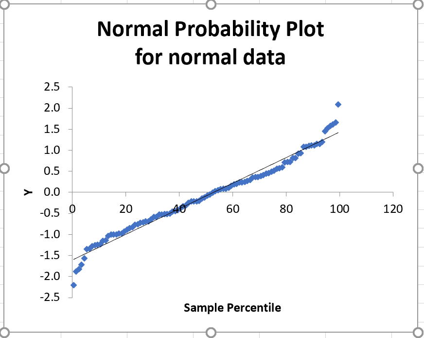
Except for a few points at each end, these sample values
fall very close to the straight line of a normal probability plot.
It is visually obvious
that this sample is consistent with having been drawn from a
normal population.
The Excel file is NormPlot3.xlsx.
Confidence Intervals
We shall use Excel to
- simulate drawing a random sample from a known normal population,
- construct one- and two-sided confidence intervals for the mean,
- draw inferences on the true value of the mean from the confidence
intervals.
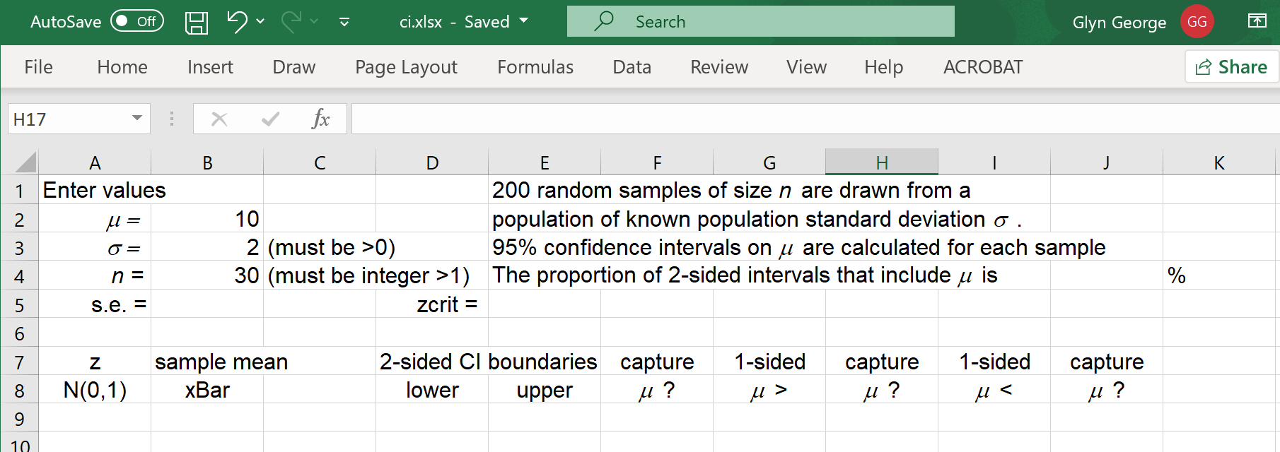
In a new Excel workbook, type in the text shown.
Again I have chosen to change the font for the entire workbook to Arial 12 and
to change the width of the first few columns to 10.
Right clicks on cells (or on characters within a cell entry) allow you to control
cell alignment (left, centre or right) and font (Symbol font italic to change
'm' to the mean μ and 's' to the standard deviation σ)
 |
|
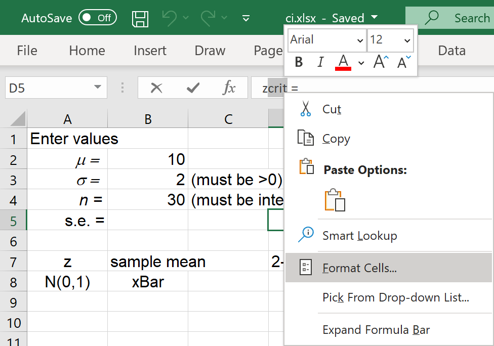
To change 'zcrit' to 'zcrit',
click on cell 'D5',
in the data entry box, highlight 'crit'
and right click on the selected text.
In the pop-up menu,
click on 'Format Cells...' |
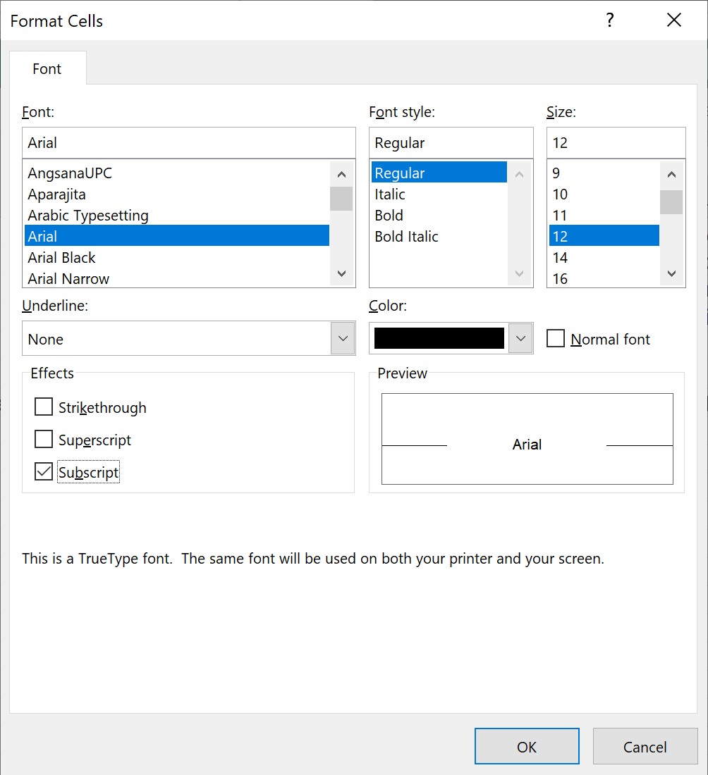
In the new dialog box,
check the box 'Subscript'.
Click on 'OK'.
|
|
 |
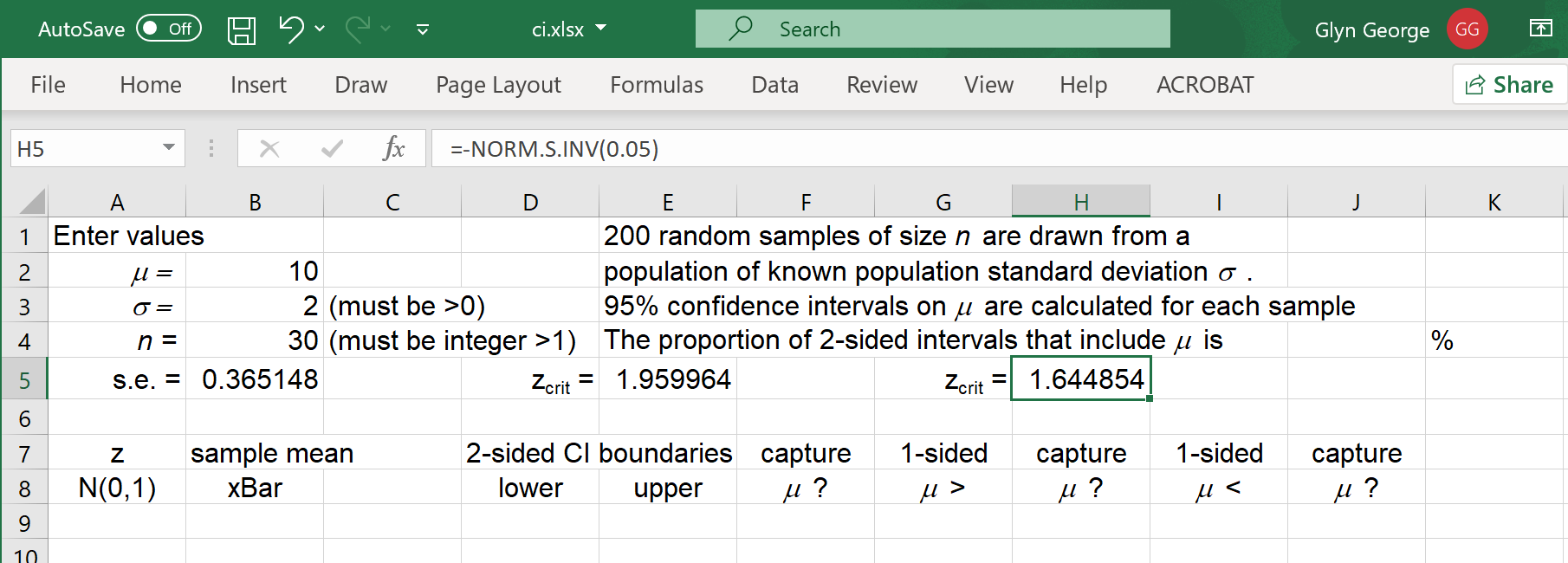
Copy the newly modified cell 'D5' to 'G5'.
The standard error (s.e.) is
the standard deviation σ divided by
the square root of the sample size n.
In cell 'B5' enter = B3/SQRT(B4)
For two sided 95% confidence intervals,
the critical z value is z.025
In cell 'E5' enter
= -NORM.S.INV(0.025)
For one sided 95% confidence intervals,
the critical z value is z.050
In cell 'H5' enter
= -NORM.S.INV(0.05)
In the main menu bar, click on 'Data' then 'Data Analysis'
Find and select 'Random Number Generation'
Click on 'OK'
|
|
|
Enter the values shown in the 'Random Number Generation' dialog box
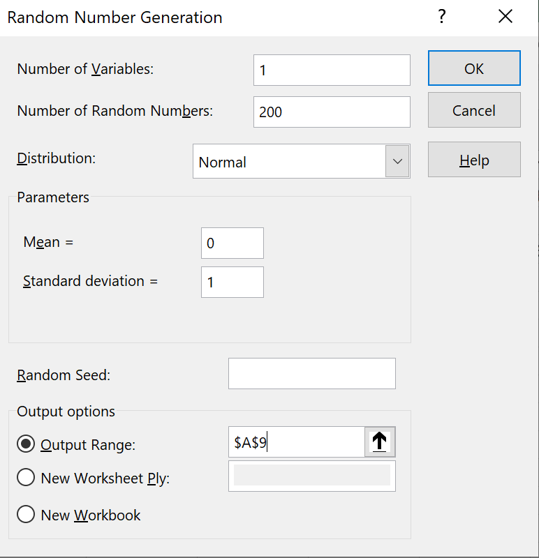
and click 'OK'.
When we scroll down through the data, we wish to keep the top eight rows
in view.
 |
|
Click on cell 'A9',
to make it the active cell.
In the main menu bar, click 'View',
then click on 'Freeze Panes',
then click on the first option.
All rows above cell 'A9' remain in view.
If there were any columns to the left,
then they would remain in view also. |
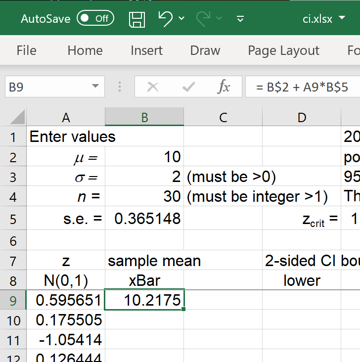
Column 'A' contains values of the standard normal random quantity
Z ~ N(0, 1).
For each simulated random sample, the sample mean is z standard errors
above the true population mean μ.
 |
|
In cell 'B9' enter the formula
= B$2 + A9*B$5
(The '$' provides an absolute reference
when this cell is copied). |
Drag-copy cell 'B9' down to row 208.
When the population standard deviation σ is known, the
boundaries cL, cU
of the two-sided (1 – α)
confidence interval are at
xBar ± zα/2×(s.e.)
The one sided lower confidence interval is
μ < xBar +
zα×(s.e.)
The one sided upper confidence interval is
μ > xBar –
zα×(s.e.)
The two sided confidence interval captures the true value of the
population mean if and only if
cL < μ < cU
Similarly, the one sided confidence interval captures the true value of the
population mean if and only if μ is inside the interval.
Enter the following formulas:
| In cell 'D9': | = B9-E$5*B$5 |
| In cell 'E9': | = B9+E$5*B$5 |
| In cell 'F9': | = IF(B$2>D9,IF(B$2<E9,1,0),0) |
| In cell 'G9': | = B9-H$5*B$5 |
| In cell 'H9': | = IF(B$2>G9,1,0) |
| In cell 'I9': | = B9+H$5*B$5 |
| In cell 'J9': | = IF(B$2<I9,1,0) |
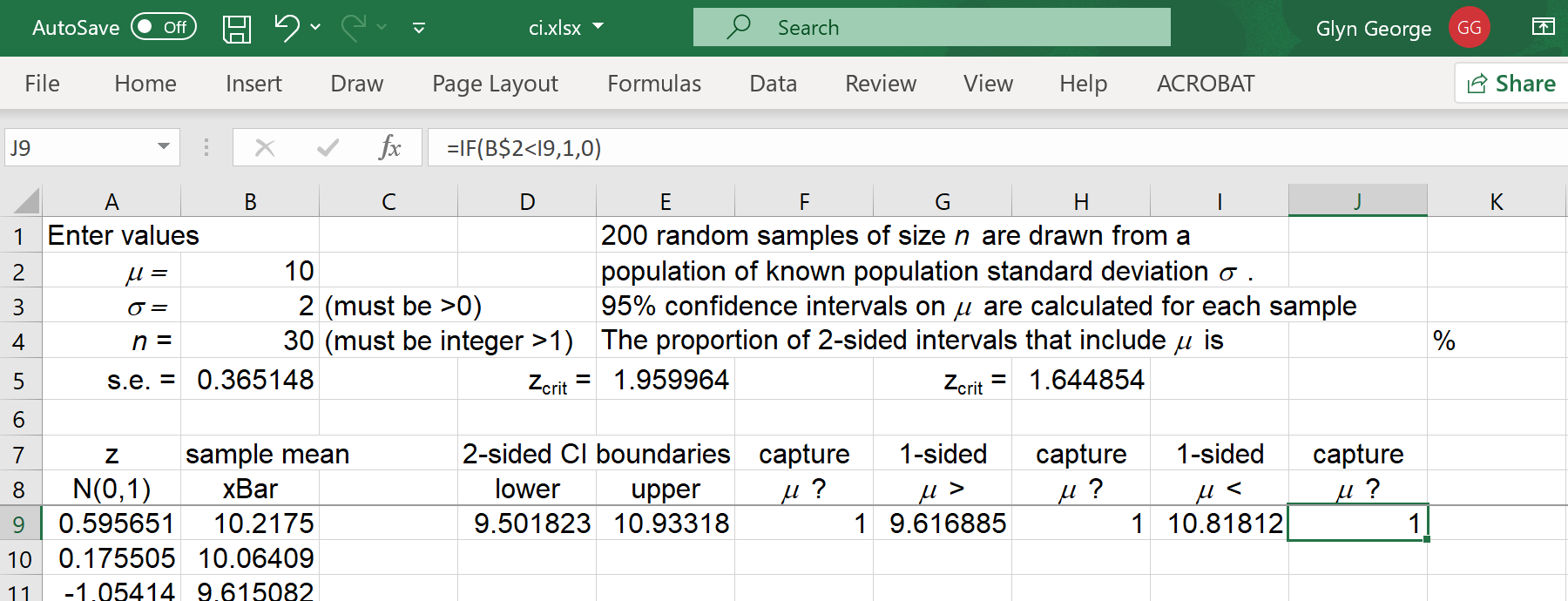
Drag-copy cells 'D9' to 'J9' down to row 208.
Column 'E' now records how many times the 2-sided confidence interval
captured the true value of μ.
In cell 'J4' enter = SUM(F9:F208)/2
Unfortunately, pressing 'F9' will not draw a new set of 200
random samples.
One has to overwrite the values in column 'A'
with a new set of random normal values.
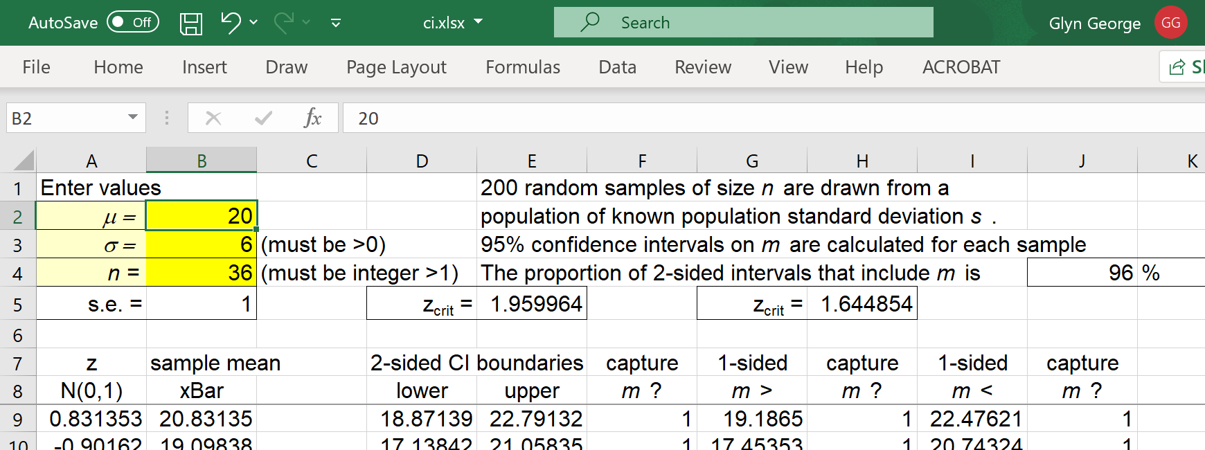
The proportion of intervals that contain the true mean will vary,
but will mostly be close to 95%.
The user can vary the values of μ, σ and n.
One can extend this spreadsheet to simulate 99% confidence intervals (or
any other level of confidence) by amending the formula for the critical
z value in cells 'E5' and 'H5'.
A more extensive revision, requiring the use of Excel macros or a
commercial add-in, is to estimate the population standard deviation
by the sample standard deviation of each random sample.
Critical values of z should be replaced by the corresponding
critical values of tn-1.
Also available is a Minitab
macro to simulate the construction of confidence intervals, from many
random samples, for a population mean and to show more effectively that
the proportion of 95% confidence intervals that capture the true value of the
population mean is close to 95%.
 [Return to the index of
demonstration files]
[To the next tutorial]
[Return to the index of
demonstration files]
[To the next tutorial]

[Return to your previous page]
Created 2020 04 10 and most recently modified 2021 02 10 by
Dr. G.H. George
![[graph]](distnorm.gif)
![[graph]](distlognorm.gif)
![[graph]](distcauchy.gif)
![[graph]](distbeta18_2.gif)