The results of the cointoss simulation
should appear in the worksheet window.
Again note that the contents of columns
C2 and C3 will change with each run.
![[screenshot]](i225data2.png)
In the Minitab tutorial #2 (coin toss example), the lengthy block of command and subcommands,
### Plot the relative frequency as a time series plot:
Tsplot 'Rel.Freq.';
  Scale 2;
    MODEL 1;
      Tick 0.3 0.4 0.5 0.6 0.7;
      Min 0.3;
      Max 0.7;
    EndMODEL;
  AxLabel 1;
    ADisplay 1;
    Label "# coins";
      ALevel 1;
  Index;
  Connect;
    Type 1;
    Size 2;
  Symbol;
    Type 0;
    Size 0.75;
  Title "ENGI 4421 Empirical Probability";
  SubTitle "Coin Tossing Experiment";
  Footnote;
    FPanel;
  NoDTitle.
was generated as follows.Tsplot
command shown above.
|
The results of the cointoss simulation Again note that the contents of columns |
|
On the main menu bar, |
![[screenshot]](i202menu.png) |
![[screenshot]](i202Dialog.png) |
Accept the default "Simple". Just click "OK". |
This dialog box window opens.
![[screenshot]](i203dialog.png)
In the large variables pane at the left,
double click on the variable
"C3 Rel.Freq.".
It should appear in the upper right pane "Series".
Click on the "Labels" button of the main "Time Series Plot: Simple" dialog box.
On the new dialog box, ensure that the first tab
"Titles/Footnotes" is active.
Enter appropriate text in the title box(es).
![[screenshot]](i205dialog.png)
Click "OK" on this dialog box.
Click "OK" on the main "Time Series Plot - Simple"
dialog box.
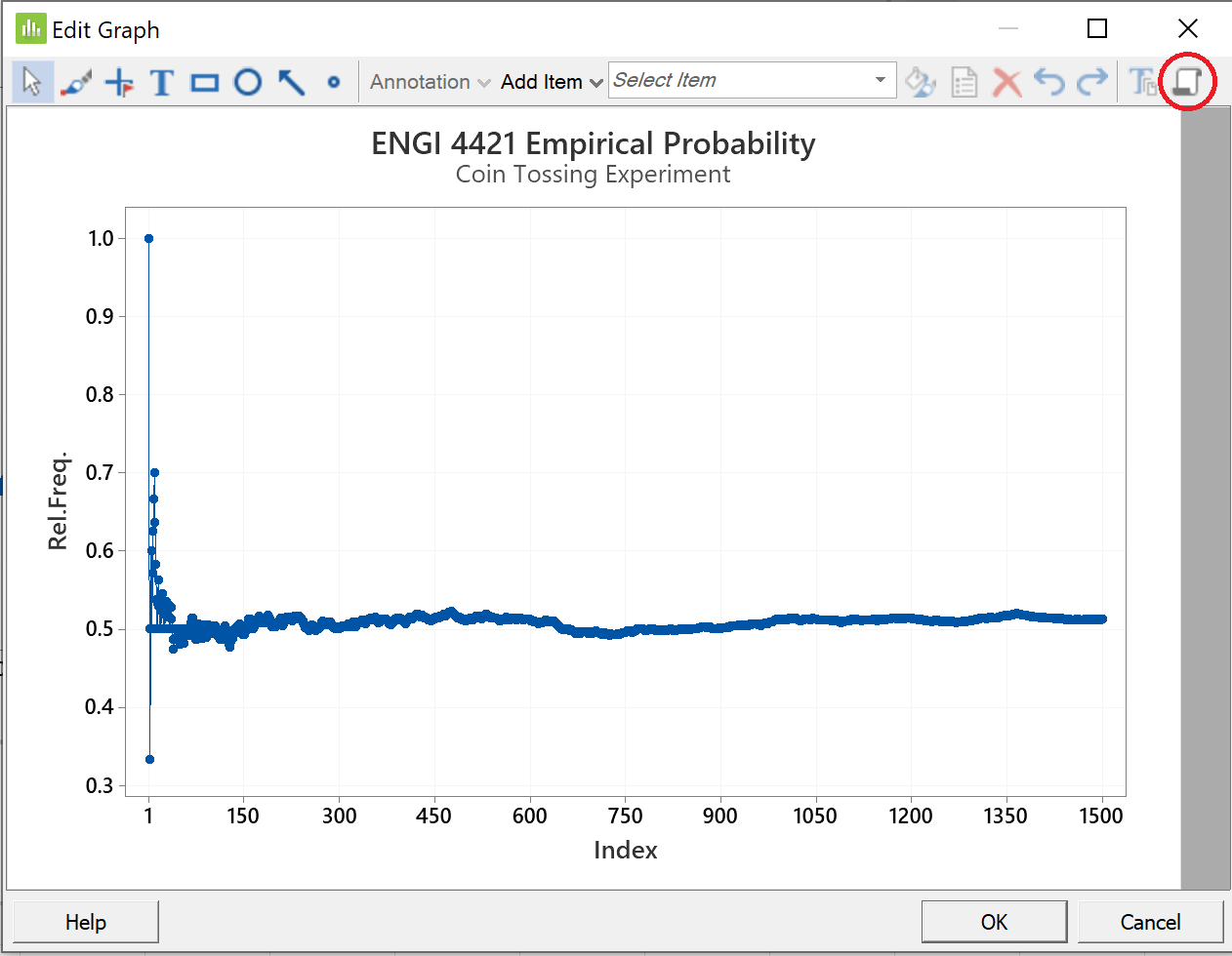
Our time series plot looks like this:
![[screenshot]](i206graph.png)
We need to tidy this graph up.
The hundreds of plotted points are overlapping each other and are obscuring the connecting lines.
We also wish to restrict our attention to ranges of relative
frequency closer to 0.5 .
The interval [0.3, 0.7] is appropriate.
Double click on any part of the plot to bring up the 'Edit Graph' window.
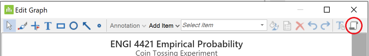
Click the icon in the top right corner "Copy Command Language'.
This will place the commands on the clipboard.
Double-click on any number by the vertical axis.
![[screenshot]](i207dialog.png) |
On the first tab "Scale", Amend the numbers in the text box as shown. In the lower left group Other features can be modified on the other tabs, (not shown here). Click the "OK" button. |
Double-click on the horizontal axis label "Index".
In the "Edit Axis Label" dialog box:
in the lowest text box, Click the "OK" button. |
![[screenshot]](i208dialog.png) |
![[screenshot]](i209dialog.png) |
On the first tab "Attributes", Click the down arrow beside "Type", This will suppress the plotting of the blue symbols, so that only the blue connecting lines will be plotted. Click the "OK" button. |
On the first tab "Attributes", Click the down arrow beside the This will double the width of the Click the "OK" button. |
![[screenshot]](i210editline.png) |
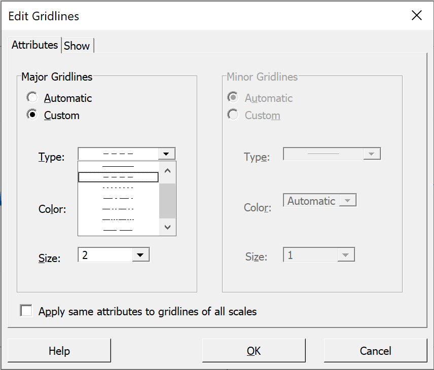 |
We can also make the nearly invisible gridlines more visible. Click on any horizontal gridline. As we have seen before, Click the "OK" button. |
Click again on the "Copy Command Language' icon
to ensure that the various commands to modify the graph are in the clipboard.
Click "OK" to exit from the 'Edit Graph' window.
Your graph should have a similar format to the one shown here.
![[screenshot]](i226plot2.png)
To incorporate all of these options into the macro,
open Notepad,
paste the clipboard into the blank Notepad document and
save it with some appropriate file name.
You can then copy and paste this text onto the end of your previous macro that generated the data for the time series plot.
Save the macro. It should now be as shown near the top of this web page.