Click on the menu item
"Graph", then
Click on
"Probability Plot..." |
|
![[menus]](i210menu.png) |
 |
|
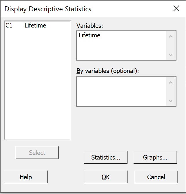
Accept the default "Single"
Just click on the "OK" button. |
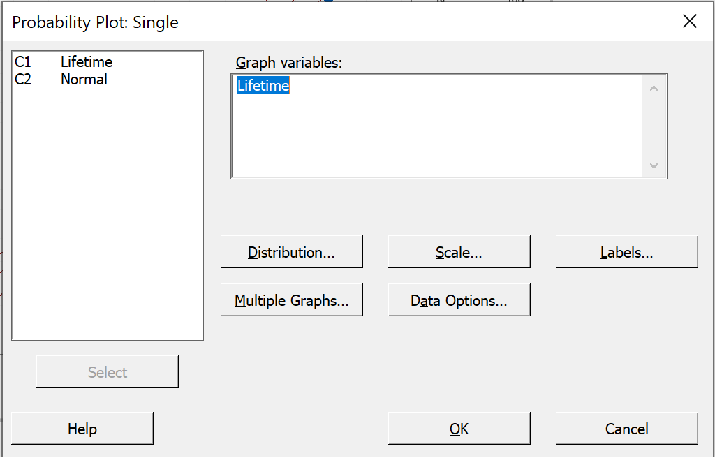
In the left pane of the dialog box,
Double click on "C1 Lifetime"
to select it into the "Graph variables" pane, then
Click on the "Labels..." button.
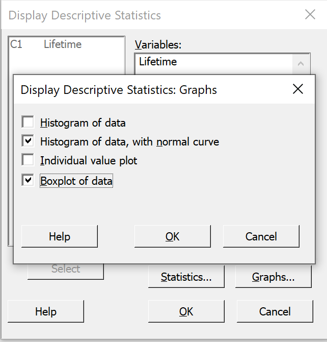
Provide a more meaningful title for the normal probability plot.
Then click on the "OK" button.
Back in the "Probability Plot"
window, click on the "OK" button.
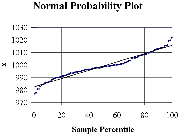
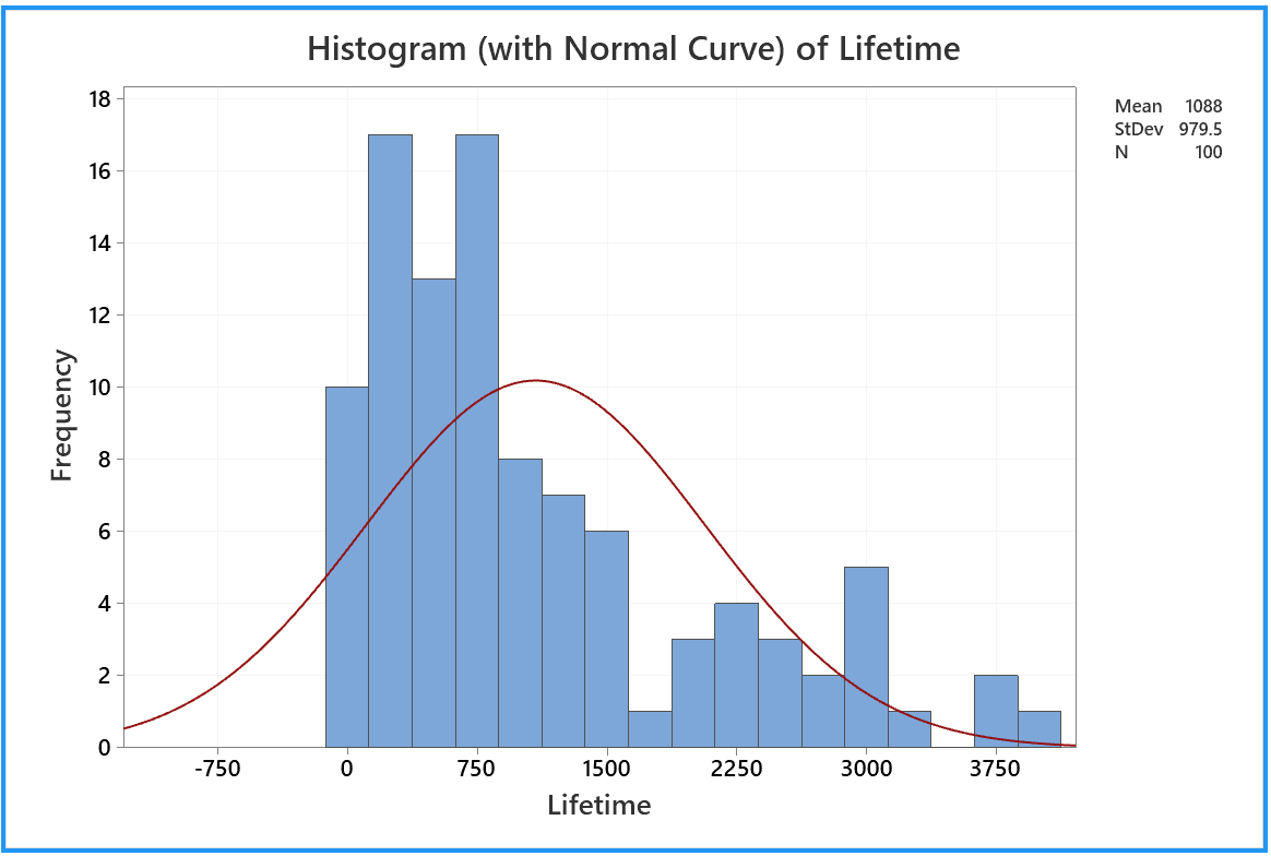
The following normal probability
plot (or something very like it) then appears in a new tab of the
output pane:
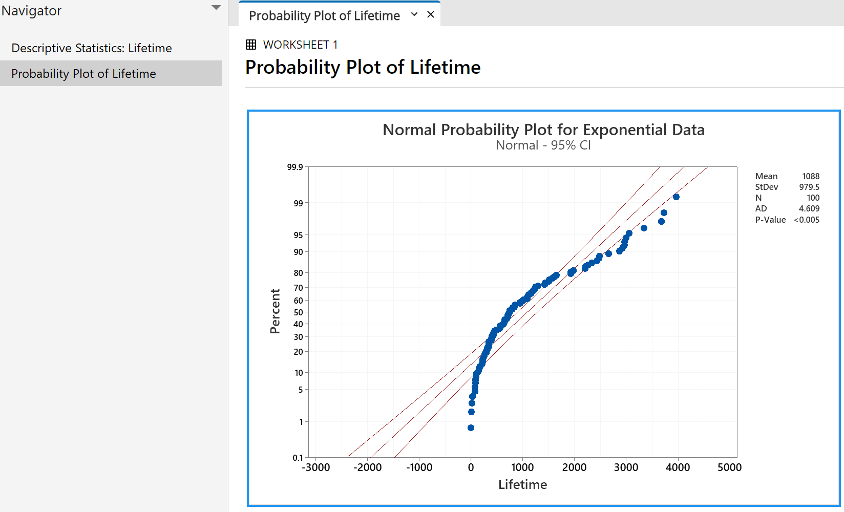
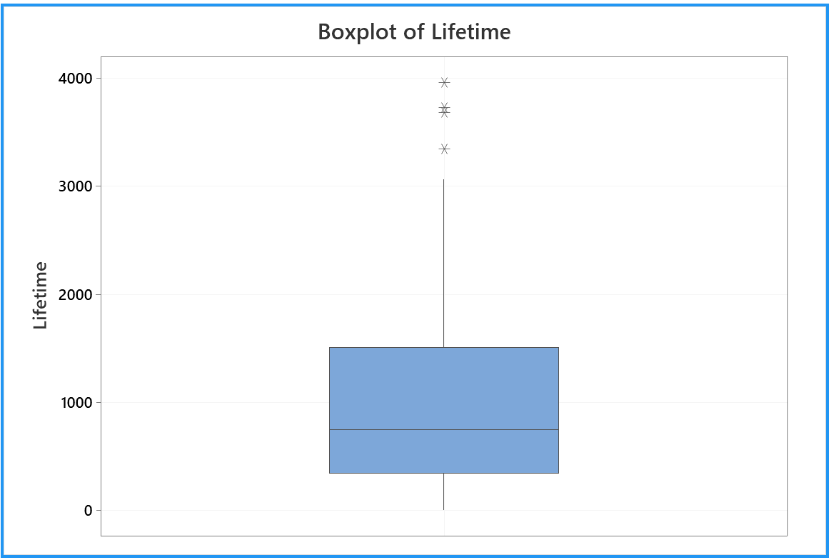
A random sample of size 100, drawn from a normal distribution,
will have all (or nearly all) of its points near the straight
line of a normal probability plot. Only 5% of all points
will fall, by chance, outside the two curves on either side of
the line.
Clearly this data set has not been drawn from a normal distribution.
Here are some other normal probability plots (as produced by
Version 19 of Minitab - similar to Versions 13 to 18).
The set-up is similar to the steps above, except for drawing
the samples from other probability distributions.
 |
|
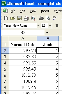
In the worksheet in the data pane,
name column 2 as 'Normal'. |
|
For a sample drawn from the standard
normal distribution:
Click on the menu item "Calc"
Move to "Random Data"
On the new pop-up menu,
click on "Normal..." |
|
![[Menus]](i215menu.png) |
 |
|
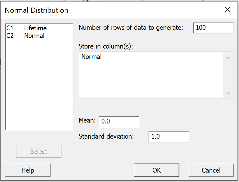
Enter 100 as the 'Number of rows of data to generate'.
Click in the right pane 'Store in column(s)'.
Choices appear in the left pane.
In the left pane of the dialog box,
double click on 'C2 Normal'.
Leave the 'Mean' and 'Standard deviation' at their
default values.
Click 'OK'. |
Click on the menu item
"Graph", then
Click on
"Probability Plot..." |
|
|
|
|
As before, accept the default "Single"
Just click on the "OK" button. |
|
Minitab remembers your choices
from your previous visit to this
dialog box in this session.
In the left pane,
double click on 'C2 Normal'
to replace the graph variable.
Then click on the 'Labels' button. |
|
 |
 |
|
Again Minitab remembers your most recent choice.
Replace the word 'Exponential' by the word 'Normal'.
Then click 'OK' on this and the previous dialog boxes. |
A new tab appears in the output pane.
100 data drawn from a standard Normal distribution N(0, 1)
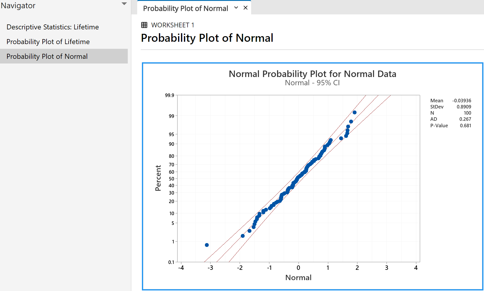
Note how nearly all points lie within the two curves, close to a
straight line.
In this simulation, only one of the 100 points is clearly outside the
95% confidence bands.
The 'P-value' of 0.681 indicates that 68.1% of all future samples drawn
randomly from this population will show a greater deviation from the
ideal normal distribution than this sample does. We are
therefore very confident that this sample came from the standard
normal distribution (which, of course, it did!).
Similar steps allow us to explore normal probability plots for samples
drawn at random from other probability distributions.
100 data drawn from a standard
LogNormal distribution.
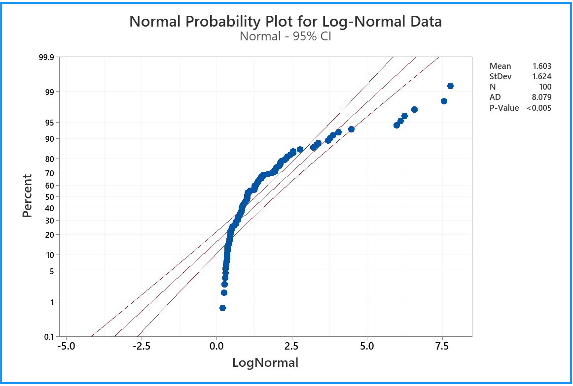
Note how this plot resembles that for the exponential distribution.
100 data drawn from a
Cauchy distribution
of mean 0 and semi-interquartile range 1.
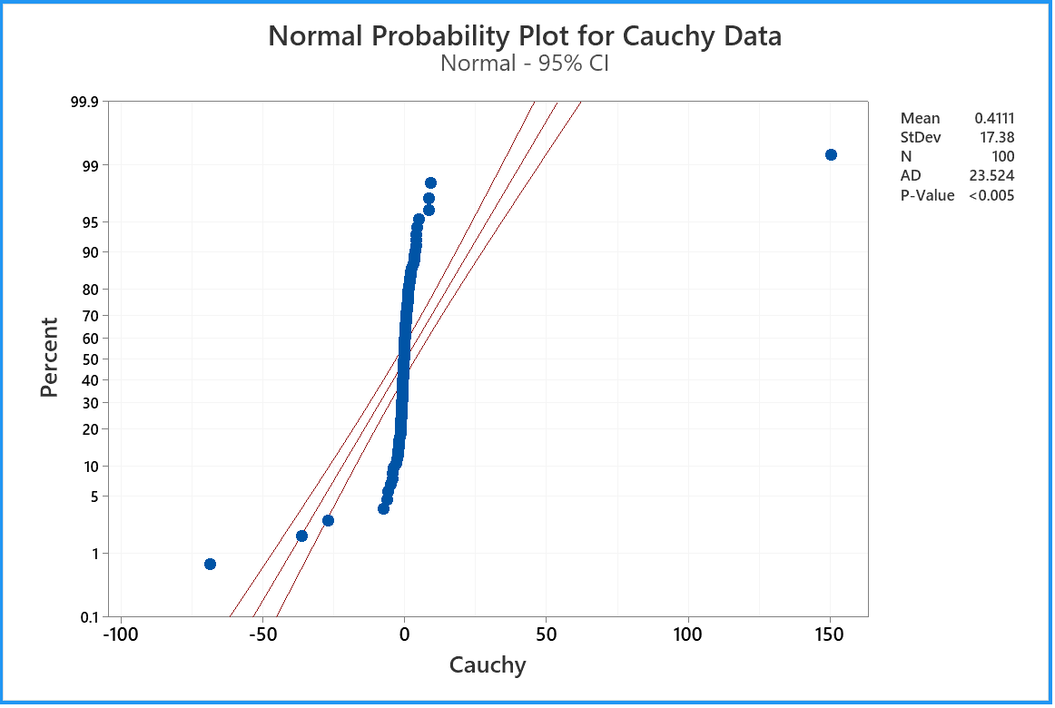
This plot reveals the very heavy tails of the Cauchy distribution.
For the run that produced this plot, the 100 data values had a sample
median very close to the population median value of zero and quartiles
near ±1 (which usually happens).
By chance, very extreme outliers on both sides
(dozens of interquartile ranges away from the median) cancelled out to
leave this sample mean close to zero. If you draw more random
samples from the same Cauchy distribution, you will find instances when
the sample mean is far away from the population mean of zero.
Recall from the last question of
Problem Set 5 that the Cauchy
distribution has a finite interquartile range but an infinite
population variance, which renders the sample mean completely unstable.
100 data drawn from a Beta distribution Beta(18, 2).
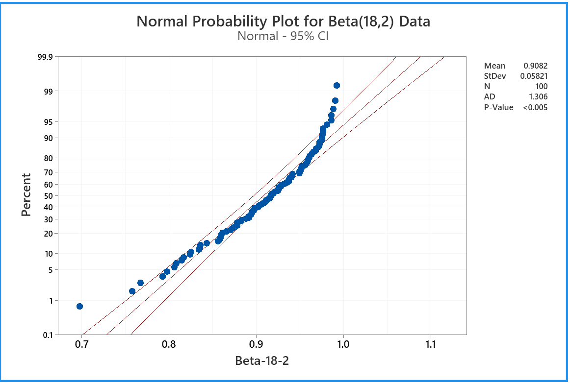
Note how this plot reveals a strong negative skew, together with the
light right tail. The plot clearly shows that these data are
inconsistent with a normal distribution.
Here is one example of a non-normal probability plot.
As before, click on 'Graph' then 'Probability Plot...',
then 'Single' and 'OK'.
In the 'Probability Plot: Single' dialog box,
click on the 'Distribution' button.
In the 'Probability Plot: Distribution' dialog box, first tab 'Distribution',
pull down the menu for 'Distribution' and click on 'Exponential'
Then click 'OK'. You should also adjust the label.
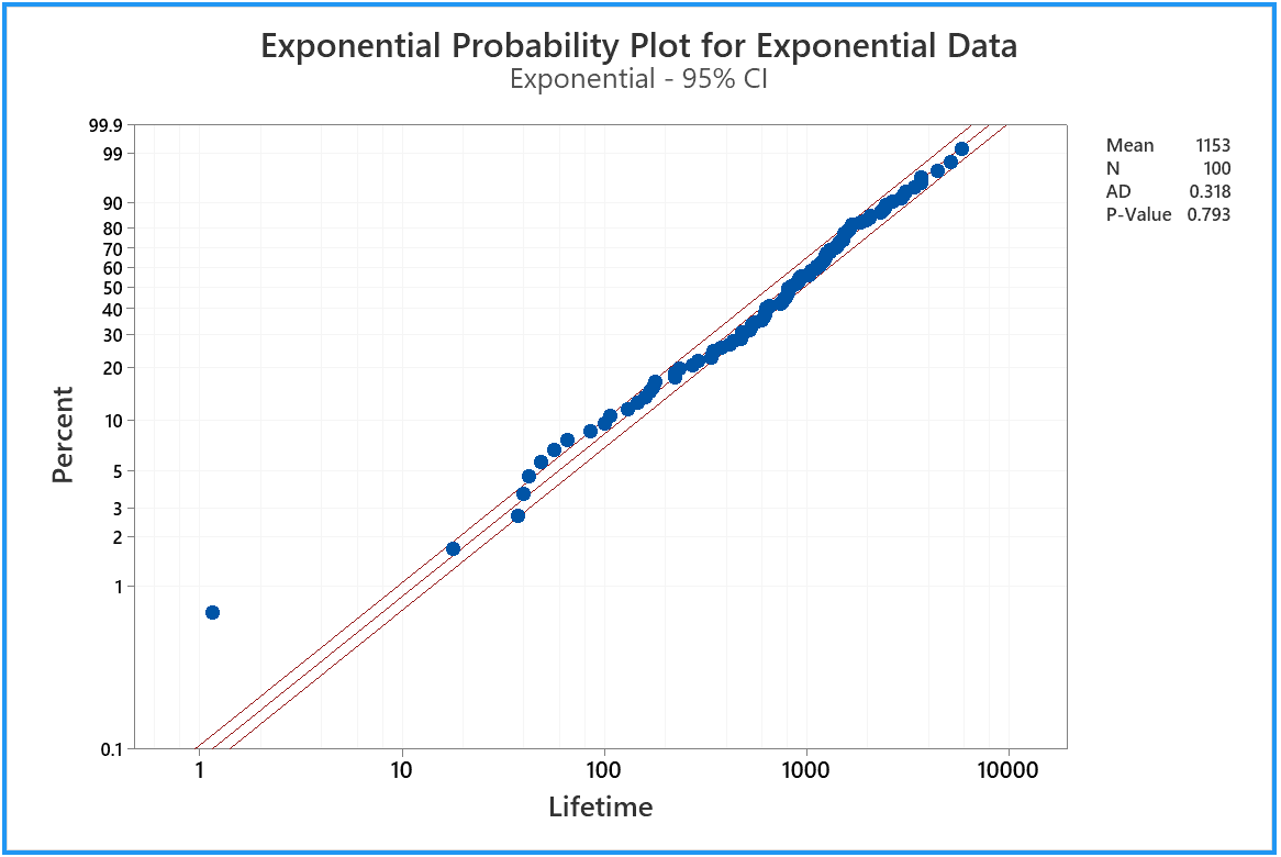
Now we can see that our 'Lifetime' sample is consistent with having been drawn
from an exponential distribution (which, of course, it was!)
Feel free to explore other features of Minitab’s powerful
probability plot options, such as changing the confidence intervals
from 95% to 99%, or changing the normal probability plot to a
probability plot for another distribution.
You can export the results from the various tabs of the output pane
to Word.
Then save your work and exit from Minitab.
The populations from which these
data sets came are illustrated here, in their standard forms.
standard exponential
![[graph]](distexp.gif) |
standard normal
![[graph]](distnorm.gif) |
standard log-normal
![[graph]](distlognorm.gif) |
standard Cauchy
![[graph]](distcauchy.gif) |
beta (18, 2)
![[graph]](distbeta18_2.gif) |
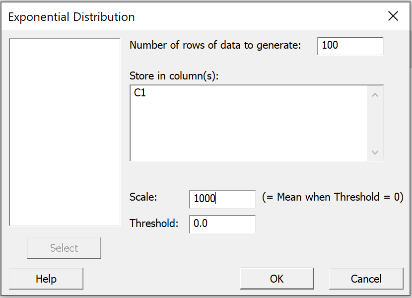
In a new project,
begin by naming column C1 |
|
 |
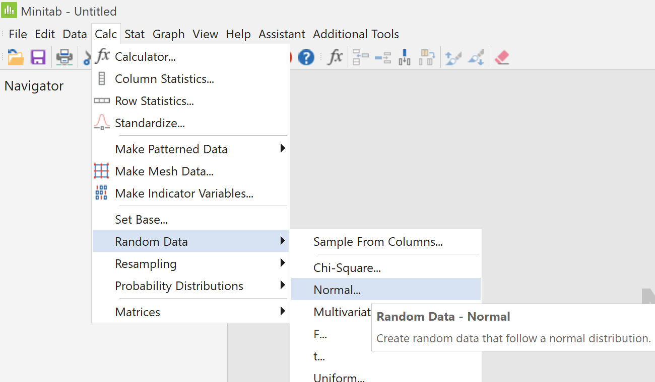
From the "Calc" menu, select
"Random Data" then click on
"Normal..."
 |
|
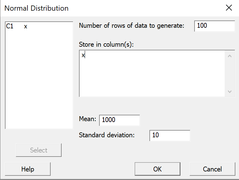
In the dialog box that pops up;
enter 100 as the "Number of rows of data to
generate";
select x for "Store in column(s)";
enter 1000 for the "Mean";
enter 10 as the "Standard deviation"; and
click "OK". |
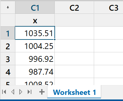
A random sample of 100 values
should now appear in column C1 x of the worksheet
in the data pane.
These values have been drawn randomly from
a normal distribution of population mean 1000
and population standard deviation 10 |
|
 |
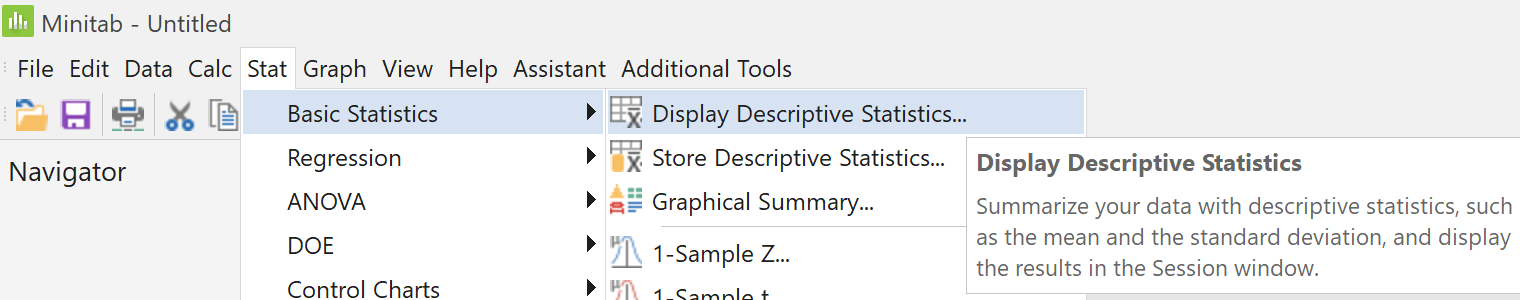
From the "Stat" menu, select
"Basic Statistics" then click on
"Display Descriptive Statistics..."
 |
|
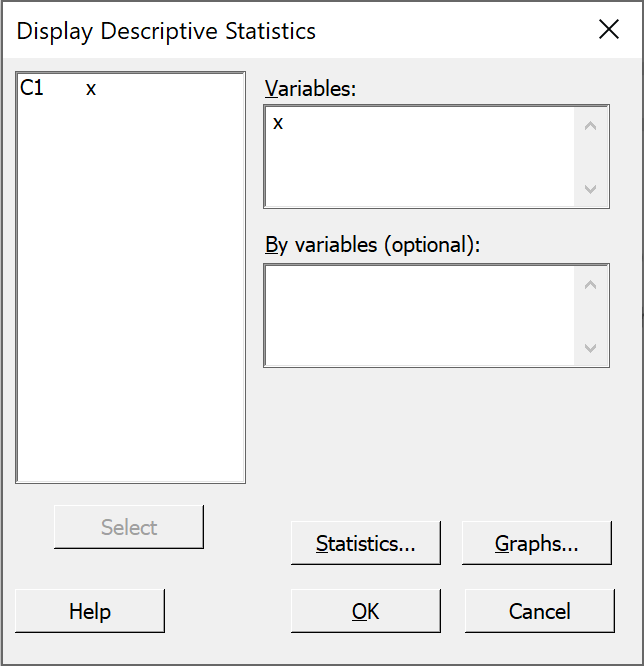
In the left pane of the dialog box,
double click on 'C1 x'.
Accept all of the defaults by just clicking
"OK".
|
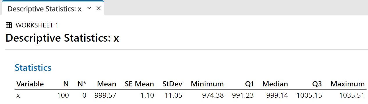
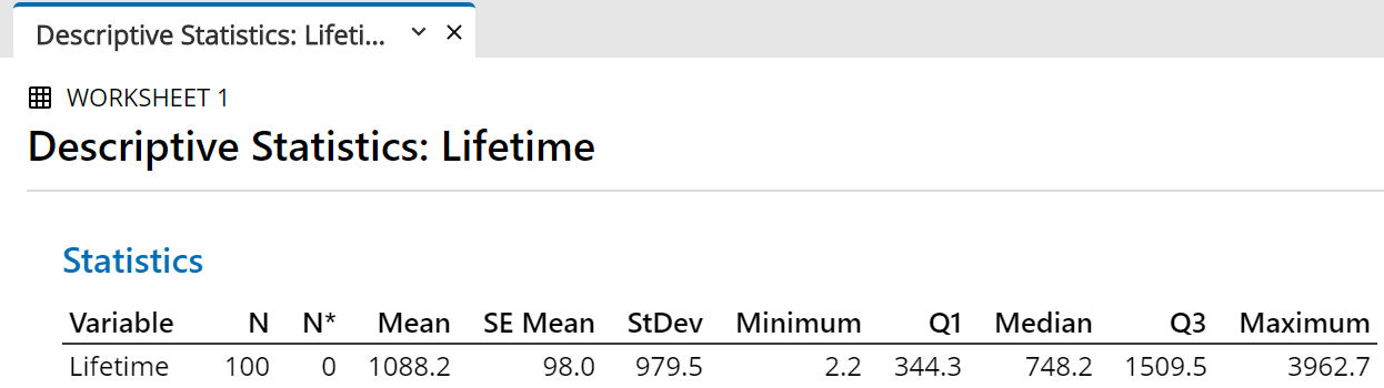
The summary statistics for your random sample then appear in the
output pane.
The exact values will vary each time.
The sample mean and sample median are usually close to but not exactly 1000
and the sample standard deviation is usually close to but not exactly 10,
(and therefore the sample standard error is close to
 ).
).
Now let Minitab find a 95% two-sided confidence interval for the population
mean µ , based on this random sample.
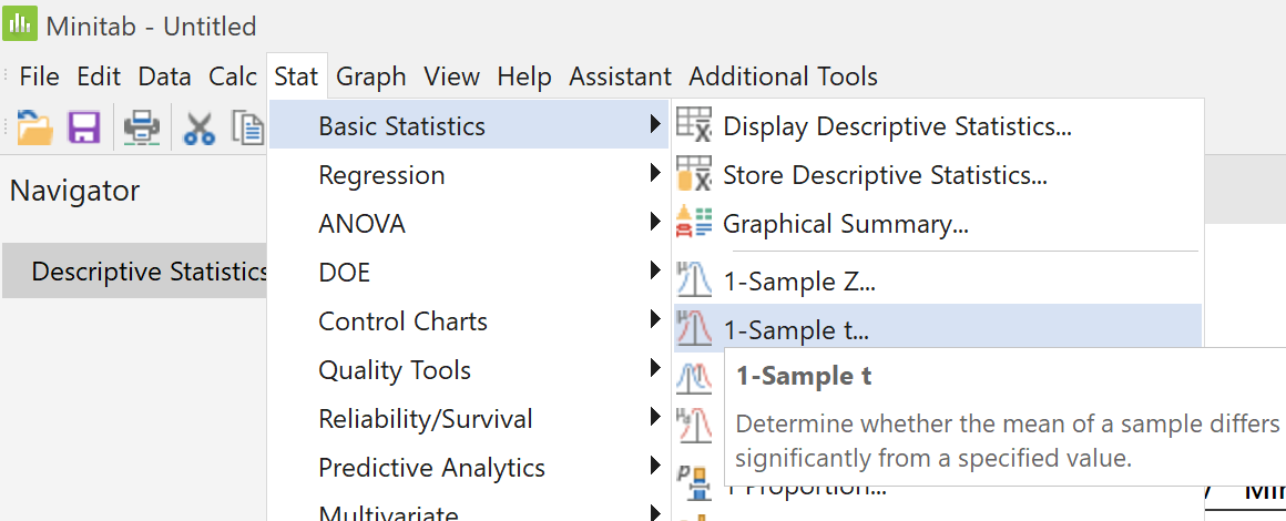
From the "Stat" menu, select
"Basic Statistics" then click on
"1-Sample t..."
 |
|
In the dialog box "One-Sample t for
the Mean" that pops up,
Click on the larger right pane.
In the left pane the only column with data appears.
Double click on C1 x
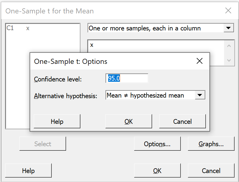
Click on the "Options" button. |
 |
|
In the secondary pop-up window we see
"95.0" for the
"Confidence level"
and "Mean not= hypothesized mean"
(which means a two-sided interval)
for "Alternative hypothesis"
Just accept these defaults for now and
click "OK" on this dialog box, then
click "OK" on the first dialog box. |
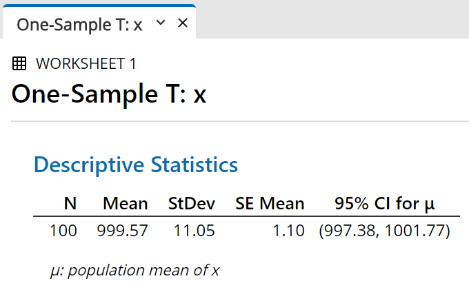
Using the sample mean, the sample size
and the sample standard deviation,
Minitab constructs a 95% two-sided
confidence interval for µ .
The result is displayed in the output pane. |
|
 |
We can easily change the level of confidence and/or replace the two-sided
interval by a one-sided interval.
 |
|
Repeat the steps
"Stat" menu →
select "Basic Statistics"
→
click on "1-Sample t..."
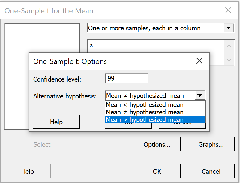
In the dialog box "One-Sample t for
the Mean" that pops up,
Click on the "Options" button.
In the secondary pop-up window shown here,
change the "Confidence level" from
"95.0" to "99.0"; then
on the line "Alternative hypothesis",
click on the pull-down arrow beside
"Mean not= hypothesized mean" and select
"Mean > hypothesized mean" instead.
Click "OK" on this dialog box, then
click "OK" on the first dialog box.
|
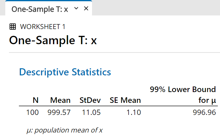
The 99% one-sided confidence interval for
µ
now appears in a new tab in the output pane.
Speaking loosely, we are “99% sure that
µ
is greater than” the value shown here
(in this illustration, 996.96)
|
|
 |
 |
|
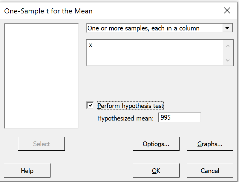
We can also conduct a classical hypothesis test,
by repeating the steps above except for
checking the box "Perform hypothesis test"
and selecting a value for the null hypothesis. |
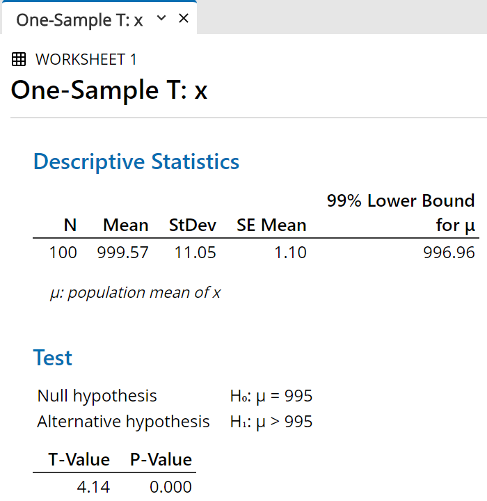
The additional information appears in the
output pane, after the confidence interval.
The t value can be compared to the
appropriate critical t value (Method 2 in class).
The P value is the probability that another random
sample would produce a sample mean at least as
extreme as the one we have, given that the population
mean truly is the value that we chose for the
"hypothesized mean" in the previous
dialog box.
In this illustration the P value is less than 0.0005
(which rounds off to 0.000 to three decimal places), so
that we are very confident indeed (better than 99.95%)
that the true mean is greater than 995.
Of course, we know that the true population mean in
this case is actually 1000 exactly.
|
|
 |
You are encouraged to construct both 95% and 99% confidence intervals,
two-sided and one-sided, with other data sets.
Assignment #2 requires both a normal
probability plot and a one-sided confidence interval.
![[Menus]](i201menu.png)
![[Menus]](i204menu.png)
![[Menus]](i19toolsmenu.jpg)
![[menus]](i22menus.jpg)