ENGI 4421 - Fourth Minitab Tutorial
Two Sample Hypothesis Tests
& Regression using MINITAB
In this session we shall use Minitab® to
Two-sample Unpaired Hypothesis Test
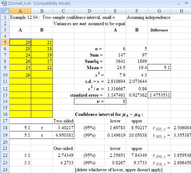
Example 12.04 provides the following information
An investigator wants to know which of two electric toasters
has the greater ability to resist the abnormally high
electrical currents that occur during an unprotected power
surge. Random samples of six toasters from factory A
and five toasters from factory B were subjected to a
destructive test, in which each toaster was subjected to
increasing currents until it failed. The distribution
of currents at failure (measured in amperes) is known to
be approximately normal for both products. The results
are as follows:
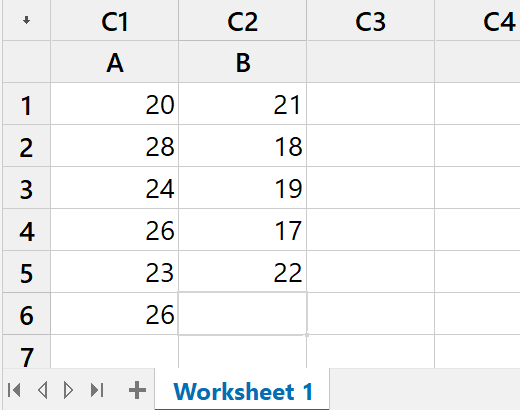
Factory A: 20 28
24 26 23 26
Factory B: 21 18
19 17 22
Conduct the appropriate hypothesis test.
|
Start a new project in Minitab.
Enter the data into the worksheet.
This can be done by copy and paste operations,
but there are so few data that they can be
entered directly. Also label the columns. |
|
 |
|
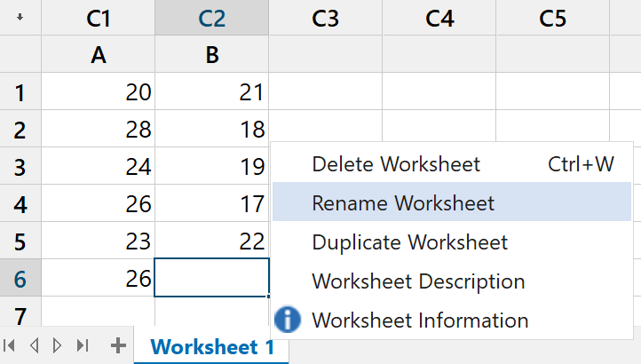
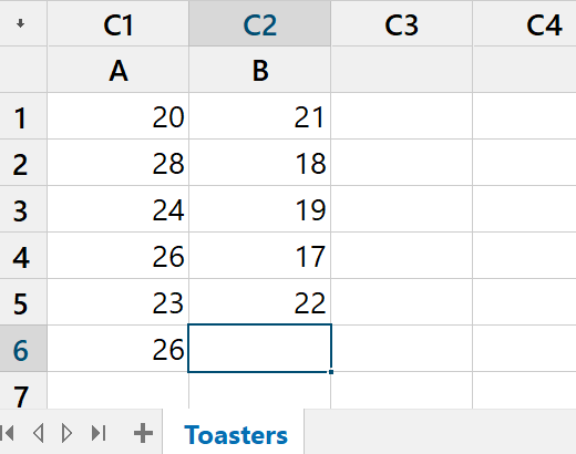
In order to rename a worksheet,
(not required in this example!),
right click on the name
"Worksheet 1",
click on "Rename" in the pop-up menu,
type in the new name and press "Enter" |
|
 |
|
 |
 |
|
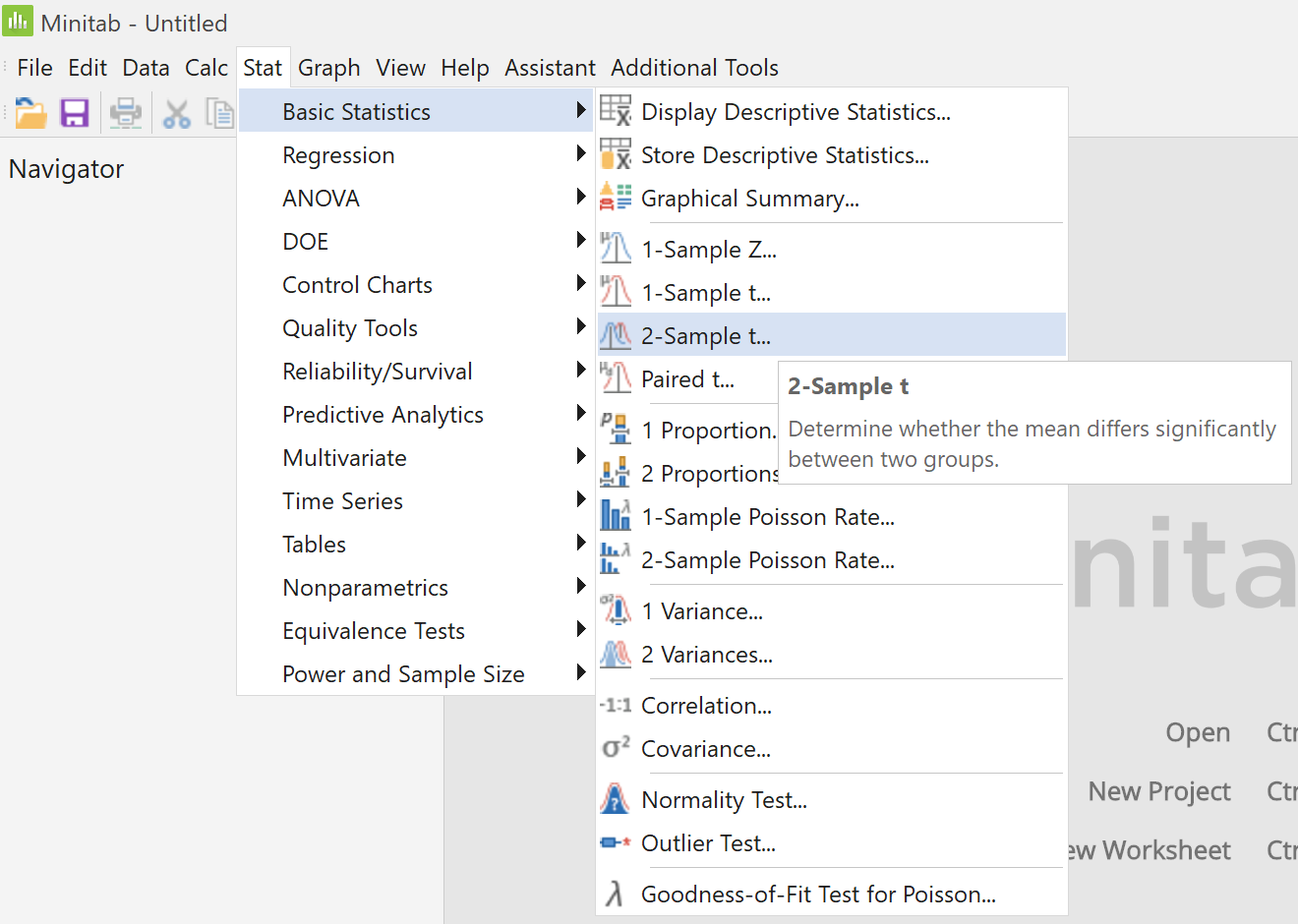
In the main menu,
click on "Stat",
then place the cursor on
"Basic Statistics",
then click on the menu item
"2-Sample t..." |
|
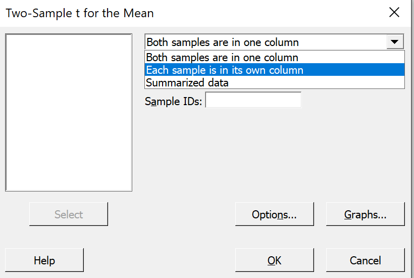
In the upper right pane click on the down arrow,
click on the option
"Each sample is in its own column", |
|
 |
|
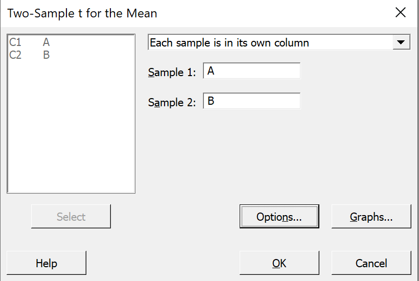
then click on the pane for Sample 1 and
select "C1 A" from the large left pane,
then click on the pane for Sample 2 and
select "C2 B".
Click on the "Options..." button.
|
|
 |
 |
|
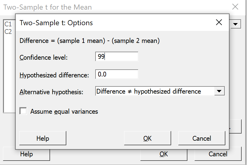
Change the confidence level
from 95.0 to 99.0 .
"Hypothesized difference" = 0.0 is correct.
"Difference not equal hypothesized
difference"
is the correct alternative hypothesis here.
Ensure that the box
"Assume equal variances"
is not checked.
Click on the "OK" button
and back in the previous dialog box,
click on the "OK" button. |
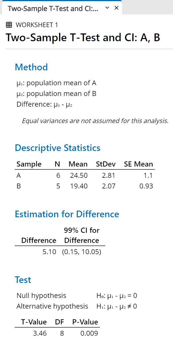
In the output pane, the following results appear:
 |
|
For any of the following reasons,
we can reject the null hypothesis

at a level of significance of 1%:
(difference = 0) is not in the confidence interval; or
the t value of 3.46 is greater than the critical value
t.005, 8 = 3.36; or
the P-value, 0.009, is less than 1% (though not by much!). |
One may also examine the custom
Excel spreadsheet
demos/CI2small_n.xlsx:
Two-sample Paired Hypothesis
Test
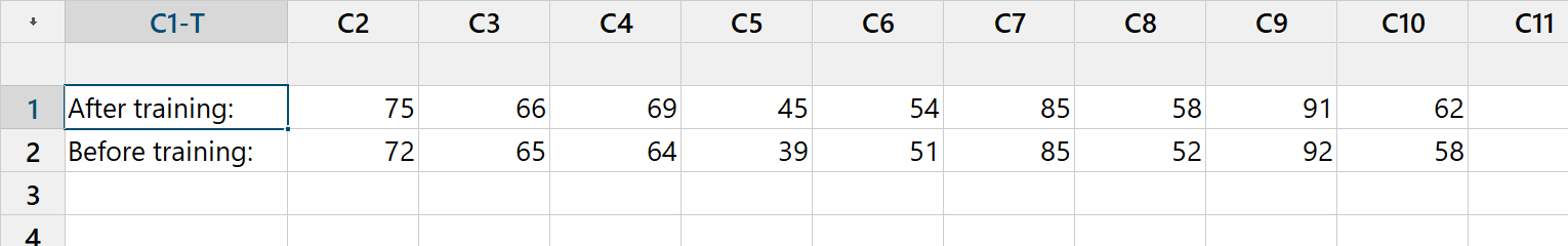
Example 12.05 provides the following example for
a paired t-test.
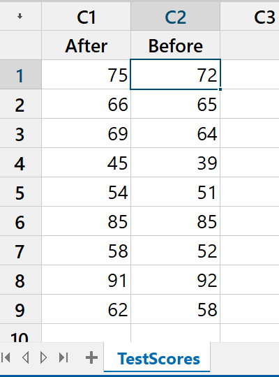
Nine volunteers are tested before and after a training
programme. Based on the data below, can you
conclude that the programme has improved test scores?
| Volunteer: |
1 | 2 | 3 | 4 | 5 |
6 | 7 | 8 | 9 |
| After training: |
75 | 66 | 69 | 45 | 54 |
85 | 58 | 91 | 62 |
| Before training: |
72 | 65 | 64 | 39 | 51 |
85 | 52 | 92 | 58 |
Start a new project in Minitab.
Enter the data into the worksheet.
[Click here to skip the topic of transposing rows
and columns in a Minitab worksheet.]
Transposition of Rows/Columns
of a Minitab worksheet
If we use a copy and paste from this web page,
then the data appear in rows instead of columns.
Having copied the two rows of data from the
web page into the clipboard, click on the first white cell
in the data window and paste at that location.
In the data pane, the worksheet should now appear similar to this.
 |
|
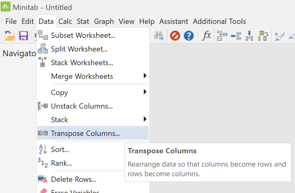
To correct this problem, proceed as follows.
In the main menu,
click on "Data",
then click on the menu item
"Transpose Columns..." |
| |
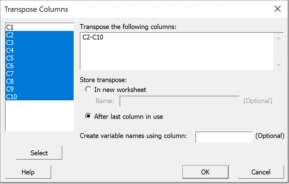
Enter "C2-C10" into the top right pane,
either by typing directly into the right pane
'Transpose the following columns'
or by clicking in the left pane on 'C2',
holding down the shift key while
clicking on 'C10', then
clicking on the 'Select' button.
Select the radio button "After last column in
use".
Click on the "OK" button. |
 |
|
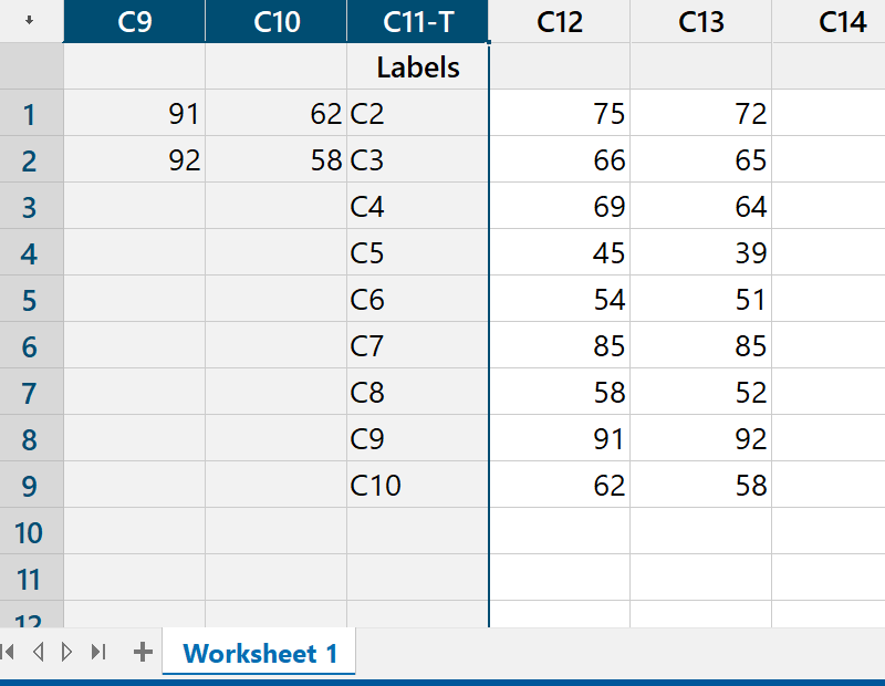
The data appear in the final columns.
Select the header of the first column
"C1",
then Shift+Select the last junk column,
headed "C11-T Labels". |
|
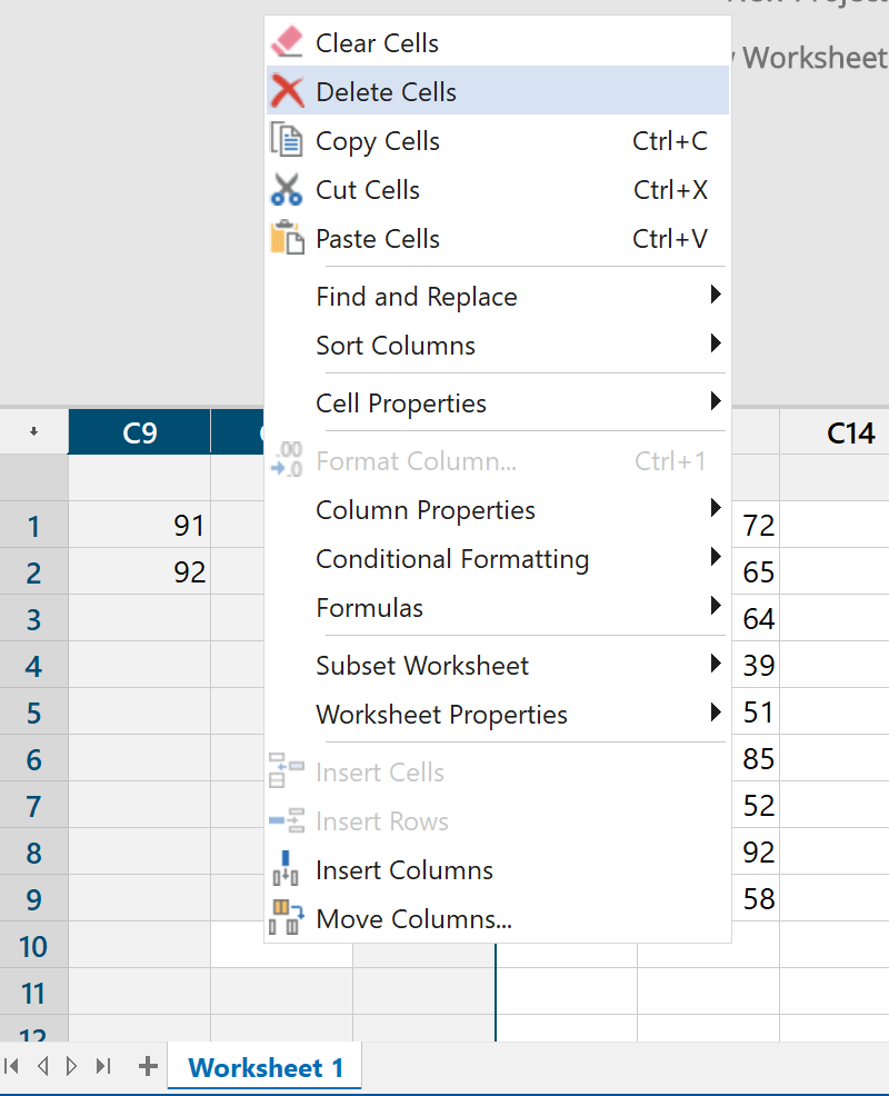
Right click on this selection
and click on
"Delete Cells". |
|
 |
 |
|
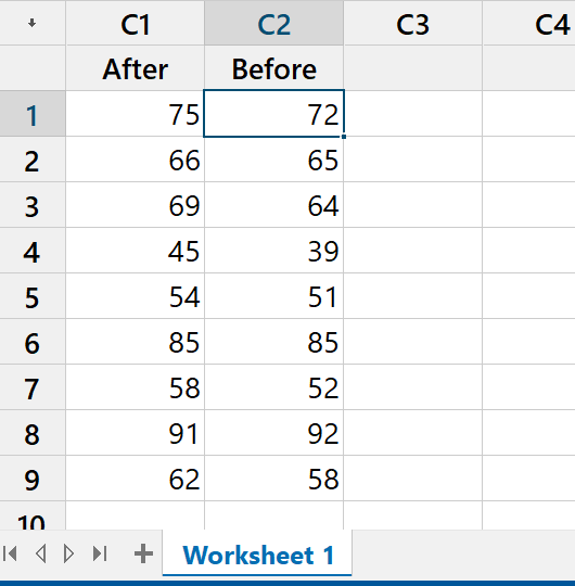
The desired data are now in columns 1 and 2.
Click in the header space just above the first cell
and give appropriate names to these columns |
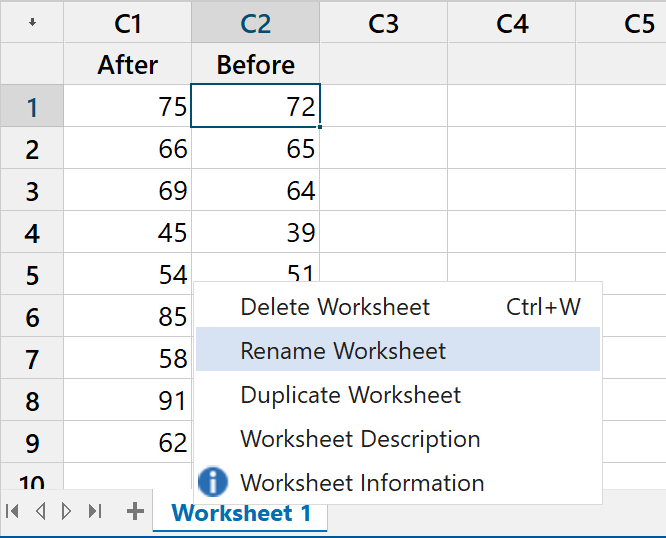
Again we can rename the
worksheet if we wish, by
right-clicking on the worksheet name. |
|
 |
 |
|
The worksheet is now ready. |
Two-sample Paired Hypothesis
Test
 |
|
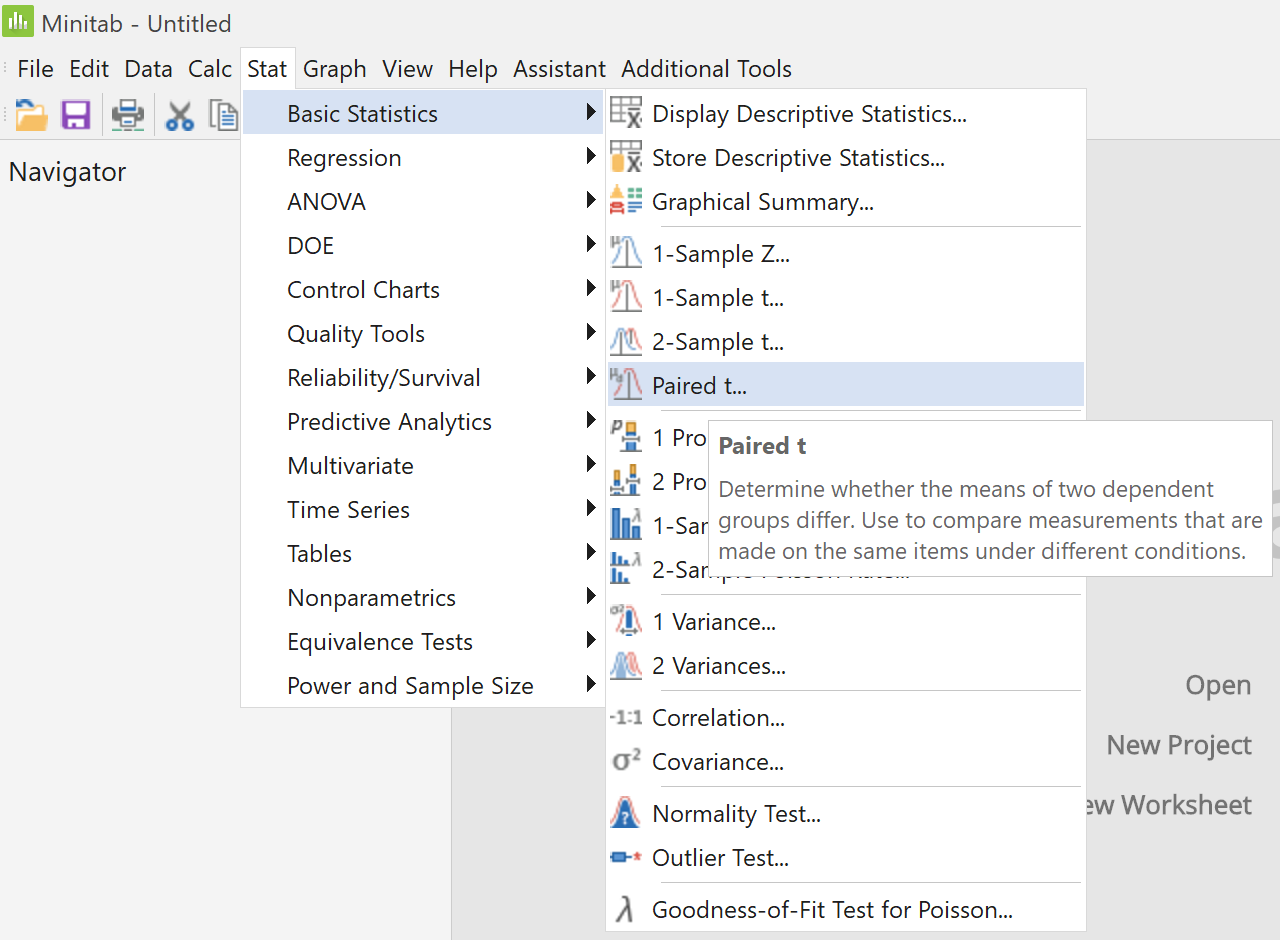
In the main menu,
click on "Stat",
then place the cursor on
"Basic Statistics",
then click on the menu item
"Paired t..." |
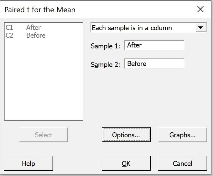
In the dialog box,
Ensure that the default option
"Each sample is in a column"
is showing in the top right pane,
Click anywhere in the box
"Sample 1:",
(so that the column names
appear in the left pane),
Select column "C1 After" into
the box "Sample 1:",
Select column "C2 Before" into
the box "Sample 2:",
and click on the
"Options..." button.
|
|
 |
 |
|
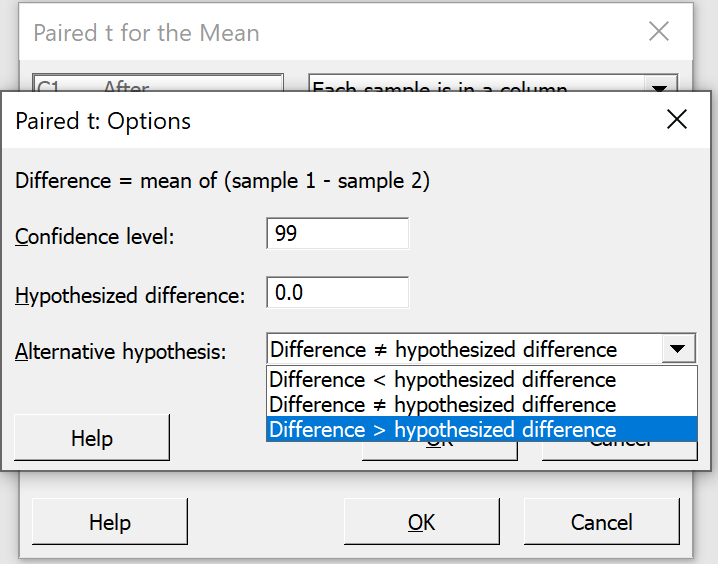
Change the confidence level
from 95.0 to 99.0 ,
click on the down-arrow
to change "not equal"
to "greater than"
in the alternative hypothesis box.
Click on the "OK" button
and back in the previous dialog box,
click on the "OK" button. |
In the Output pane, the following results appear:
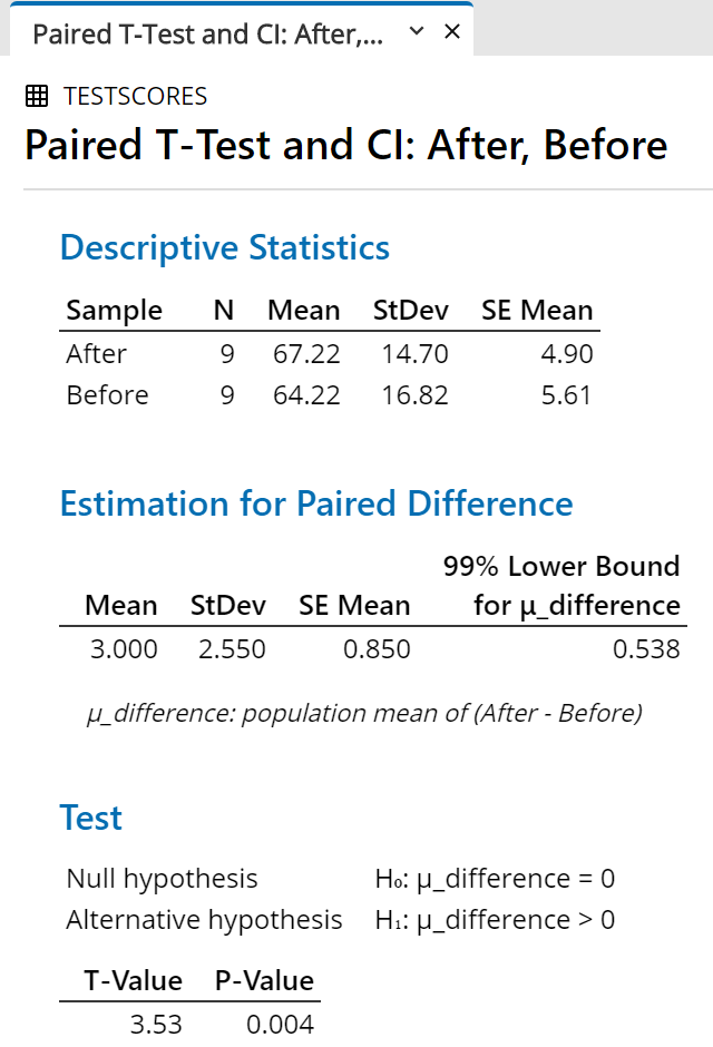 |
|
For any of the following reasons,
we can reject the null hypothesis
at a level of significance of 1%:
(difference = 0) is below the bottom of the confidence interval; or
the t value of 3.53 is greater than the critical value
t.010, 8 = 2.90; or
the P-value, 0.004, is less than 1%. |
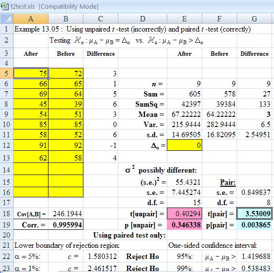
One may also examine the custom
Excel spreadsheet
demos/t2test.xlsx:
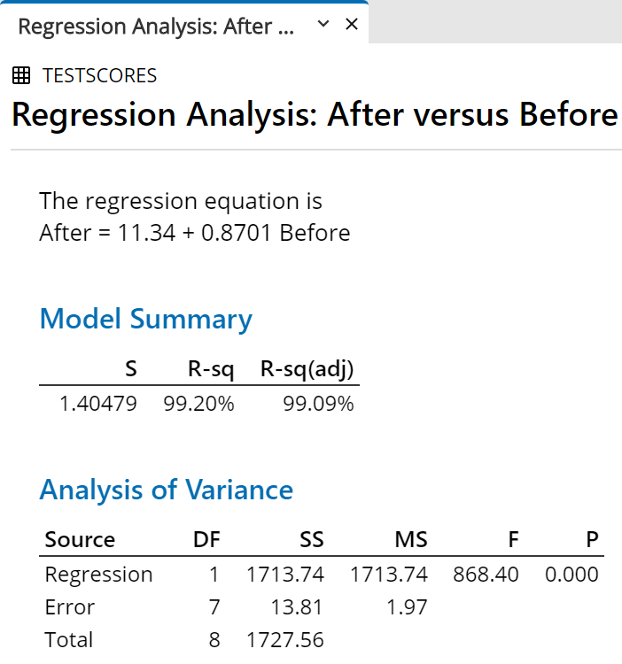
Simple Linear Regression
Example 15.02 (Simple Linear Regression) is based on the
identical data set to the paired t-test example above.
We can find the equation of the line of best fit through the data
in the least squares sense, as follows.
With the worksheet containing
the "Before" and "After" scores open,
in the main menu,
click on "Stat",
then place the cursor on
"Regression",
then click on the menu item
"Fitted Line Plot..." |
|
 |
Click anywhere in the box
"Response [Y]:",
(so that the column names appear in the left pane),
Select column "C1 After" into the box
"Response [Y]:",
Select column "C2 Before" into the box
"Predictor [X]:",
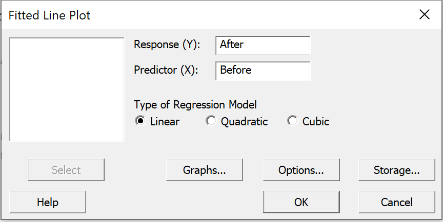
and click on the "Graphs..." button.
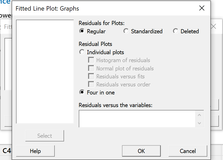 |
|
Click on the radio button "Four in one".
and
click on the "OK" button. |
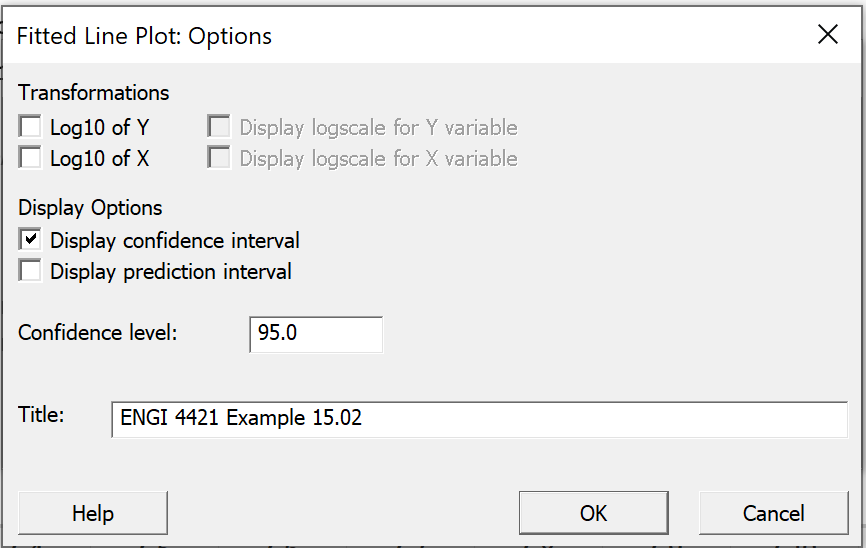
Back in the "Fitted
Line Plot" main dialog box,
click on the "Options..." button.
|
Check the box
"Display confidence interval".
Supply an appropriate title.
Click on the "OK" button.
Back in the 'Fitted Line Plot'
dialog box, click on the "OK" button. |
|
 |
The following graph is produced.
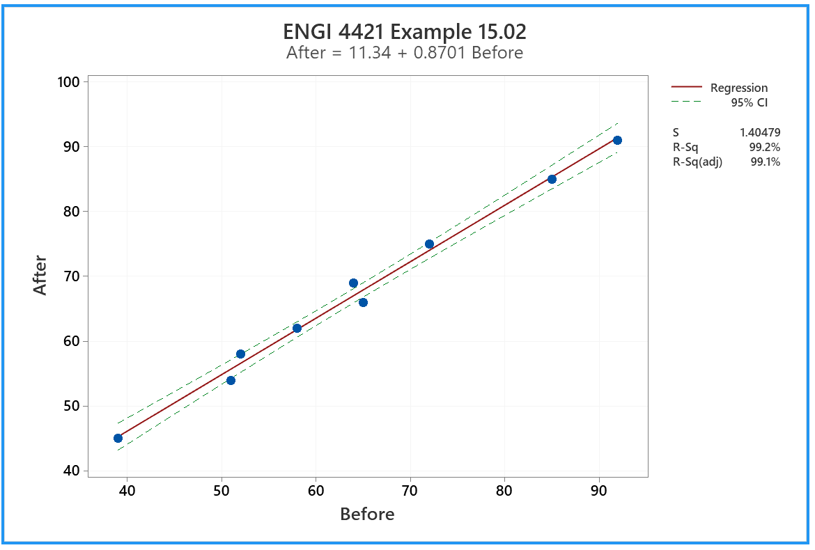
With a coefficient of determination above 99%, it is no surprise
that all of the nine points lie very close to the same straight line.
|
The ANOVA table and
other information
appear in the same output pane. |
|
 |
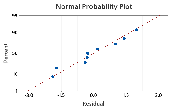
Normal Probability Plot for Residuals
The method of simple linear regression requires the
assumption that the residuals are independent and identically
distributed, with a normal distribution of zero mean and
constant variance. Due to the options exercised in the
"Graphs..." dialog box, we can check
this assumption.
 |
|
Scroll down to the foot of the output pane.
Among the four graphs in the "Residual Plots for
After" group is this normal probability plot of
the residuals.
We can see that the residuals do appear to be consistent
with the assumption of normality. |
 [Return to the index of
demonstration files]
[Return to the index of
demonstration files]
[Return to your previous page]
Created 2003 11 10 and most recently modified 2021 02 19 by
Dr. G.H. George