Minitab® is a powerful statistical package
that has been available in the computer laboratory EN 3000 /
3029, but not remotely. For as long as the pandemic prevents
access to this site licence, the online format of this course will
use Microsoft Office Excel® instead.
Students with access to their own copy of Minitab may wish to
view the former tutorials for that software, starting at
http://www.engr.mun.ca/~ggeorge/4421/demos/t1/index_Minitab.html.
There are some differences between Minitab 18 in those
tutorials and Minitab 19.
In this demonstration, we shall
From the course text, (Navidi, second edition), table 1.2
p. 20:
The data set below consists of observations on particulate
matter emissions x (in g/gal) for 62 vehicles
driven at high altitude.
| 7.59 | 6.28 | 6.07 | 5.23 |
5.54 | 3.46 | 2.44 |
3.01 | 13.63 | 13.02 |
| 23.38 | 9.24 | 3.22 | 2.06 |
4.04 | 17.11 | 12.26 | 19.91 |
8.50 | 7.81 |
| 7.18 | 6.95 | 18.64 | 7.10 |
6.04 | 5.66 | 8.86 | 4.40 |
3.57 | 4.35 |
| 3.84 | 2.37 | 3.81 | 5.32 |
5.84 | 2.89 | 4.68 | 1.85 |
9.14 | 8.67 |
| 9.52 | 2.68 | 10.14 | 9.20 |
7.31 | 2.09 | 6.32 | 6.53 |
6.32 | 2.01 |
| 5.91 | 5.60 | 5.61 | 1.50 |
6.46 | 5.29 | 5.64 | 2.07 |
1.11 | 3.32 |
| 1.83 | 7.56 |
- Produce summary statistics of the data.
- Construct a bar chart of the data, using class intervals
of equal width, with the first interval having lower
limit 1.0 (inclusive) and upper limit 3.0 (exclusive).
- Modify the histogram of the data, combining the class
intervals for [11, 15) into one class and
the class intervals for [15, 25) into one
class
- Construct a tally chart for the following qualitative
descriptions of emissions:
low: [0, 5);
moderate: [5, 10);
high: [10, 15);
very high: >= 15.
 |
|
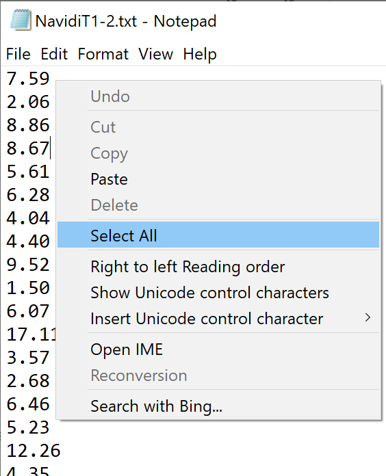
The simplest method to import these data into Excel is to
copy and paste from
http://www.engr.mun.ca/~ggeorge/4421/demos/t1/NavidiT1-2.txt.
From this link open the plain text file
"NavidiT1-2.txt" containing the data,
using a simple program such as 'Notepad'.
Right click anywhere in the main window and click on
'Select All' (or click on the menu item 'Edit' and then
click on 'Select All' or press 'Ctrl A').
Choose any of the usual methods for copying into the clipboard:
'Ctrl+Ins', or 'Ctrl+C', or
right click again on the selected text and click 'Copy'
on the pop-up menu.
The 62 values should now be in the clipboard, ready to be pasted.
|
Open a blank workbook in Excel.
Data Entry
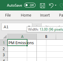
Click on cell 'A1'.
Name that column by typing an appropriate label in that cell,
ending with the 'Enter' key.
'PM Emissions' is now an alias for
the data in column 'A'
|
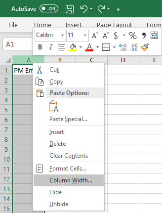
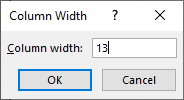
Adjust the column width so that the title fits in the column.
Either place the cursor on the right edge of
column 'A' and drag it,
|
|
|
OR
|
|
right-click on the grey header for column 'A',
click on 'Column Width ...'
and choose a sufficient width in the new dialog box
(13 should be sufficient for the default Calibri 11 font).
|
|
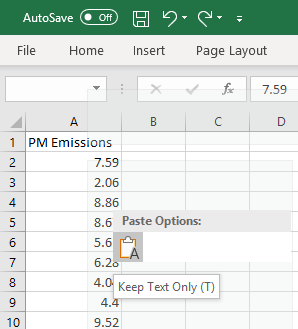
Click on cell 'A2' and paste the values
from the clipboard.
Any of the usual methods should work:
'Shift Ins'
or 'Ctrl V'
or right click and select 'Paste'
|
|
|
By itself, this column of raw data is not very helpful
as we try to grasp the overall picture of PM emissions.
One way to improve visibility is simply to rearrange these
data into ascending order.
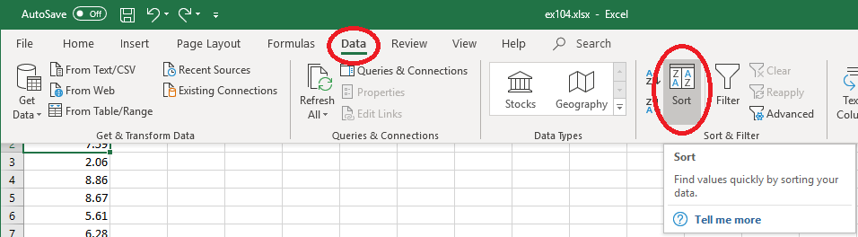
On the main menu bar of the Excel window, click on 'Data',
then on 'Sort...'
In the pop-up dialog box, ensure that the box for
'My data has headers' is checked.
In the left-hand pull-down box for 'Column Sort by", select
the only option, 'PM Emissions'.
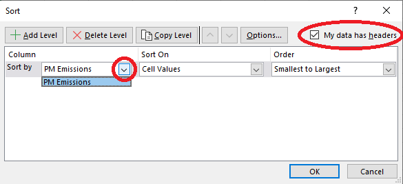
Then click on 'OK'.
|
|
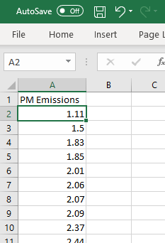
The data should now appear in ascending
order. |
One can tidy the display up.
|
For example, the font can be changed for a cell,
a rectangular block of cells,
a consecutive block of entire rows,
a consecutive block of entire columns
or the entire spreadsheet.
To change the display for the entire spreadsheet,
right-click on the top left corner at the
head of all rows and columns
(the  symbol).
The font can be changed for the selected region
in the upper dialog box.
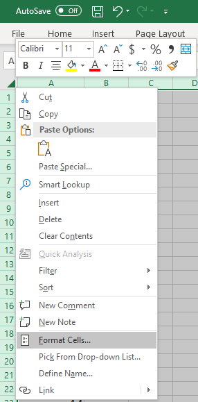
By clicking in the lower dialog box on
'Format Cells ...',
one can change more than the font.
|
|
 |
 |
|
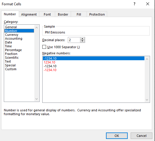
In the 'Number' tab (the left-most tab),
select the Category 'Number'.
The default number of decimal places (2)
is what we want in column 'A'.
Click 'OK'
You should now find all values displayed to two
decimal places,
including values such as 1.50 |
Summary Statistics
Minitab offers basic summary statistics with just a few mouse
clicks. Unfortunately, the user must do much more work in
Excel to achieve a similar outcome.
 |
|
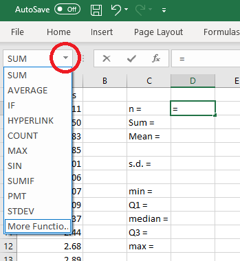
Type the entries shown in column 'C'
In cell 'D2' type '=' (just the equals sign)
then click the down arrow to pull down the menu shown.
Select 'More Functions ...'
|
|
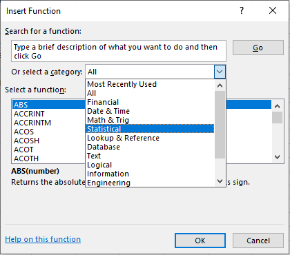
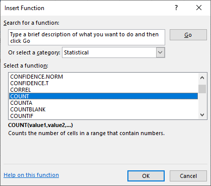
In the pop-up 'Insert Function' dialog box,
pull down the menu beside 'Or select a category'
and select 'Statistical'. |
|
 |
|
Scroll down and select 'COUNT'.
Click on 'OK' |
|
 |
 |
|
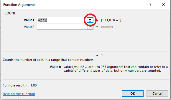
Click on the up-arrow symbol at the right of the
'Value1' box.
|
 |
|
Click on the first value in cell 'A2',
hold the mouse button down and
drag to the end of the data (in cell 'A63')
release the mouse button and press 'Enter'.
OR
click on the grey header for column 'A' to select
the entire column and press 'Enter'.
The functions that we are using should ignore the
text header.
The previous dialog box returns,
with 'A2:A63' now showing in the 'Value1' box
(or 'A:A' if you selected the entire column).
Click 'OK'
|
Repeat these steps for cell 'D3', replacing 'COUNT' by 'SUM'.
The mean can be found either by entering the formula
=D3/D2 in cell D4, or by repeating the
steps above, replacing 'COUNT' by 'AVERAGE'.
The sample standard deviation (s.d.) can be found in cell 'D6'
by repeating the
steps above, replacing 'COUNT' by 'STDEV.S'.
The minimum and maximum can be found most easily for this
spreadsheet by just entering =A2 in cell 'D8'
and =A63 in cell 'D12'.
A more general approach is to repeat the steps for the count,
replacing 'COUNT' by 'MIN' (then 'MAX').
The median in cell 'D10' uses the 'MEDIAN' function.
The quartiles use the 'QUARTILE.EXC' function.
The dialog box for the lower quartile (Q1, cell 'D9') is shown here.
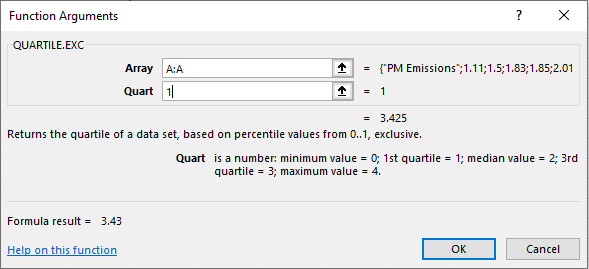
For the upper quartile (Q3, cell 'D11'), replace '1' by '3' as the
'Quart' value.
Excel has a 'Data Analysis Toolpak' add-in that can provide some (but not all)
of these summary statistics more easily.
In the main menu bar, click on 'Data', then 'Data Analysis' (if it is there).
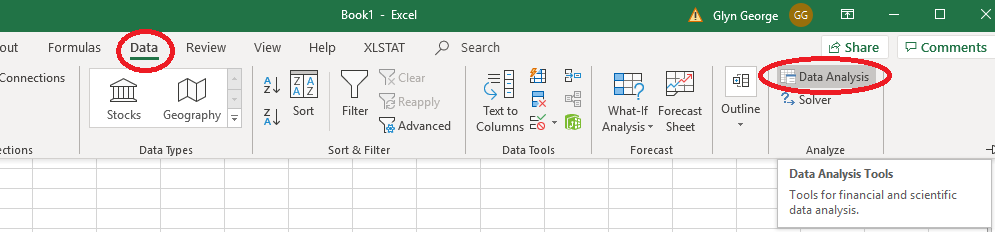
If 'Data Analysis' is not visible, then you will need to load it.
On the main menu bar at the top, click 'File ' then 'Options'.
Near the bottom of the left pane of the new window, click 'Add-Ins',
If 'Analysis ToolPak' is not in the list of Active Application Add-ins, then
at the foot of the main pane, click the button 'Go...'.
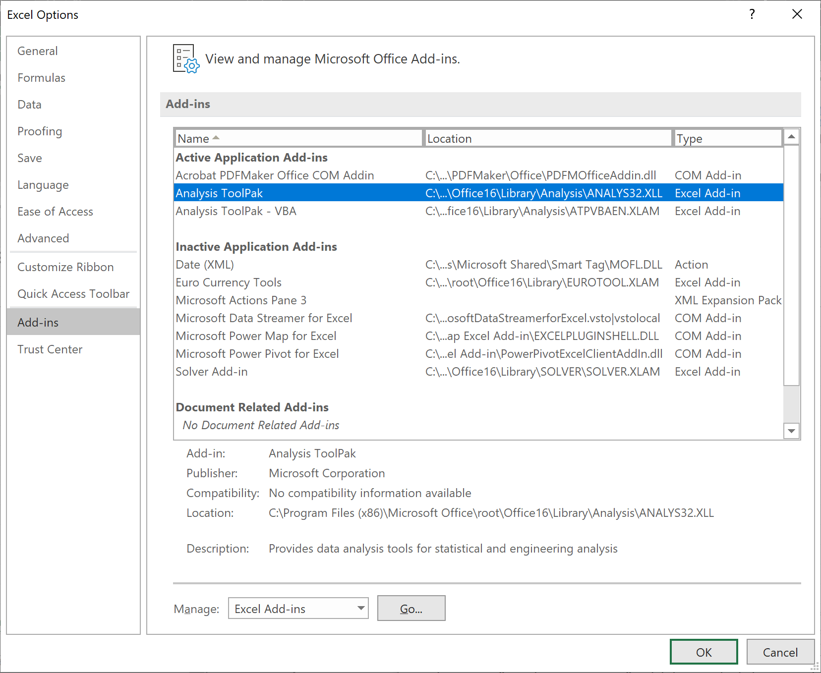
In the new pop-up box,
check the boxes for
'Analysis ToolPak' and
'Analysis ToolPak - VBA'
and click 'OK'. |
|
|
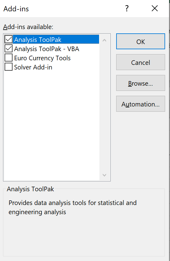
Having clicked on 'Data', then 'Data Analysis',
in the new dialog box,
find and click on 'Descriptive Statistics'
and click 'OK'. |
|
|
 |
|
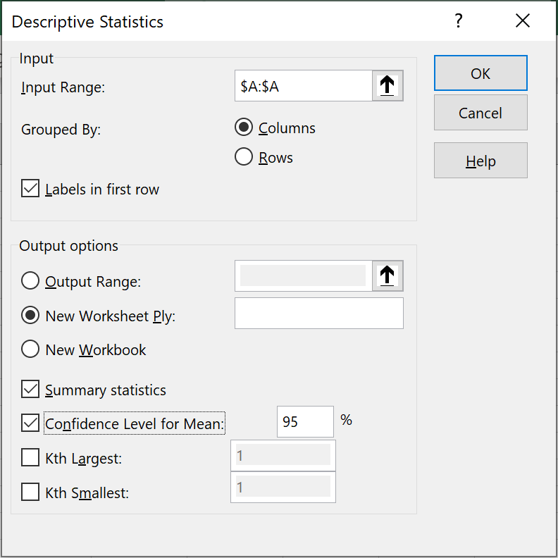
In the new dialog box,
select all of column 'A' as the 'Input Range',
check the box for 'Labels in first row'
check the box for 'Summary statistics' and
click 'OK'.
|
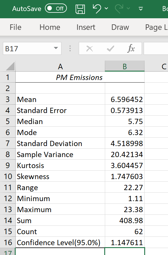
In a new worksheet,
some summary statistics appear.
You may have to widen column 'A'
to see the labels.
Unfortunately, the quartiles are
not included. |
|
|
Boxplots
Minitab constructs a boxplot with a few mouse clicks.
Excel does have a “Box and Whisker Plot” capability that
we shall see shortly.
For manual construction of a boxplot, we need to calculate the
locations of the inner and outer fences.
'IQR' is the interquartile range. IQR = Q3 – Q1
or, with our cell references, the entry in cell G5 is
=D11-D9.
'SIQR' is the semi-interquartile range. SIQR = IQR / 2
The entry in cell G6 is =G5/2.
The upper outer fence (UOF) is three interquartile ranges beyond
the upper quartile, at
UOF = Q3 + 3*IQR (the entry in cell G8 is
=D11 + 3*G5 ).
The upper inner fence (UIF) is three semi-interquartile ranges beyond
the upper quartile, at
UOF = Q3 + 3*SIQR (the entry in cell G9 is
=D11 + 3*G6 ).
The lower fences are the equivalent distances below the lower
quartile.
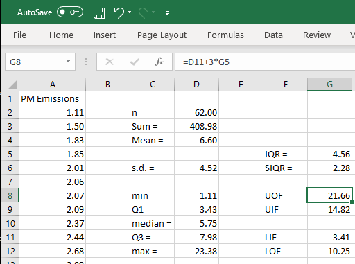
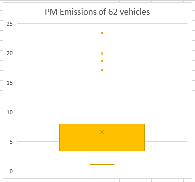
None of the 62 values are below the lower inner fence — negative
values of particulate matter emissions are impossible.
There are therefore no outliers at all below the box.
The lower whisker ends at the minimum value of 1.11.
Only the maximum value of 23.38 is above the upper outer fence
and is therefore an extreme outlier.
The next three largest values, 17.11, 18.64 and 19.91, lie between
the two upper fences and are mild outliers.
The upper whisker ends at the largest value that is not an outlier:
13.63.
This is sufficient information to construct the boxplot manually.
Excel is able to generate a boxplot.
First select all of column 'A'.
From the 'Insert' menu, click the down arrow next to the second small
bar chart / histogram icon, then click on 'Box and Whisker'.
This generates the unlabelled plot shown here.
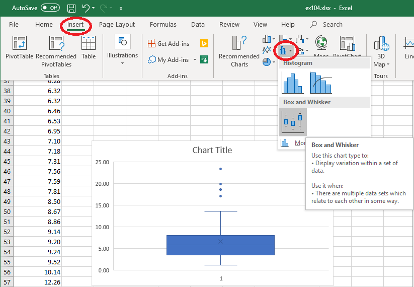
By clicking on various elements within this chart you can
customize it.
Note that Excel, unlike Minitab, also displays the location of the
arithmetic mean by default.
Bar Charts
The bar chart option of Excel is designed to provide a graphical
interpretation of a frequency table for data from a discrete
population.
Our data set is a list of 62 separate values,
originating from a continuous population.
Most of these values are unique even after rounding to two decimal
places.
We should use the “histogram” feature instead.
First select all of column 'A'.
From the 'Insert' menu, click the down arrow next to the second small
bar chart / histogram icon, then click on 'Histogram'.
This generates the unlabelled plot shown here.
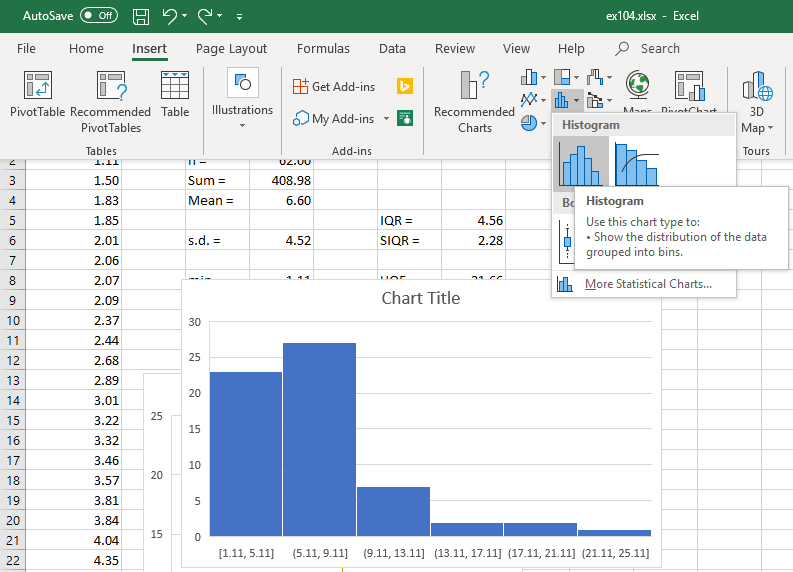
Unfortunately, Excel sets the left boundary of the first bar
at the minimum value and forces all bars to be of equal width.
In Excel 2016 and later, there is no way to reset the left
boundary and there is no way to create bars of unequal width.
|
In order to reproduce the bar chart on page 1.04 of the
lecture notes, we need to construct a frequency table
(tally chart) and then construct a bar chart from it.
The bar boundaries are all integers,
so let us restore the general format for these numbers.
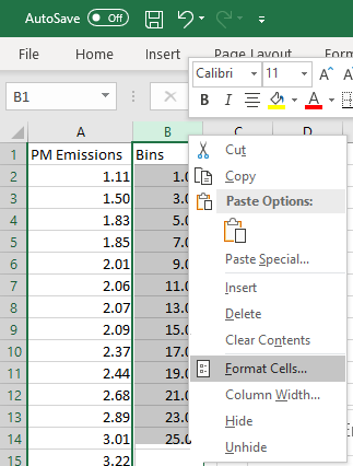
Right-click on the grey column header for column 'B'.
Click on 'Format Cells ...'
|
|
 |
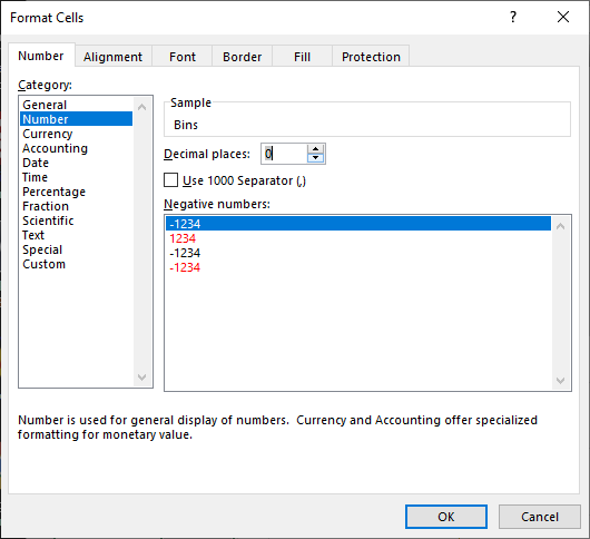
|
Reset the number of decimal places to zero
and click 'OK'.
or
in the 'Category' tab,
click on 'General'
and click 'OK'.
|
|
 |
|
In column 'B' enter the desired boundaries for each interval of
values.
We will start with all bins of width 2, starting at 1.00
However, Excel treats each bin value as the right
boundary,
not the left boundary.
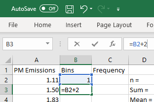
Enter the column header in cell 'B1',
and enter '1' in cell 'B2'.
To speed up data entry, enter a formula in cell 'B3':
=B3+2
|
|
 |
|
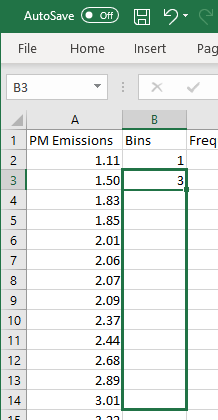
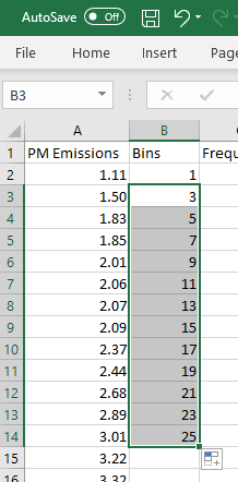
Position the cursor at the bottom right corner of 'B2'
so that the cursor becomes a crosshair (the 'fill handle').
Click and drag the cursor down far enough to reach
the value of the right boundary of the final bar, 25,
(cell 'B14') then release.
|
|
 |
|
 |
|
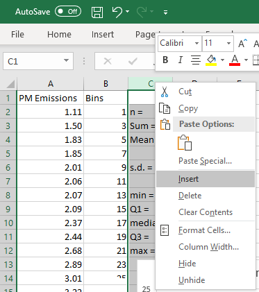
We need to make room for the column of frequencies.
Right-click on the grey header for column 'C'
and click on 'Insert'
Type 'Frequency' into cell 'C1'
and widen column 'C' to fit
(width 10 should be sufficient).
|
|
 |
|
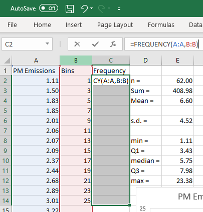
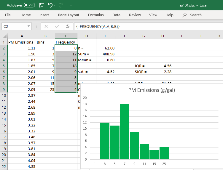
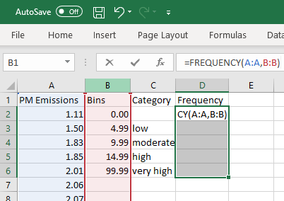
Obtaining the frequencies in Excel is not obvious.
Click and drag to highlight cells 'C2' to 'C14'.
With the range still highlighted,
in the data entry box just below the main menu bar,
type in =FREQUENCY(A:A,B:B)
but do not press 'Enter'!
Instead press the special three-key combination
Ctrl+Shift+Enter .
The frequencies will then appear as an array
(which is why the special key combination
Ctrl+Shift+Enter is required).
|
|
 |
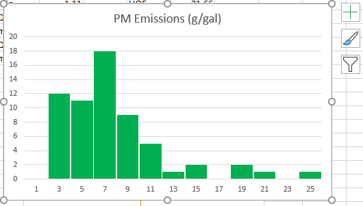
Select cells 'B1' to 'C14' (the set of bins and frequencies).
From the 'Insert' menu, select 'Recommended Charts'
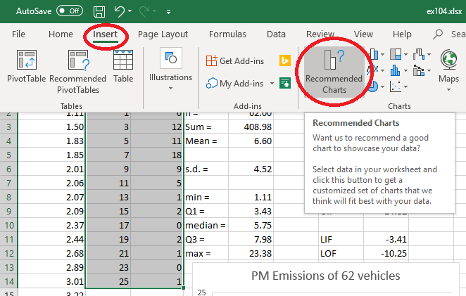
Select the first choice and click 'OK'.
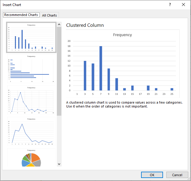
The following bar chart is produced.
 |
|
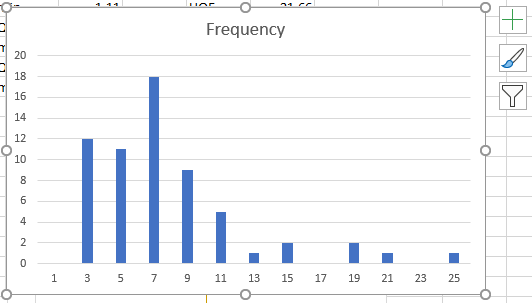
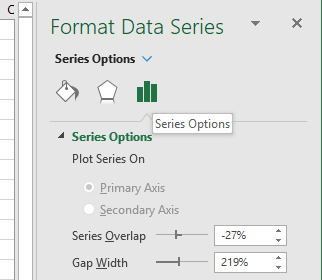
Click on any bar in this chart.
To the right side of the worksheet is
the 'Format Data Series' menu.
Click on the icon
 to bring up series options.
Change the gap width to 5% and
click anywhere in the chart.
|
|
A few more adjustments can be made to this bar chart,
which now bears some resemblance to the bar chart on
page 1.04 of the lecture notes.
However there are serious problems.
The horizontal axis labels are misaligned.
The vertical axis is frequency, not density
(although, with equal bar widths, this is less of a problem).
|
|
 |
Upon combining intervals to produce bins of unequal
width,
Excel insists on drawing bars of equal widths for these bins,
which is an even more incorrect bar chart than the one
on page 1.05 of the lecture notes!
Histograms
Unfortunately, unlike Minitab, there is no way in Excel 2016+
to produce a proper histogram when the bins are of unequal width.
The best that we can do in Excel is to generate the data to
draw the histogram in some other graphical package (or manually).
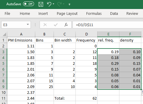
The relative frequency = frequency / (total frequency)
The density = (relative frequency) / (bar width)
 |
|
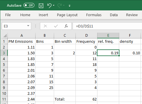
Create new columns as shown.
Bin width: in cell 'C3' enter
=B3-B2
Total frequency: in cell 'D11' enter
=SUM(D3:D9)
Relative frequency: in cell 'E3' enter
=D3/D$11
(Note that the '$' fixes row 11 as an absolute
reference when cell 'E3' is copied)
Density: in cell 'F3' enter
=E3/C3
|
|
By dragging each of cells 'C3', 'E3' and 'F3' down
to row 9, the rest of the table can be populated.
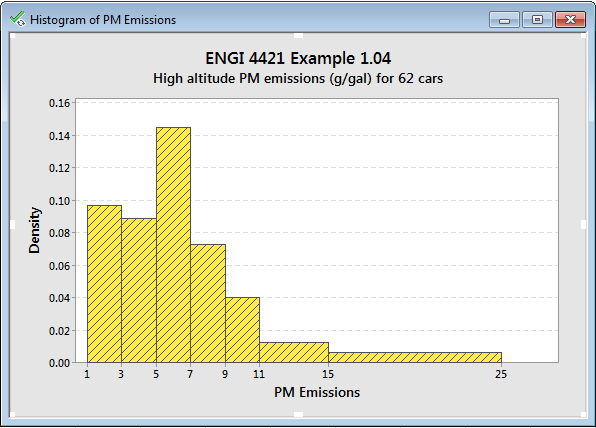
One can now import the values in columns 'B'
as the location of the right edge of each bar
and the values in columns 'F' as the location of the
top of each bar.
The true histogram (as on page 1.06 of the
lecture notes) can now be generated.
|
|
 |
Pie Chart
Excel can generate graphical summaries in
various other forms, such as a pie chart.
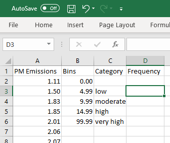
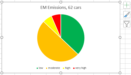
From the question, we need to find how many of our observations
fall into each of the four categories
| low | [0, 5) |
| moderate | [5, 10) |
| high | [10, 15) |
| very high | ≥ 15 |
|
Clear all columns except the column with
the original data (column 'A').
Type the entries shown into the other columns.
Note that Excel has bins that include the right end.
We therefore need to end each interval just before
5, 10 and 15.
The right boundary of the final interval can be any
value that is definitely greater than the maximum value.
|
|
 |
 |
|
As before, select all entries to be filled with frequencies,
cells D2 to D6.
Keeping this range selected, click in the data entry box
and type =FREQUENCY(A:A,B:B)
followed by Ctrl+Shift+Enter . |
|
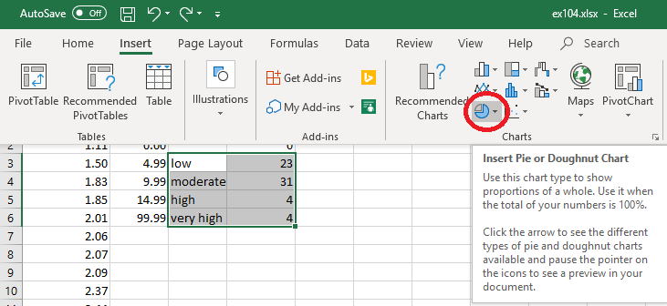
Select the range of categories and frequencies,
cells C3 to D6.
Click on 'Insert', then the pie
 icon.
icon.
| |
 |
 |
|
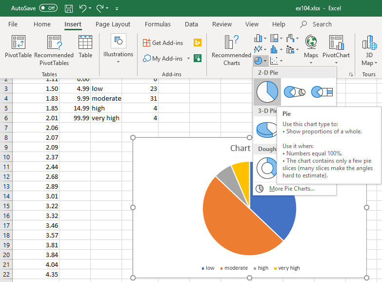
Click on the first option, '2D Pie'.
A pie chart appears. |
By clicking on various parts of the chart, one can edit its
appearance as needed.
 [Return to the index of
demonstration files]
[To the next tutorial]
[Return to the index of
demonstration files]
[To the next tutorial]

[Return to your previous page]
Created 2020 03 31 and most recently modified 2021 02 10 by
Dr. G.H. George